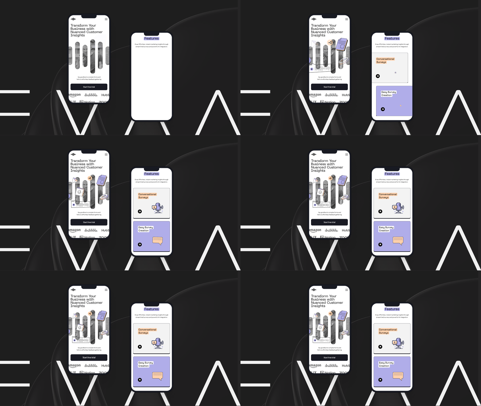
BUENA ONDA
UX/UI CASE STUDY
The breathwork app helps people from all levels to have proper guidance by integrating real-time biometric data in its ecosystem
Buena Onda is a breathing app that incentive users to feel the benefits of daily breathwork practice. It helps users from all levels to have proper guidance based on their experience and knowledge providing personalized sessions with visuals, texts, guided voice, and background music. Create customized exercises by integrating biometric data to enhance the effectiveness of breathwork.
GETTING STARTED
→ Challenge
We were tasked by the Daily Health Conference to create a wellness app for users to improve their health routines and make progress.
Which feature and functionality to include is open for proposals from the designer. To realize a Minimum viable product, the app should not attempt to solve all of the wellness issues that people are experiencing. Each design should focus on one important aspect of wellness (backed up by user research).
→ Role
This project was a collaborative effort where I assumed responsibilities for each stage of the design process, including research, synthesis, ideation, and implementation. I invested substantial effort in the precise development of the logo and the corresponding graphics, focusing on effectively conveying the visual communication of the final product.
→ Methods
Competitive Analysis, Lean Survey Canvas, Users Interviews, Affinity diagram, User Persona, User Journey Map, Problem statement, How might we?, MOSCOW & MVP, User Flow, Concept sketches, Low-fidelity prototypes, Mid-fidelity prototypes, Visual Competitive Analysis, Brand Attributes, Style Tile, High-fidelity wireframes, Concept testing, Usability Testing, Desirability Testing.
→ Strategy
We conducted a survey to inform our qualitative research, aiming to cluster our key findings into actionable insights that we can prioritize for further validation through user interviews. Subsequently, we defined our target user and generated a set of core features to be implemented in low, mid, and high-fidelity prototypes. We will then conduct testing and iterate on the solution at each stage of prototyping.
FRAMING THE PROBLEM
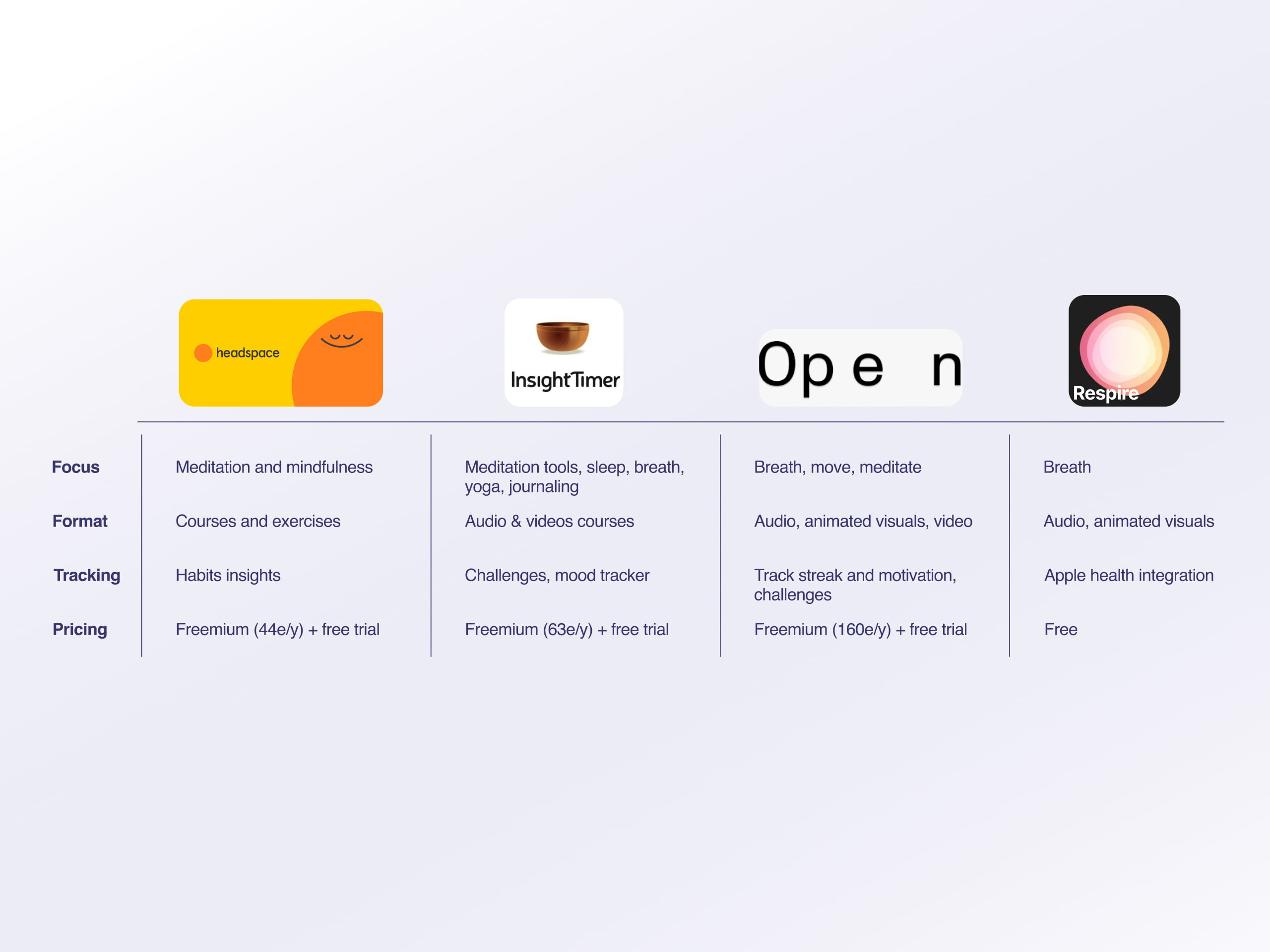
Exploring New Horizons: Navigating Industry Waters to Carve Our Unique Path
We initiated the process by conducting a comprehensive competitive analysis. This analysis proved instrumental in identifying a pertinent positioning strategy and determining the scope of our project. We delved into the specific practice being offered by our competitors, the format in which it was presented, and the methods employed for tracking performance and establishing pricing.
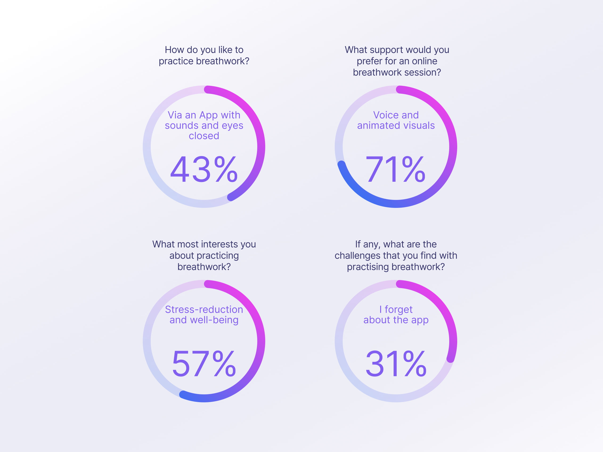
From Responses to Revelations: The Breathwork Journey Unfolded Numerically
We decided to create an online survey using Google Forms to understand more about the current breathwork practice and what prevents them from breathing more.
We collected a total of 57 responses providing a set of 10 specific questions to inform better our qualitative research.
We noticed that they like to practice with sound and eyes closed. They mostly do it to reduce stress, and most of them find it challenging to practice because they forget that it exists when they need it.
Beyond Numbers: Exploring New Horizons Through Conversations
We conducted a comprehensive analysis of 5 user interviews to gain insights that were not captured in the quantitative data.
Our primary focus was on understanding the motivations, goals, and pain points of our users. Below, we present a summary of notable quotes extracted from these interviews.
“It is hard to concentrate on your breath. It sounds simple but it is really hard. You overthink and you overanalyze it”
“It was not easy. I was losing concentration super fast. I was thinking about losing concentration and starting this loop”
“If you are doing it by yourself. you do not know that you are doing it right”
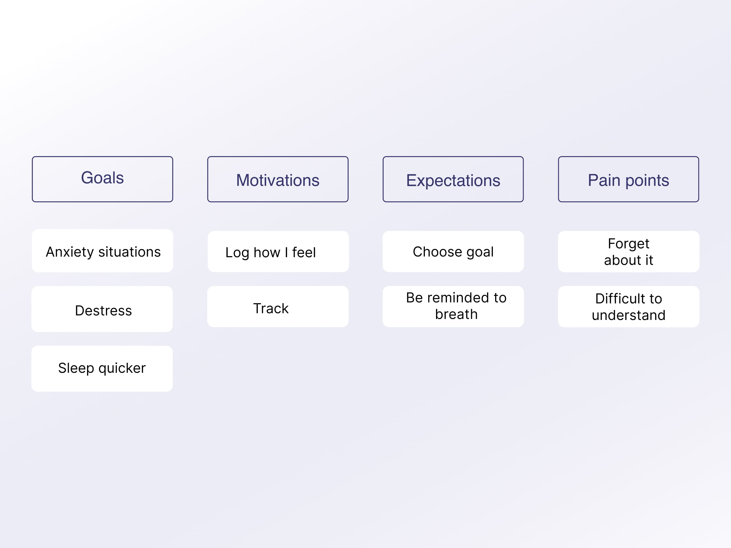
Harmonizing Insights: Crafting Clarity from the Chaos
We categorize the multitude of insights by creating an affinity diagram.
We group similar statements into four headers, effectively organizing the information.
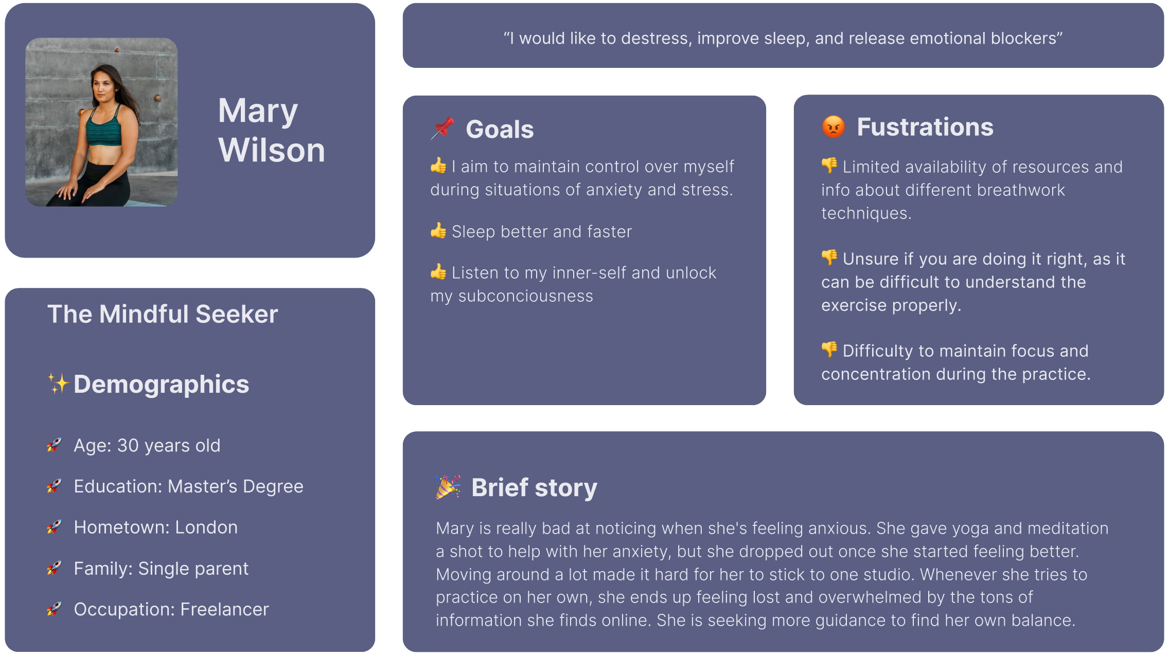
Mary Wilson: The Mindful Seeker
Based on the data collected from interviews and surveys, we utilized an affinity diagram to organize our findings and establish our Primary Persona, Mary Wilson. Mary is an individual who exhibits a strong interest in wellness and actively engages in yoga practices. However, she encounters difficulties in maintaining focus and incorporating breathwork into her routine. The provided summary offers a comprehensive understanding of Mary's background, objectives, and challenges.
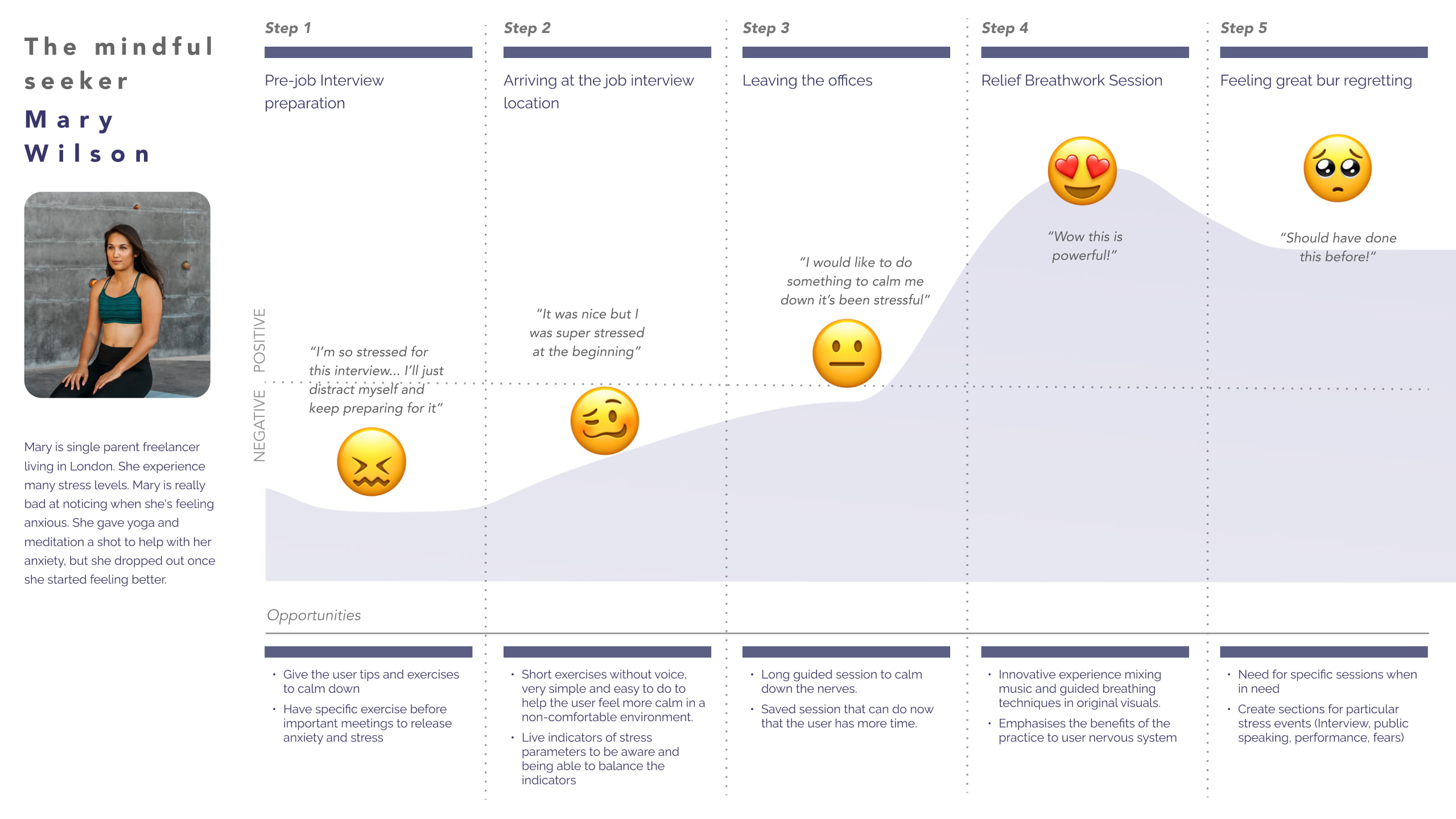
Unfolding Awareness: Tracing Her Steps Through Moments of Change
She exhibits a proclivity for mindfulness and self-discovery. Nevertheless, when faced with a high-pressure situation such as an interview, she experiences uncertainty and anxiety, lacking knowledge of appropriate coping mechanisms. It is only upon attending a breathwork class that she recollects the potential benefits it could have provided prior to the aforementioned stressful event. She expresses a desire for earlier recognition of this advantageous technique.
Problem Statement & HMW
In order to understand what issue needs to be addressed and why, we came up with the next problem statement:
Adults with stressful lives looking to improve their well-being need to find a way to access immediate anxiety relief exercises and practice original self-discovery techniques because they struggle to find easy motivating solutions and resources to practice breathwork.
How might we integrate real-time biometric data into an app to enhance the effectiveness of breathwork?
How might we help users from all levels to have proper guidance based on their experience and knowledge?
How might we incentivize users to feel the benefits of the daily breathwork practice and breath more?
Charting Digital Journeys: Unveiling the Pathways of User Exploration
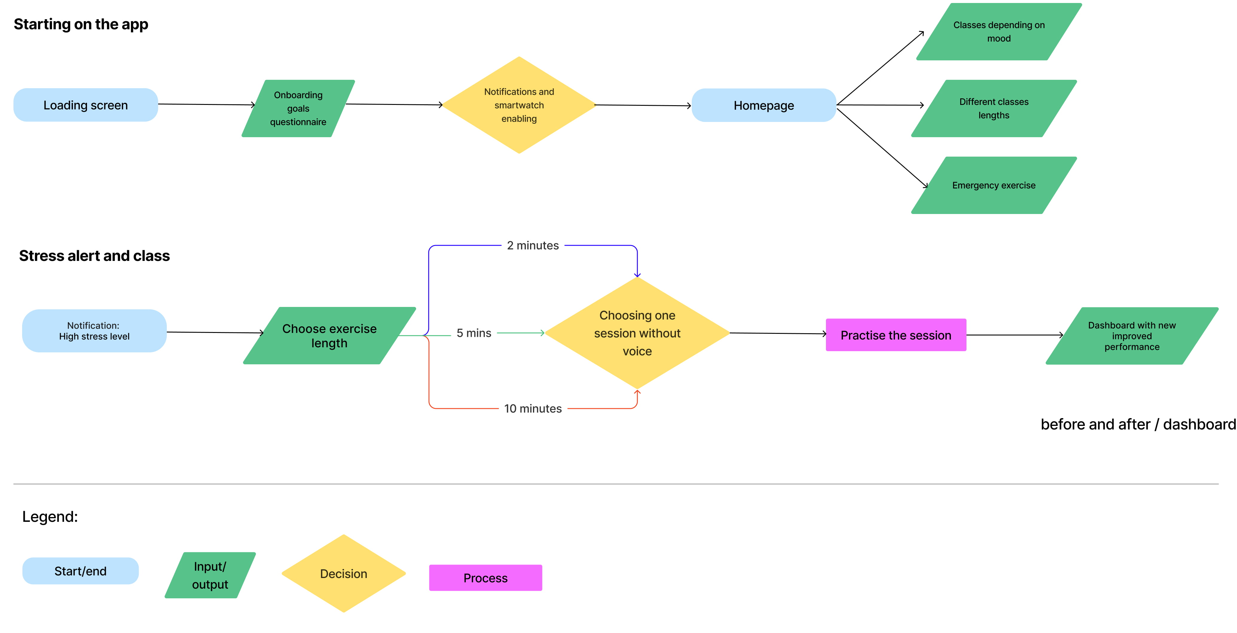
To further refine our minimum viable product, we will outline the two primary user flows that our solution will cater to:
App Onboarding Flow: This flow encompasses the steps a first-time user will undertake to gain access to the app and explore its various functionalities.
Stress Alert and Session Flow: This flow enables users to engage in breathwork sessions whenever the app detects elevated stress levels based on the analysis of their biometric data.
User-Focused Creation: Capturing Acceptance and Onboarding in a Low-Fidelity Realm
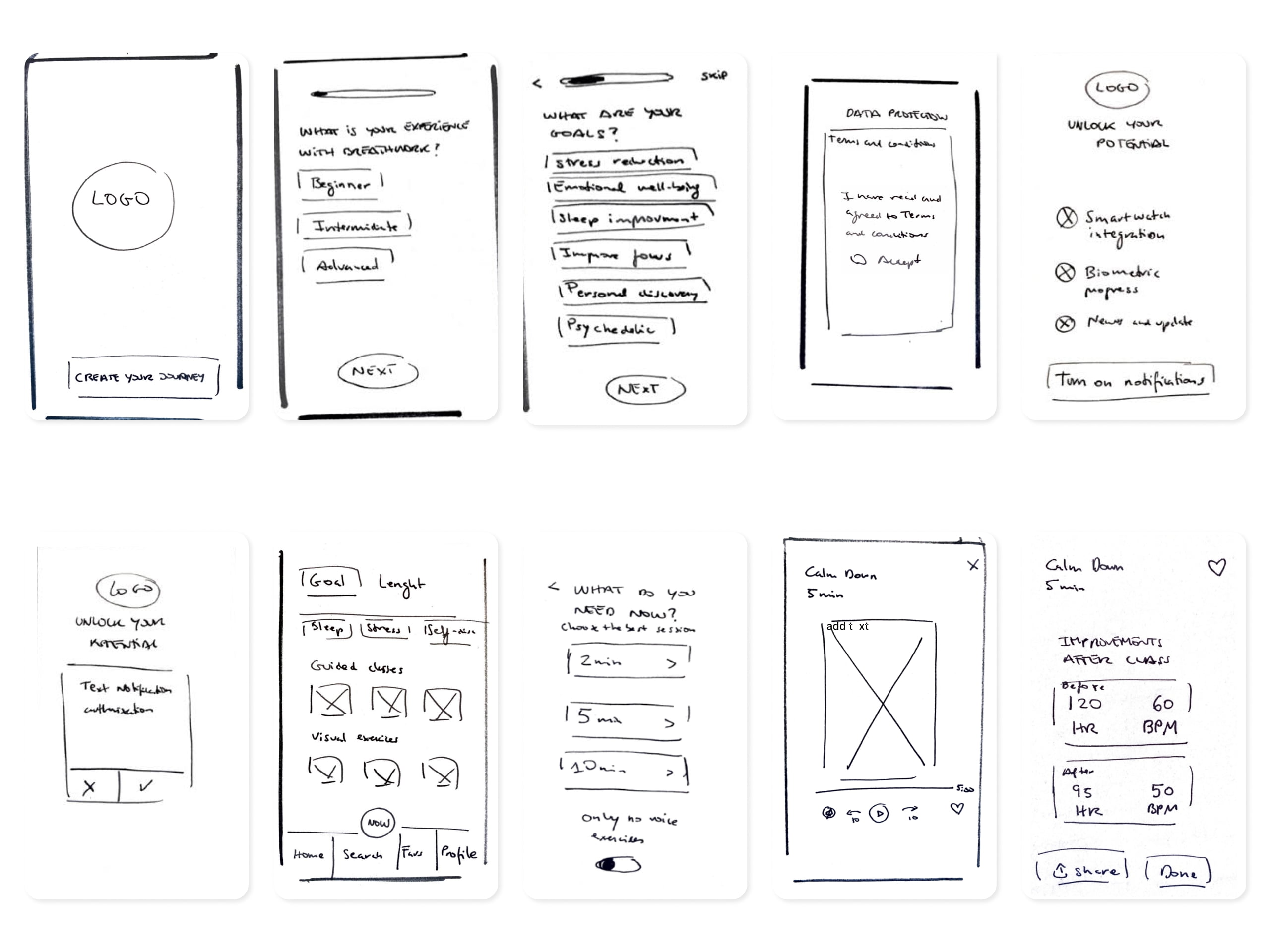
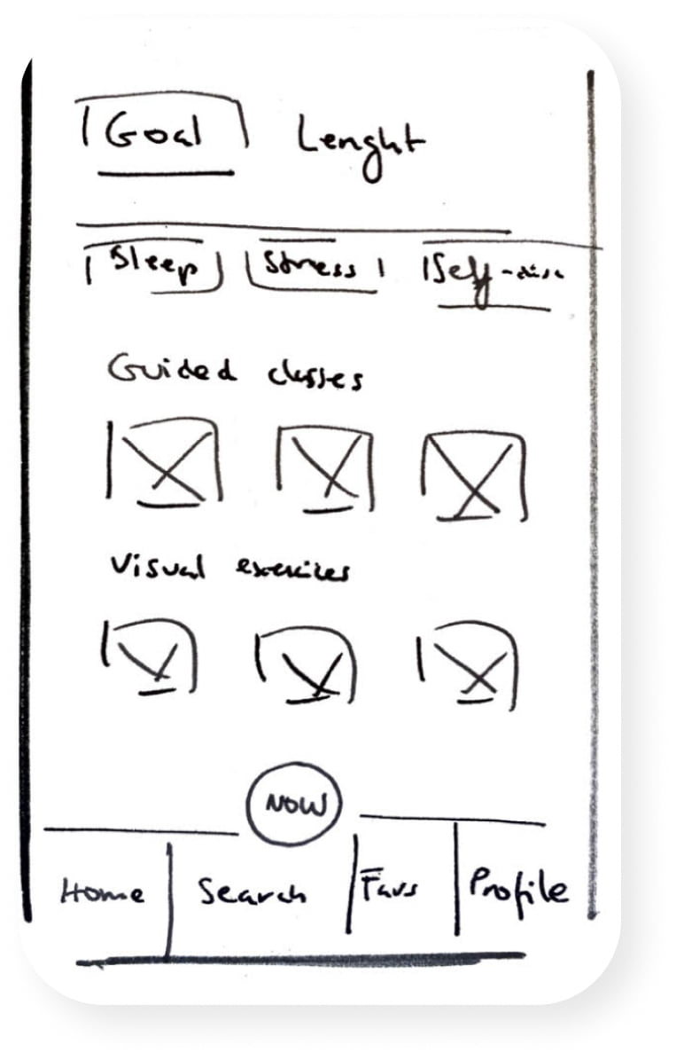
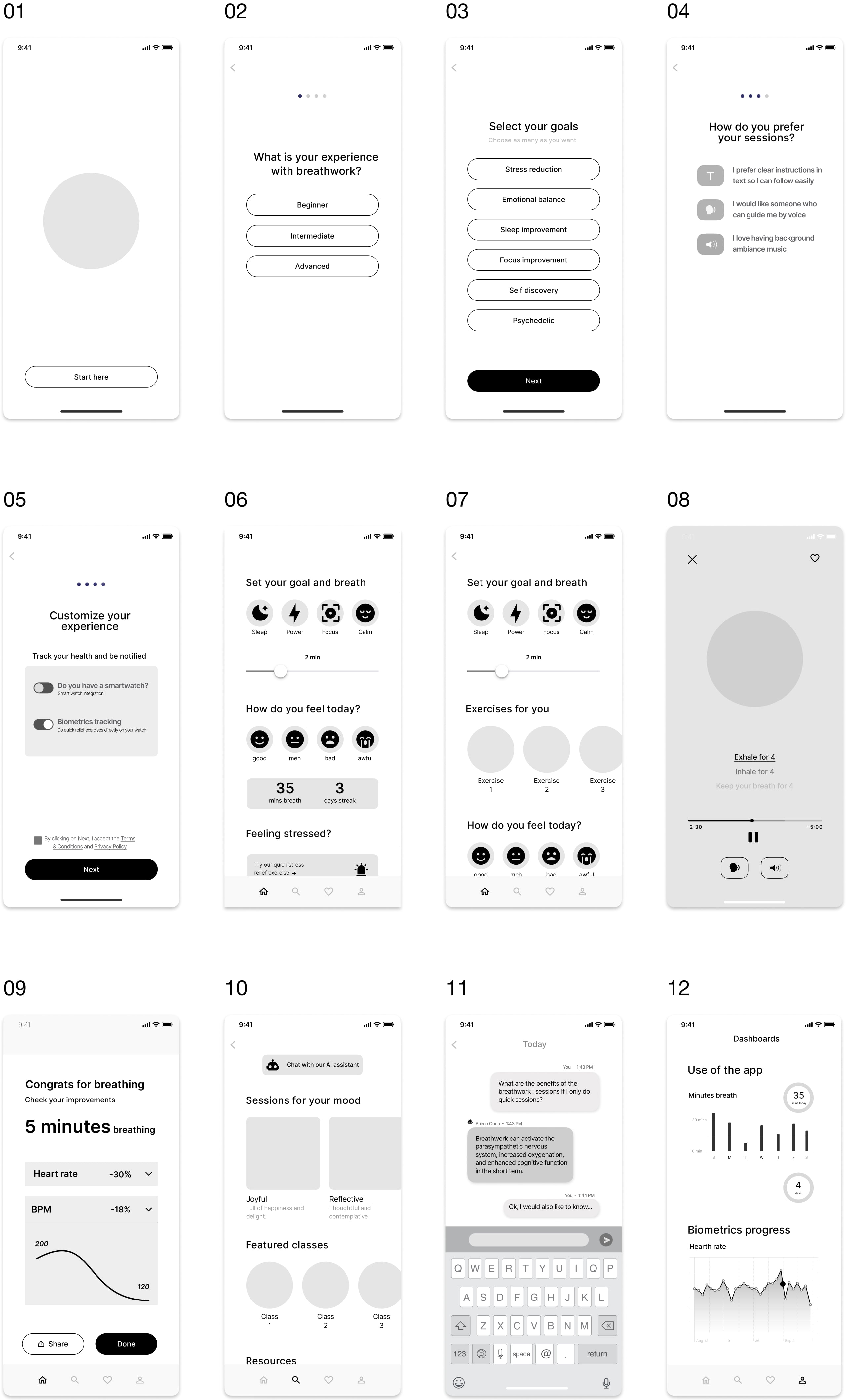
In this step, we need to create a low-fidelity prototype to validate the usability of our solution. Our main focus was to validate consumer acceptance, especially in the onboarding experience.
We conducted concept testing with 3 users who have been using mindfulness apps.
The main idea of the app was generally appreciated by our users.
Here, below, are some main observations that we captured during the interviews.
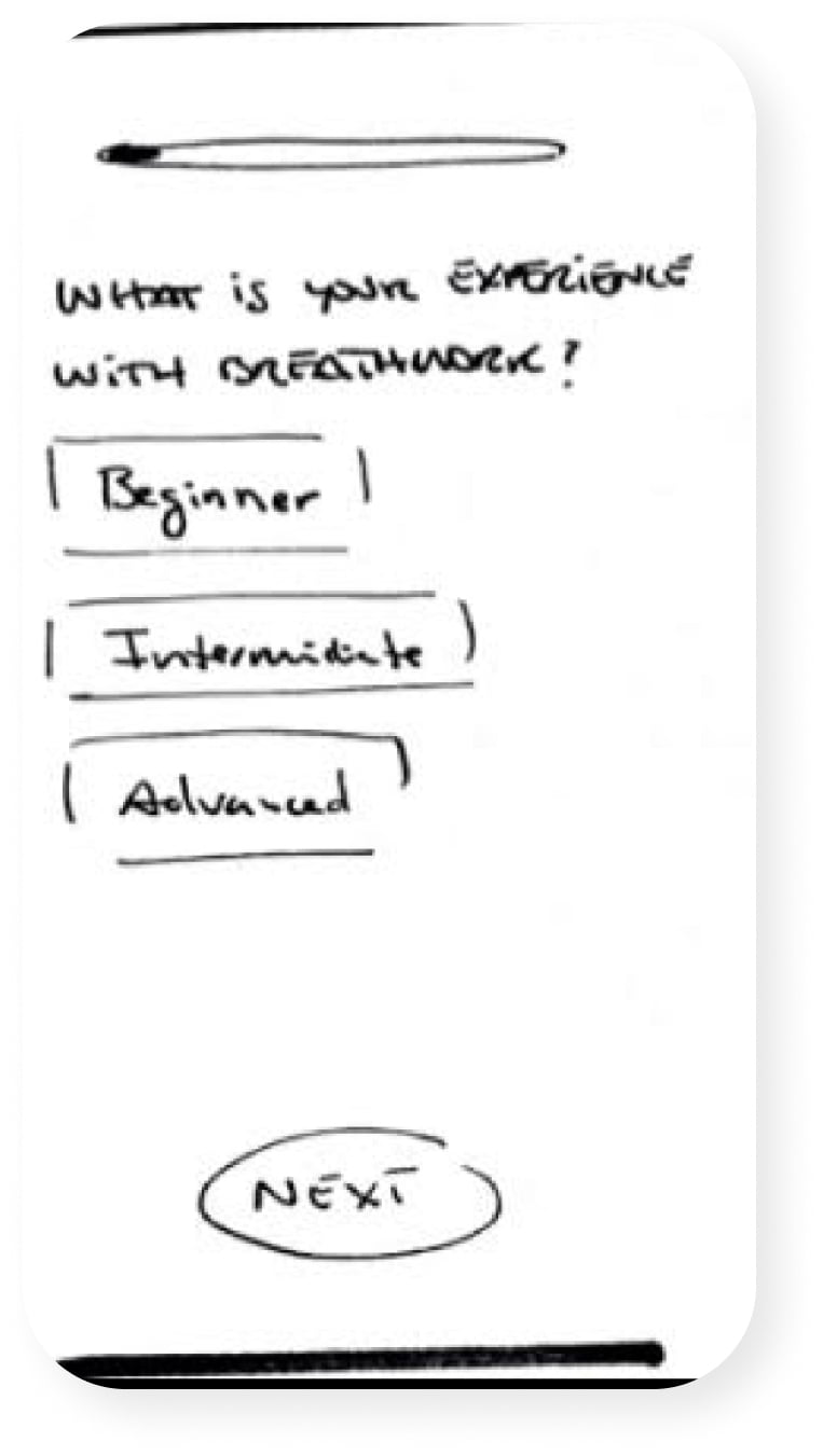
“Next button irrelevant. I want to see an animation once I press the selected option and directly change the screen.”
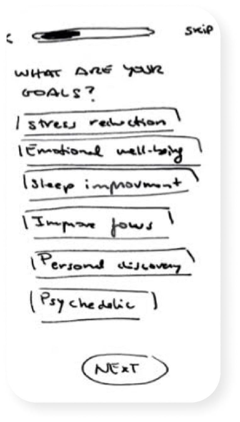
“It makes sense the next button here, as I can select more options. I would consider adding a sentence to reinforce the user that can select more than one option.”
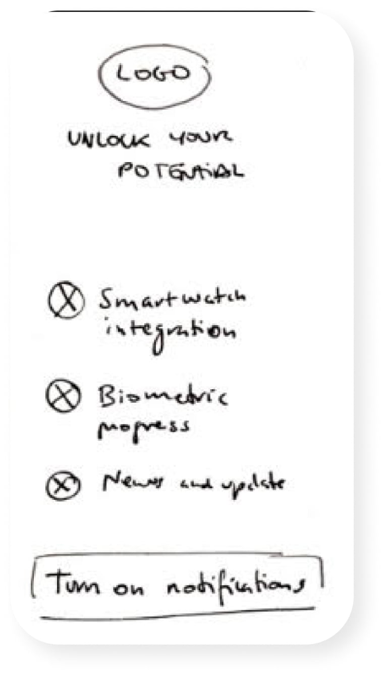
“Ask the person if they have a smartwatch or not. In case you have it you should allow the app to track it.”
“I would like to see a quote as a title like: What’s your goal? or some question.”
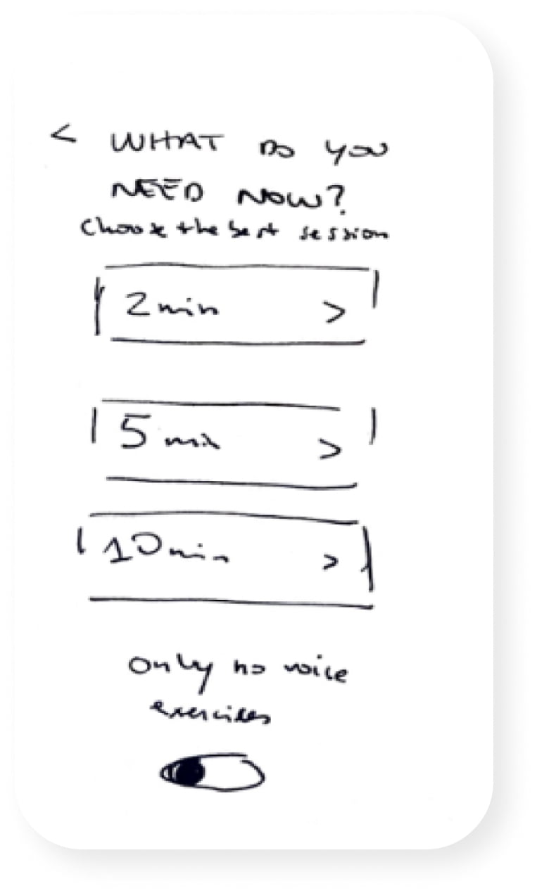
“Add an audio icon next to the -only no voice exercises-. I miss a visual element.”
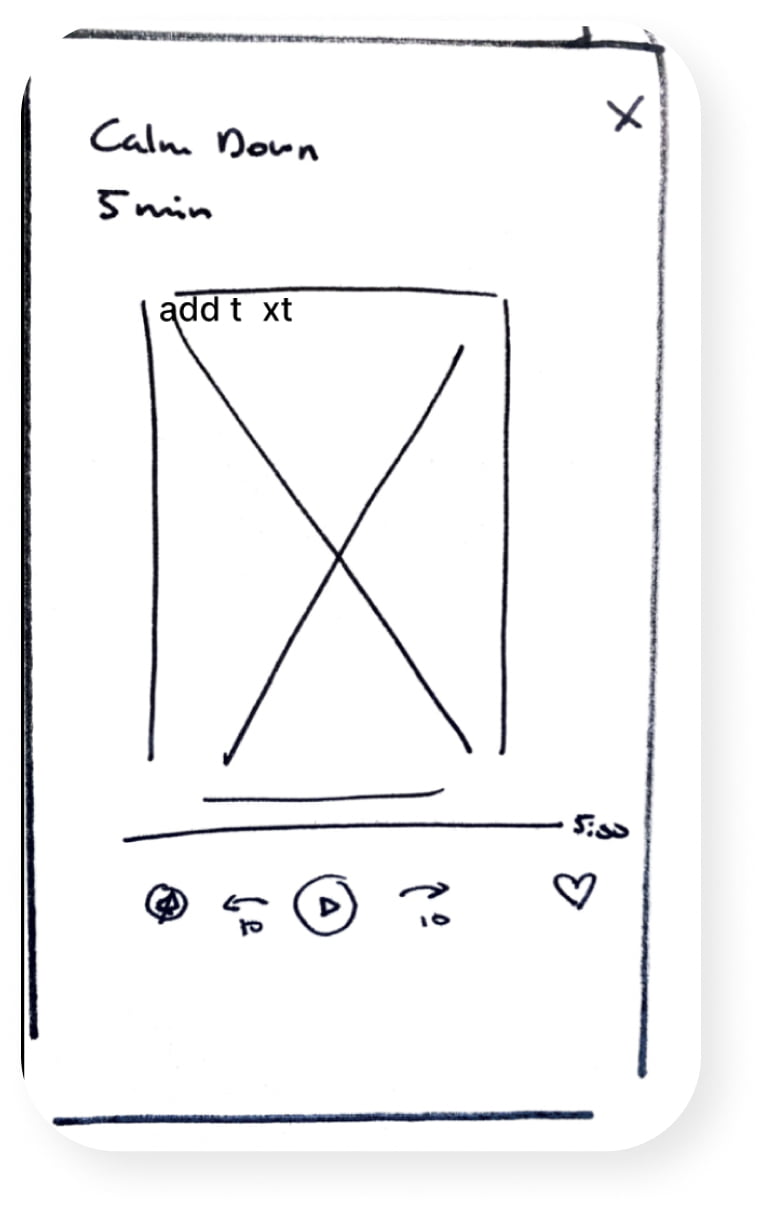
“I think the 10 sec option is good. I would delete the voice option as I think if the class has voice shouldn’t have text on the image.”
From Vision to Test: Revealing User Preferences in Mid-Fidelity Exploration
During the execution of the mid-fidelity prototypes, we started to give shape to the user flows and the information architecture of the app.
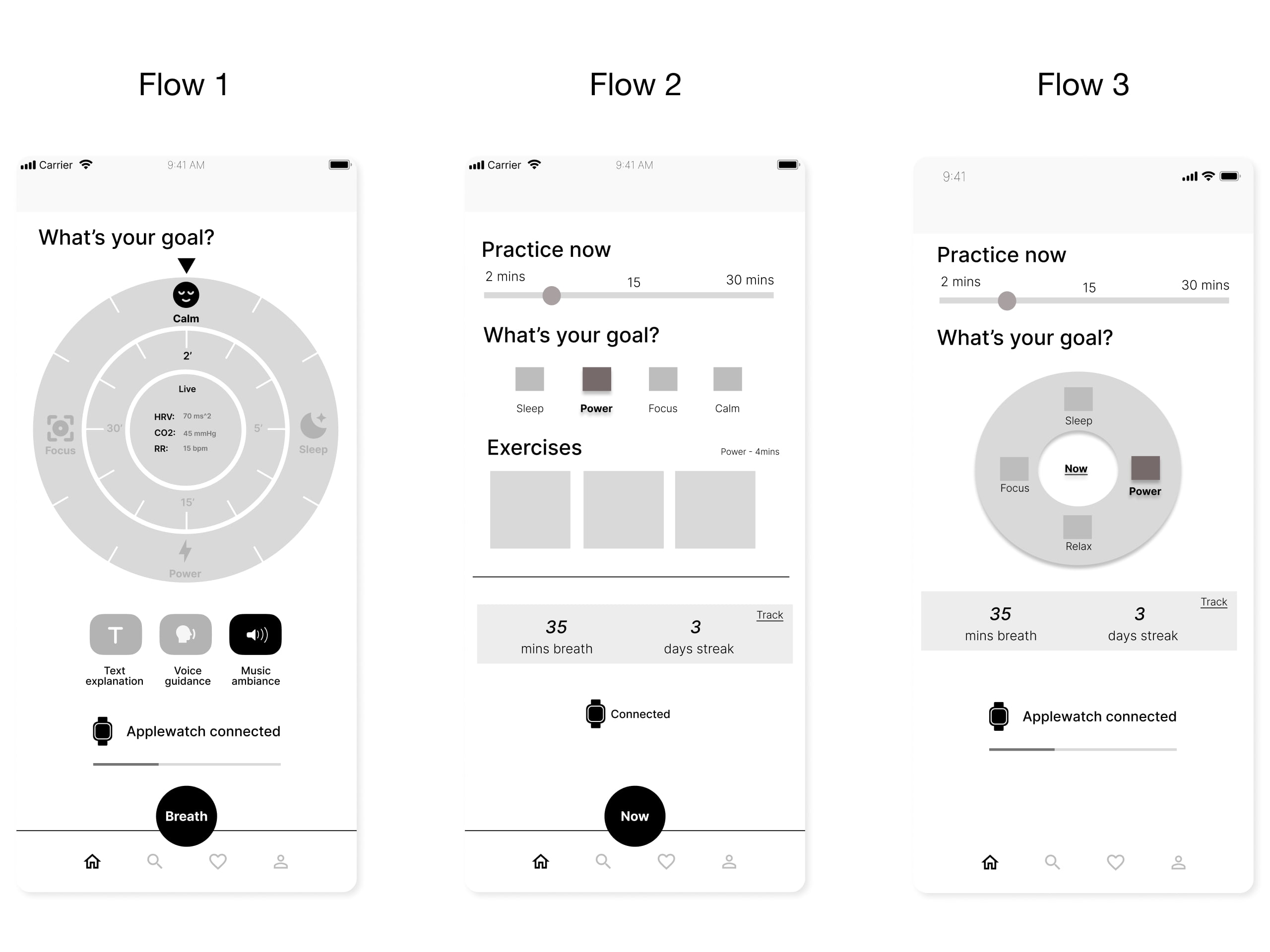
The “home” screen was an important element of debate in our design process. In the workflow within the team, we could not figure out the best way to improve the usability and clarity of such a screen and we were not convinced if such a feature will improve the clarity of the app in the use. The main idea was to present to the user a digital wheel at the center of the home screen where he could select goals, duration, and session for the breathwork activity.
To proceed with our design process and get rid of all our perplexities we conducted 5 usability testing in which we expose each user to 3 different user flows. In 2 flows were present two variations of the wheel features. In the last one, the wheel was absent with simpler visual components.
To our surprise, the flow that had the wheel was the least appreciated by the users. The users were not able to identify the goal of such a feature and preferred a simple home screen without the wheel.
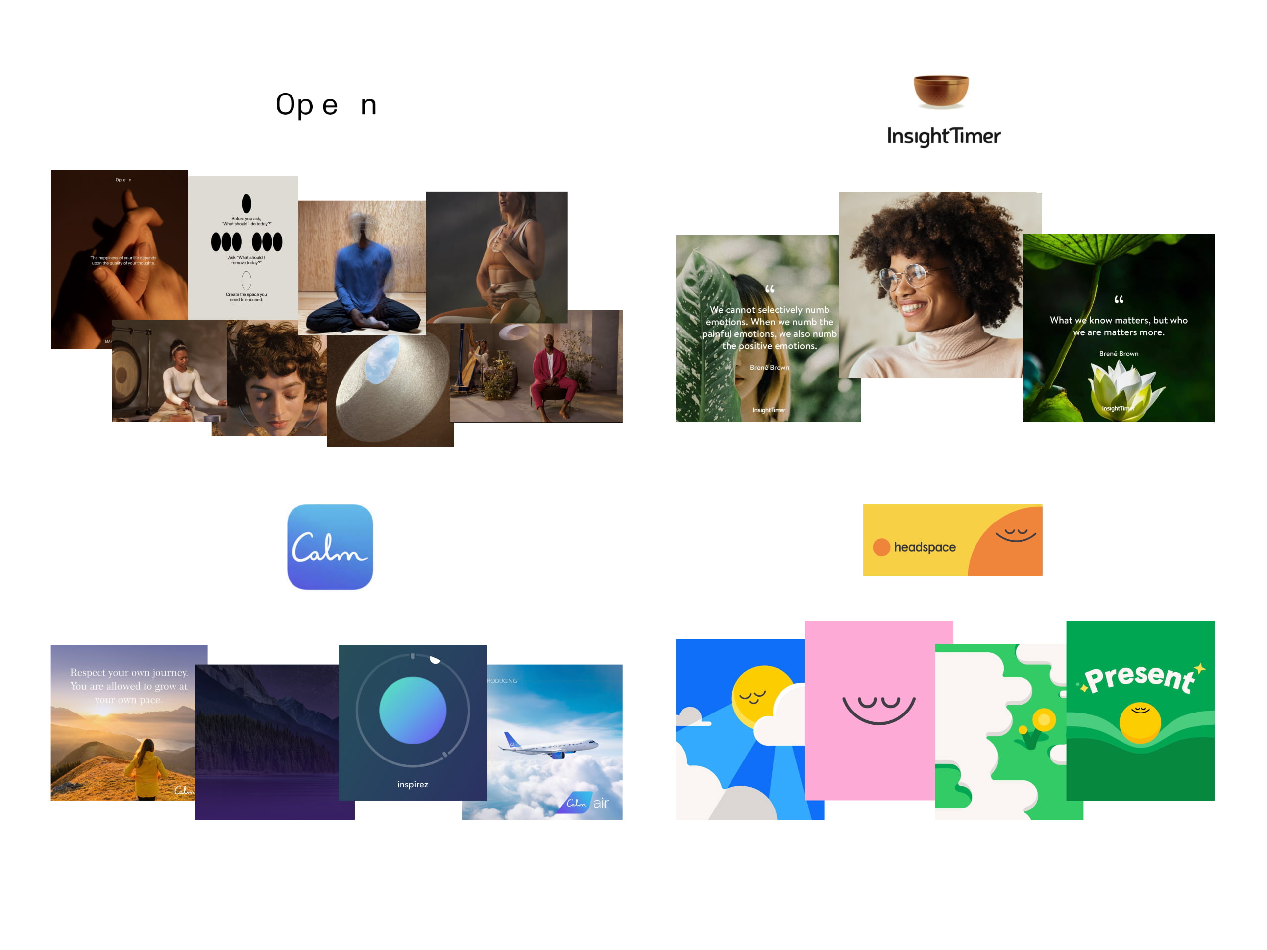
Unlocking Visual Intention: Decoding Competitors' Visual Narratives
In the quest for design distinction, delving into the realm of visual competitive analysis emerges as a crucial compass. It's not merely about observing competitors' aesthetics, but about deciphering the unspoken language they convey. The importance of understanding their visual guidelines goes beyond the surface; it's about discerning the echoes of their design choices in the minds of users.
The prevailing trend among competitors is to center their focus on photorealistic visual communication, often drawing inspiration from natural subjects and serene moments. A handful of them, however, opt for a different approach, leaning towards minimalistic and playful representations that capture the essence of the user experience.
Visual Harmonies: Infusing Essence into Our Product through Moodboarding
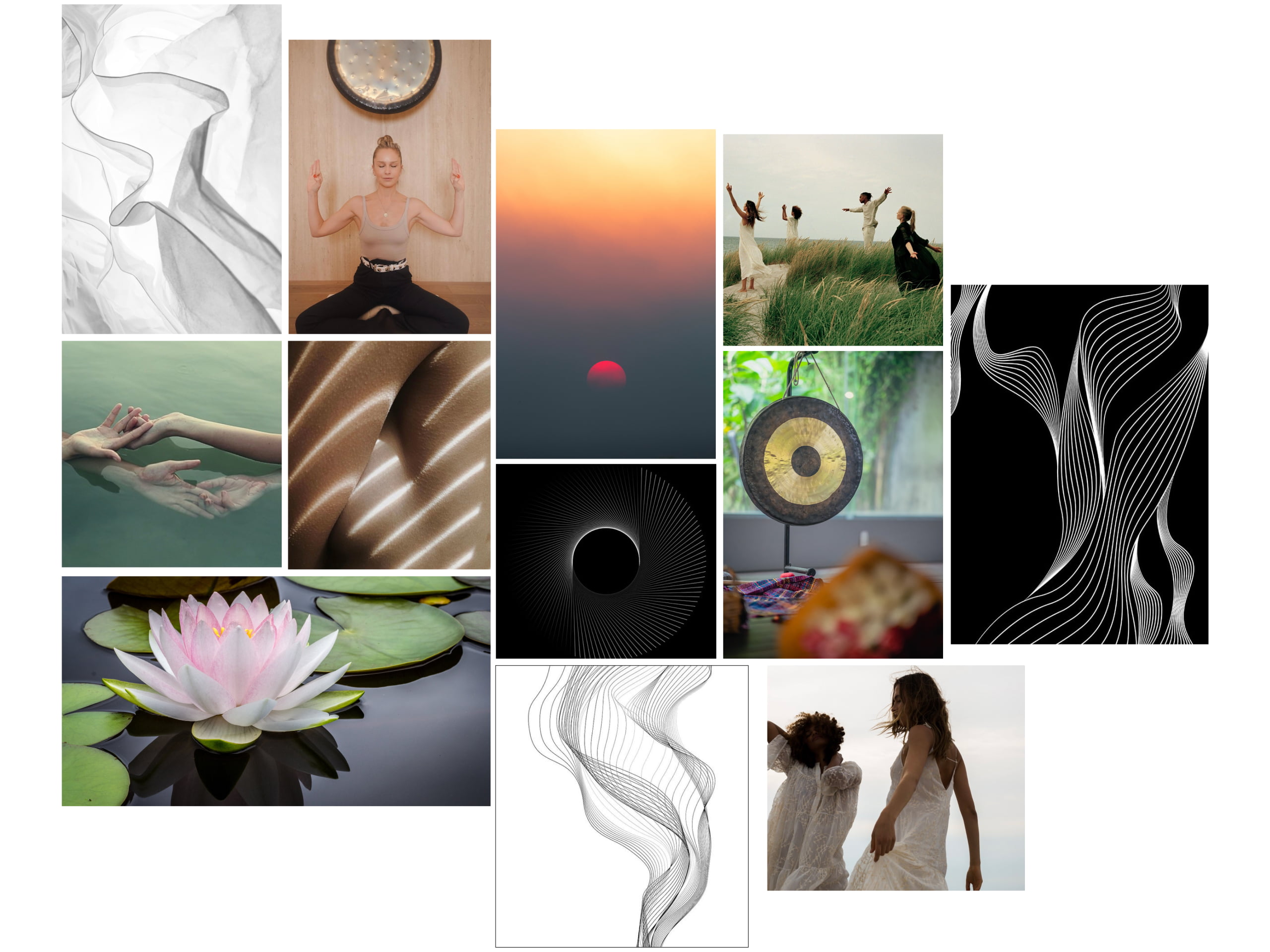
With this collage, we wanted to synthesize the essence of our product aesthetics.
The aesthetics wield the power to evoke emotions, establish trust, and resonate deeply. This understanding bridges the gap between design and brand sentiment, making each visual decision a strategic step towards crafting an experience that's not just visually appealing, but emotionally resonant. Below are some of the keywords that guide our research:
- Calm
- Sophisticated
- Mindful
- Clear
- Minimalist
Visualizing Good Vibes: The Essence of Buena Onda Unveiled in our Style Tile
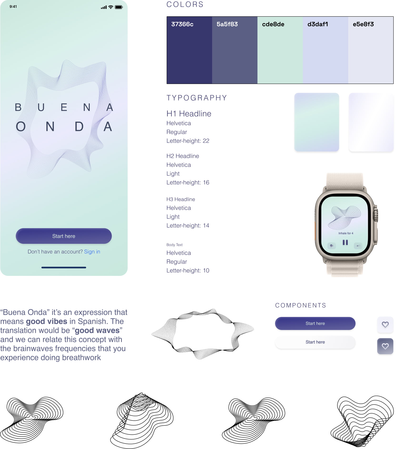
In our style tile, we embraced a modern minimalism that embodies "Buena Onda's" good vibes. A serene color palette reflects the tranquility of breathwork, aligning with the idea of "good waves" – both in translation and brainwave frequencies. Helvetica, known for its clarity, resonates with the brand.
Beyond static visuals, animations of geometric waves were integrated, visually echoing the flows of positivity. This style tile encapsulates "Buena Onda," offering users a vibrant journey into positivity and harmony, where every element moves in sync.
HIGH-FI PROTOTYPES
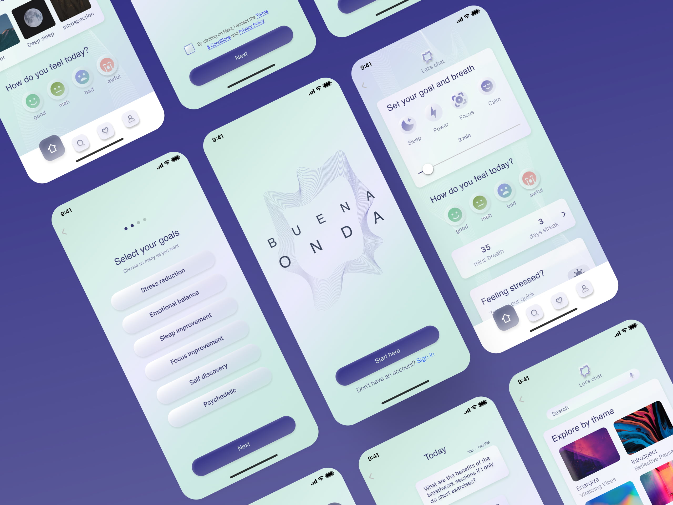
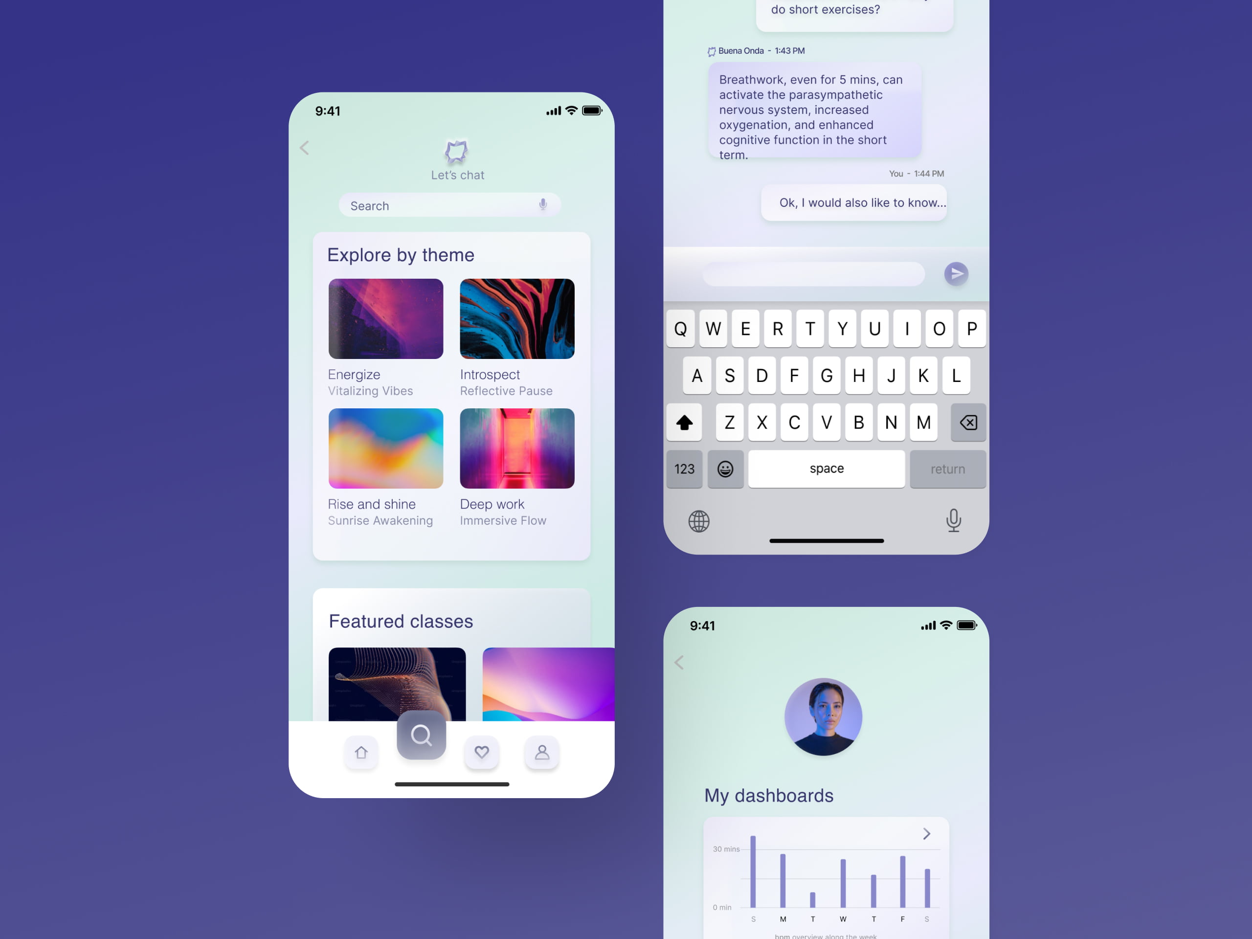
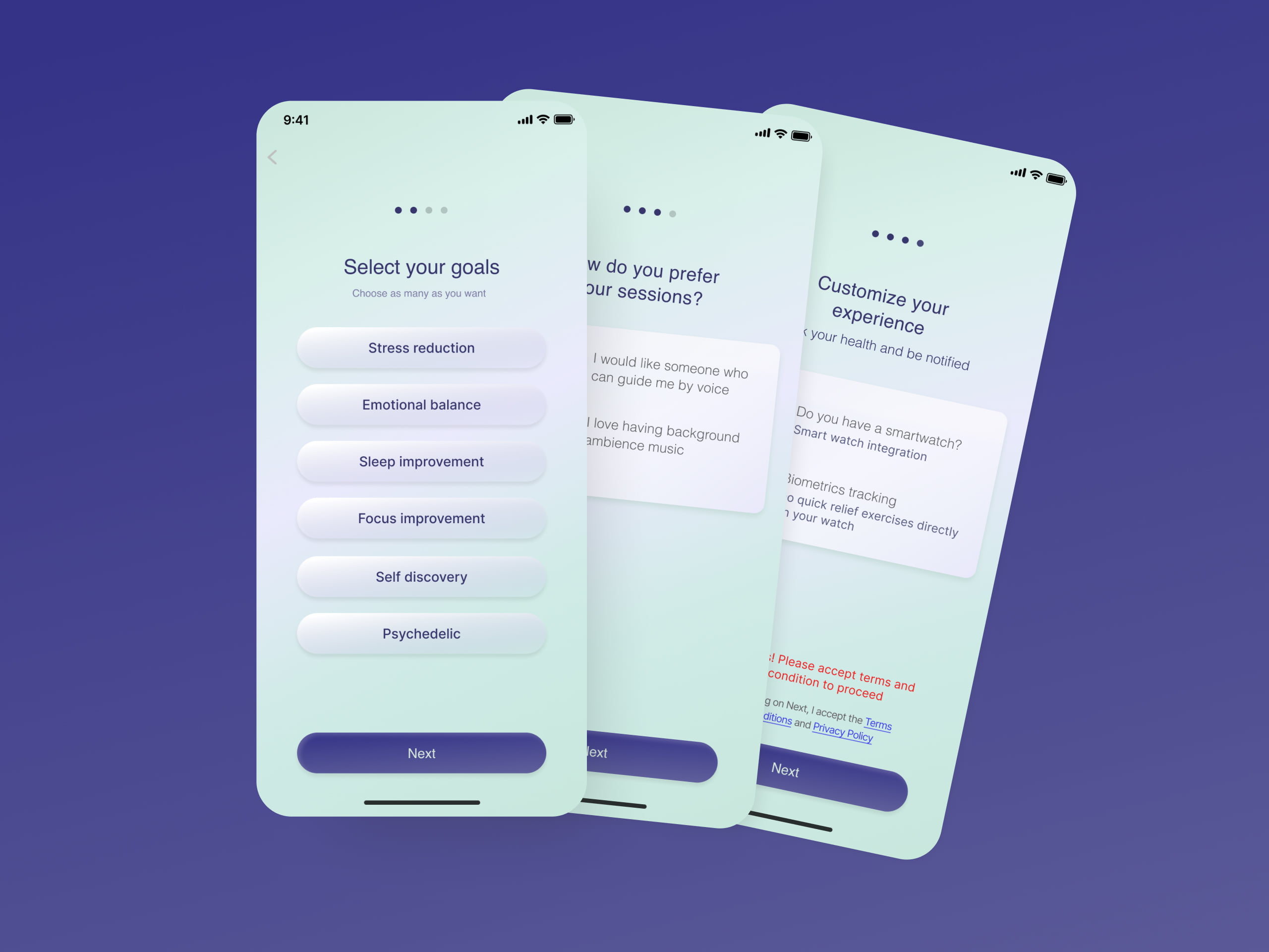
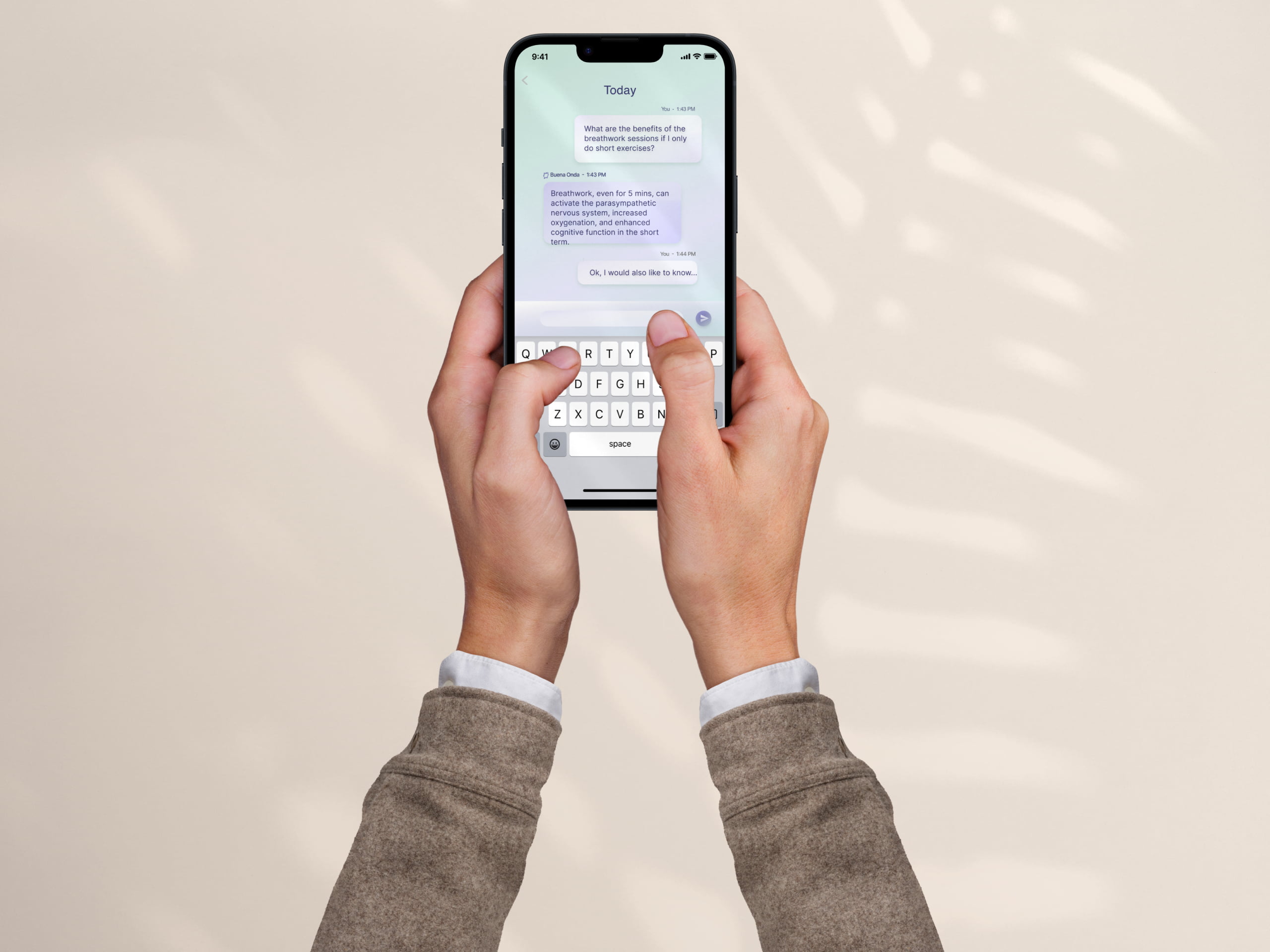

From Testing Ground to Design: Interlacing User Insights and Desirability
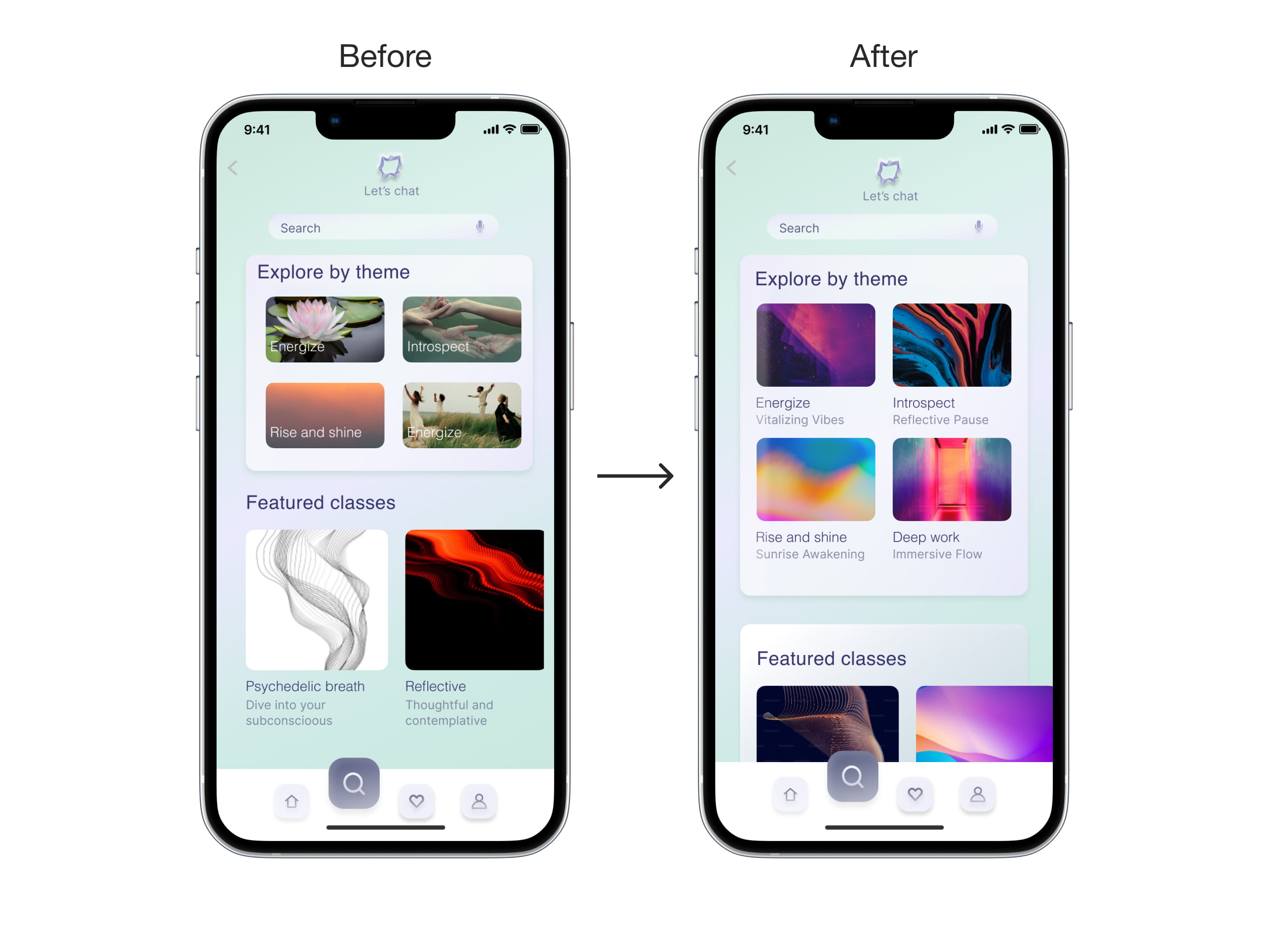
Through the lens of Desirability Testing, employing the Microsoft Card Sorting method, our high-fidelity screenshots evoked immediate emotional responses. The words "Sweet blue," "Calm," and "App for wellness" resonated in harmony with our minimalist, gradient-infused aesthetics. In the subsequent rounds, users reinforced these impressions with descriptors like "Soft," "Clean," and "Elegance," aligning seamlessly with our design's essence.
The feedback fueled enhancements, leading to the optimization of spatial balance in our redesigned Search mobile screen. This iterative journey artfully wove user perception into design intent, resulting in an interface that speaks volumes of resonance, calm, and empowerment.
FINAL EVALUATION
→ What was the reaction of your users?
We conducted 4 desirability tests and memory testing. We were satisfied with the results of the assessment: all users mentioned a sense of calmness and cleanliness while experiencing the app. Some exemplary quotes from the users:
“It feels really calm”(M.); “It is soft and calm”(T.); “It gives good energy because of the light colors”(M.)
→ Next steps?
We would love to extend the app's functionalities. Create features to follow teachers/people and produce educational content. Partner with studios, retreats, and small stores to foster exchanges in the community.
Finally, we want to have an Omnicanal, creating a seamless and integrated customer experience across multiple channels, Find studios and book in-real-life classes.
→ What knowledge did we acquire?
1) Going for the simple: Not overcomplicating things. We all liked the “wheel” feature as it is original and visually appealing but it overcomplicated several flows and was confusing for the final user. You are not your user.
2) Testing early and constantly: We discovered the importance of testing early and not adding additional big features that weren’t tested before. We lost some time and learned the hard way.
3) Competitor analysis is key: Having a good understanding of the market is key to spotting new areas of improvement differentiating and offering a unique angle over the final product.
→ Different design approach considered?
Considering the user's feedback and the time invested we were pretty satisfied.
We discussed a lot internally about the clearest and most effective user flow for our final minimum viable product. A “fail-fast” approach to gathering immediate feedback could have saved us valuable time and improved efficiency.

Thank you for exploring my design journey.
If you're curious to learn more, reach out.
I'm just an email away!
Selected Works
