CHILIMANILI
PRO-BONO UX/UI WORK
Designing a responsive online space for a mobile provider of Mexican cuisine, increasing its virtual visibility
Chilimanili's freshly launched website is an inviting digital space that mirrors the essence of their Leipzig-based food truck. Unveil a curated selection of classic Mexican street food, highlighted by their award-winning mole poblano sauce. This virtual platform seamlessly extends their mobility, catering to diverse events and engaging a wide range of appetites.
GETTING STARTED
→ Challenge
The challenge centered on translating the essence of Chilimanili, a Leipzig-based food truck specializing in authentic Mexican street food, into a compelling and user-centric website. The task was to encapsulate the vibrancy, culture, and mobility of the brand while addressing user needs and enhancing their online experience.
→ Role
This project was an organic team effort, with a total number of 3 persons involved in the final product.
My role encompassed orchestrating the end-to-end design process for Chilimanili's website. This involved stakeholder collaboration, user research, prototyping, and high-fidelity design.
→ Methods
The project unfolded through a strategic blend of methods. Stakeholder interviews paved the way for insightful collaboration, grounding design decisions in business objectives. Extensive user interviews illuminated preferences and needs, while competitive analysis provided a comprehensive industry landscape. Low-fidelity and mid-fidelity prototypes were developed and iterated based on user feedback, leading to high-fidelity mockups. Desirability testing gauged user emotional responses, guiding refinements.
→ Strategy
Our strategy revolved around capturing the soul of Chilimanili's Mexican culinary adventure in a captivating virtual space. We prioritized user-centered design, leveraging stakeholder and user insights to fuel our decision-making process. The Moscow Method facilitated the identification of must-have features, ensuring alignment with core user needs. A distinctive brand identity was forged through a meticulously crafted mood board and style tile, infusing authenticity and engagement. Our vision extended beyond the initial launch, with plans for future expansion through a blog section and workshops to further connect users with Mexican culture.
The Voice of the Business
Arranging a stakeholder interview was a very delicate step for our design process. We organized this phase carefully in order to establish clear lines of communication and collaboration, fostering a shared understanding of the project’s objectives.
By actively listening to their insights, concerns, and expectations, we were able to align our design decisions with the business’s goals, ensuring that the final product meets both user and stakeholder needs.
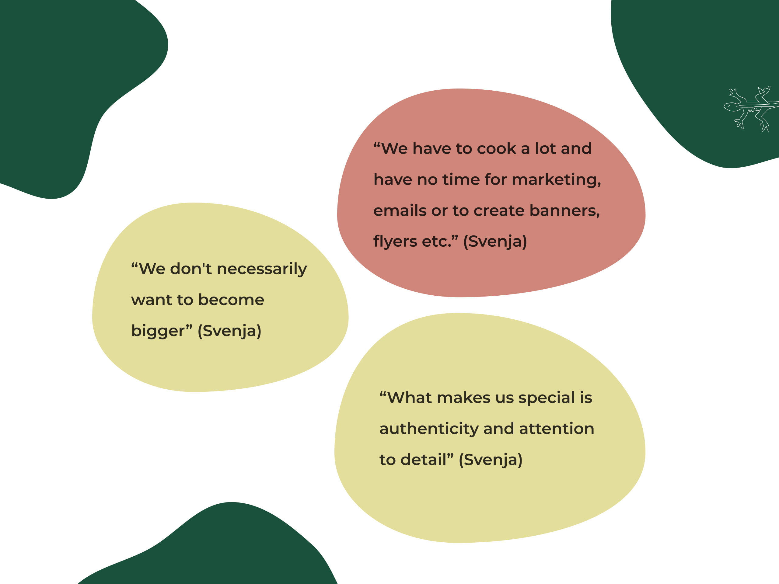
Key Insights
In our stakeholder interview, key insights emerged for our product on a unique Mexican cuisine experience. Advantages include authentic cuisine, homemade food, and a beautiful Airstream-inspired design.
Stakeholders desire a website that connects to Mexico, emphasizes authenticity, showcases the Airstream concept, and presents its products and locations. They prioritize Google ranking and catering focus, needing a website that allows for efficient planning due to the food truck not being their main job.
These insights will guide our design, delivering an engaging website that captures the spirit of authentic Mexican cuisine and the allure of their Airstream experience.
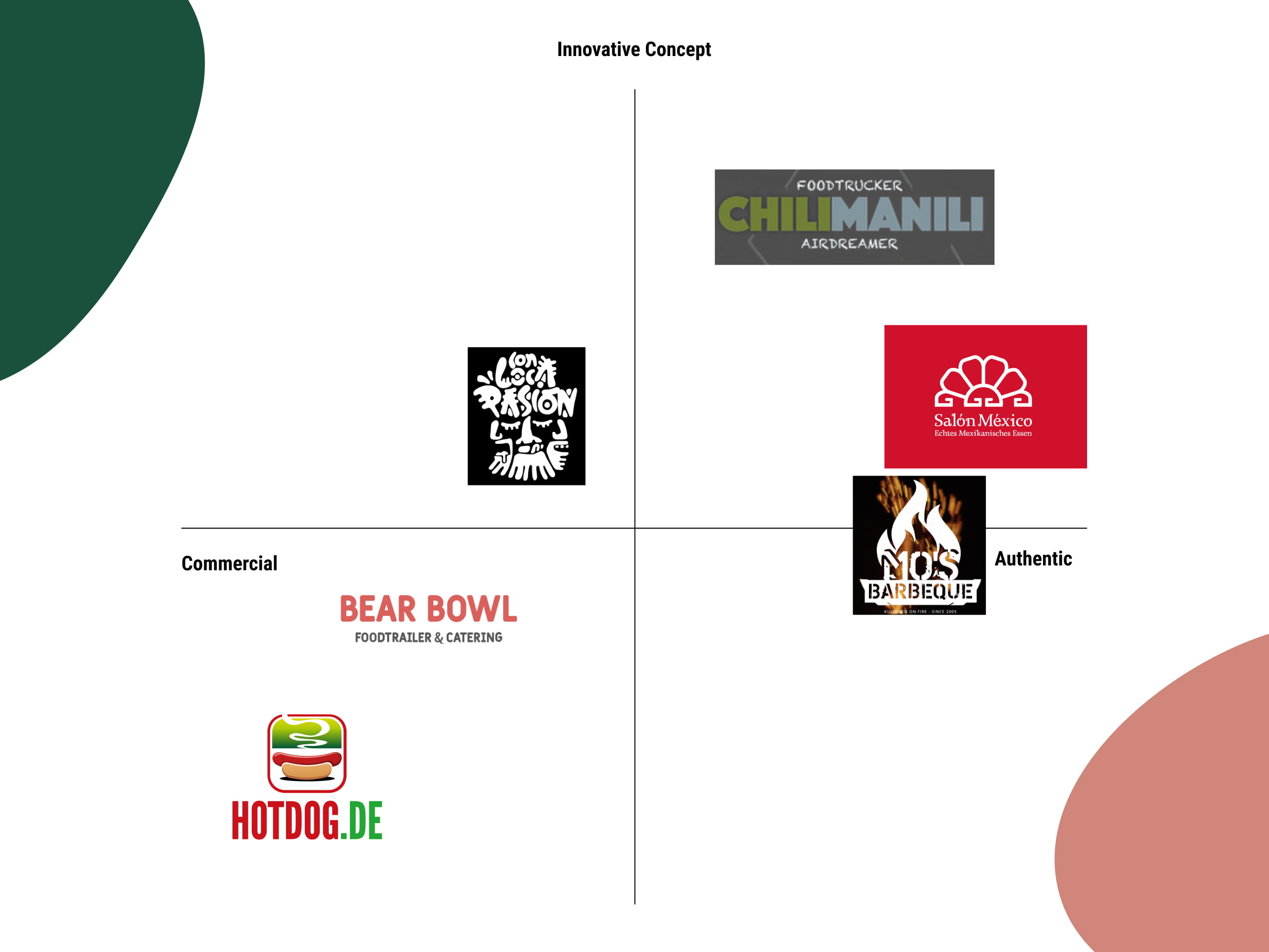
Understand The Current Landscape Of The Industry
The food truck industry is rapidly expanding in Leipzig but is still conceived as a niche market.
The competitors are not so many and not so big.
Understanding the core features present in the market is not only valuable to have a complete overview of the possibilities to maximize the potential of our design process but also to understand the grey areas that can be explored to provide added value to our final product.
Positioning 6 different competitors we realize that there is a clear gap in the market in the Food truck area. In this business, we noticed the lack of the following features:
- Language option and the ability of the website to provide content in multiple languages.
- Booking System that allows users to reserve and schedule services online.
- Dieting information to help users with intolerances or a specific variety of food.
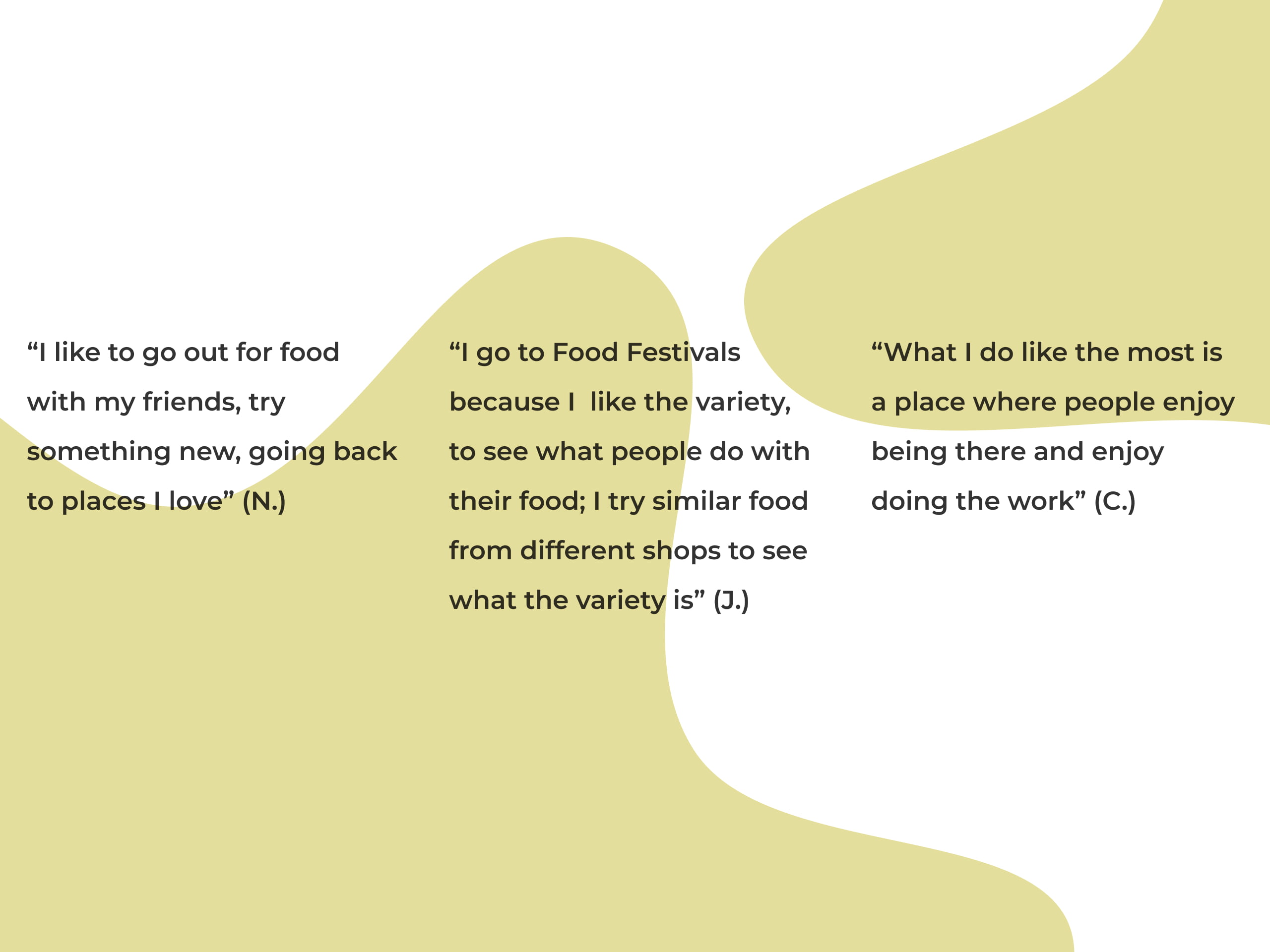
Food Is All About Authenticity And Storytelling
During our rounds of interviews, the Users expressed their preferences for exploring new culinary delights and revisiting beloved establishments. The allure of food festivals and the opportunity to sample a variety of cuisines from different vendors was also highlighted.
Additionally, users emphasized the significance of a welcoming atmosphere where both customers and staff can enjoy the dining experience. These valuable insights will serve as the foundation for our web design, enabling us to craft an immersive digital experience that celebrates culinary exploration, diverse offerings, and an inviting ambiance.
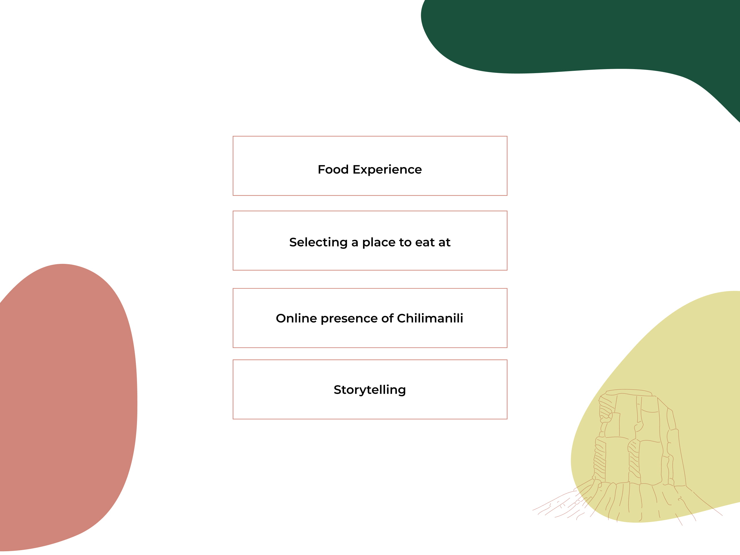
The Patterns Of Our Findings
Food Experience:
A common pattern that arose in our interviews is the need for people to come back to a place they have been to before, a place that they love. The Users expressed their preferences for exploring new varieties of food and revisiting their favorite establishments.
Criteria Selection for a place to eat:
In our findings, we have found a common pattern that emerged from the Users' responses. They expressed their preferences for the general look of the space to eat. Distance, overall design, and size are relatively important factors in the selection of a place but a good digital presence can easily potentiate all these elements.
People before jumping to the physical experience of the place like to have a look at the business website to see what it looks like. They are looking generally for the atmosphere of the place, the menu options, closing times, reviews, and social media presence, especially on Instagram.
Online presence of Chilimanili:
In this user research, we were able to expose the actual websites of the food truck to the interviewees and ask them about their impressions.
Many pointed out the outdated appearance of the website, the need for improvements regarding the landing page, language issues, not clarity in the menu options, and a general lack of coherent aesthetic reflecting the brand values.
Storytelling:
Users are disparately in need of good food but much more than that, they need good stories to go with the food. Explaining the core values behind a dish or an ingredient is an excellent way to create an emotional connection with the customer and inspire them to come back to the place. Users want to know that your brand is much more than the food you are offering.
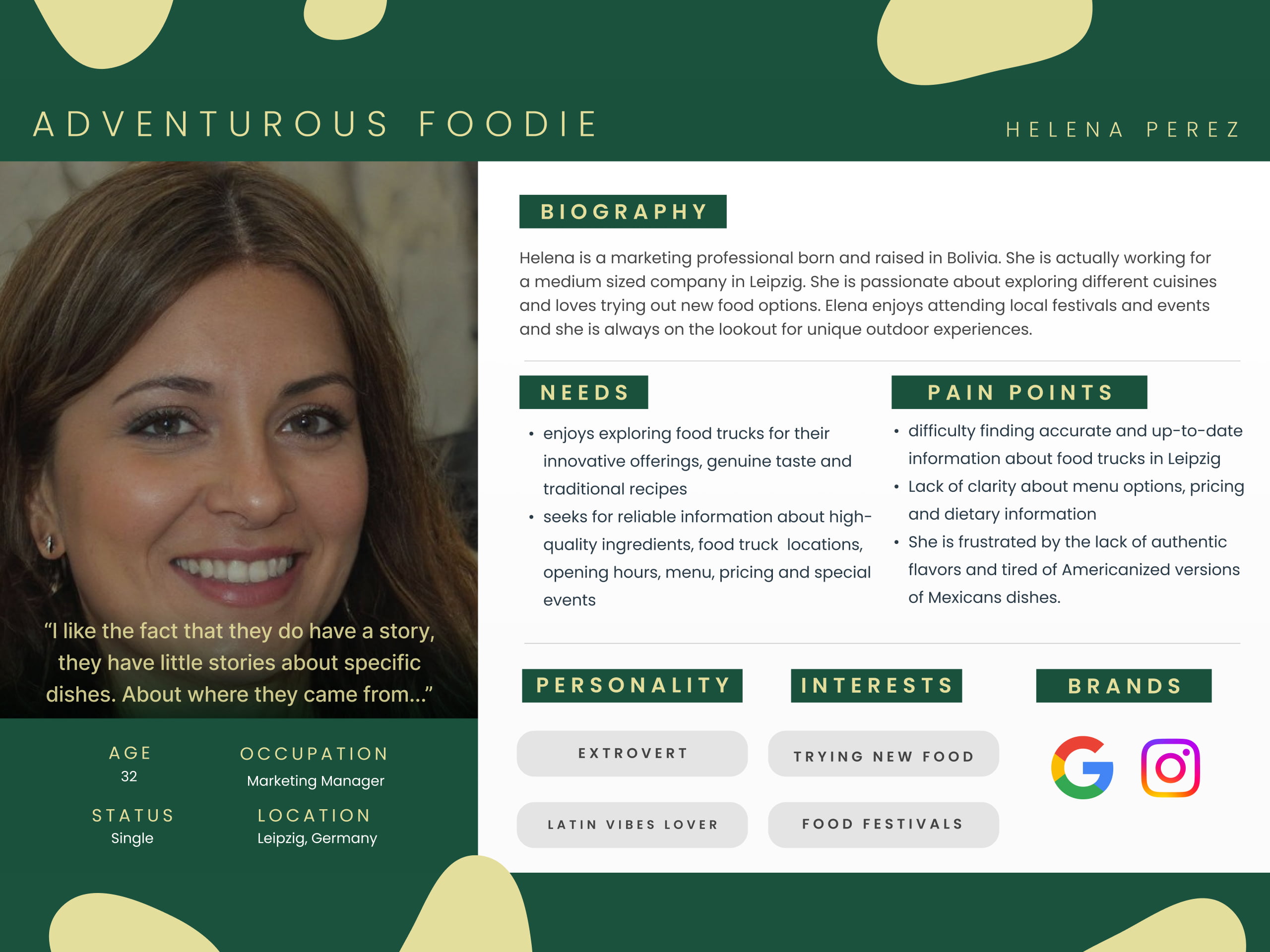
Helena: The Adventurous Food Enthusiast
Our primary User persona is a marketing expert from Bolivia who lives in Leipzig right now. Helena has a strong passion for culinary explorations and is constantly searching for interesting food options as well as taking part in regional festivals and events.
She has a soft spot in her heart for food trucks because she values their unique offers, unpretentious flavor, and age-old recipes. However, Helena finds it difficult to arrange her culinary travels because she has trouble getting reliable and current information regarding food trucks in Leipzig.
Additionally, she is fed up with the Americanized versions of Mexican cuisine and the dearth of original flavors. Helena is looking for a trustworthy website that offers thorough information on food truck locations, hours of operation, menus, prices, and dietary restrictions in order to improve her food truck experiences.
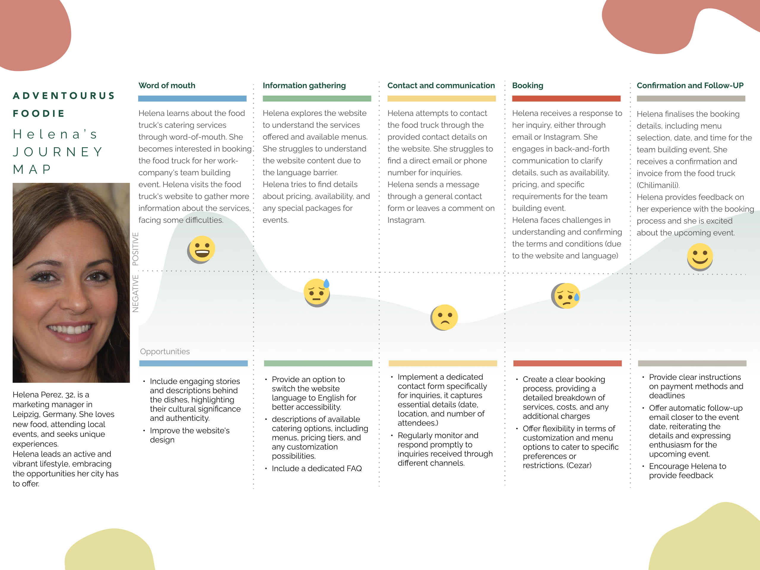
Helena Perez's customer journey begins when she hears about a food truck's catering services from a friend, prompting her to look up the business online. She persists in looking for information on meals, prices, and event packages despite having trouble understanding the website's content owing to a language barrier. Helena has trouble getting in touch with the food truck directly, so she resorts to using a general contact form or social media to send a message.
She eventually hears back and starts corresponding to iron out the specifics of the booking. The process is occasionally aggravated by language and website-related barriers. Helena is still excited, though, as she confirms the reservation, offers insightful criticism and looks forward eagerly to her forthcoming team-building activity with the food truck.
Helena's Journey in Booking a Food Truck
How might we provide adventurous foodies with detailed information about Chilimanili’s menu options, ingredients, and catering services to enhance their confidence and decision-making?
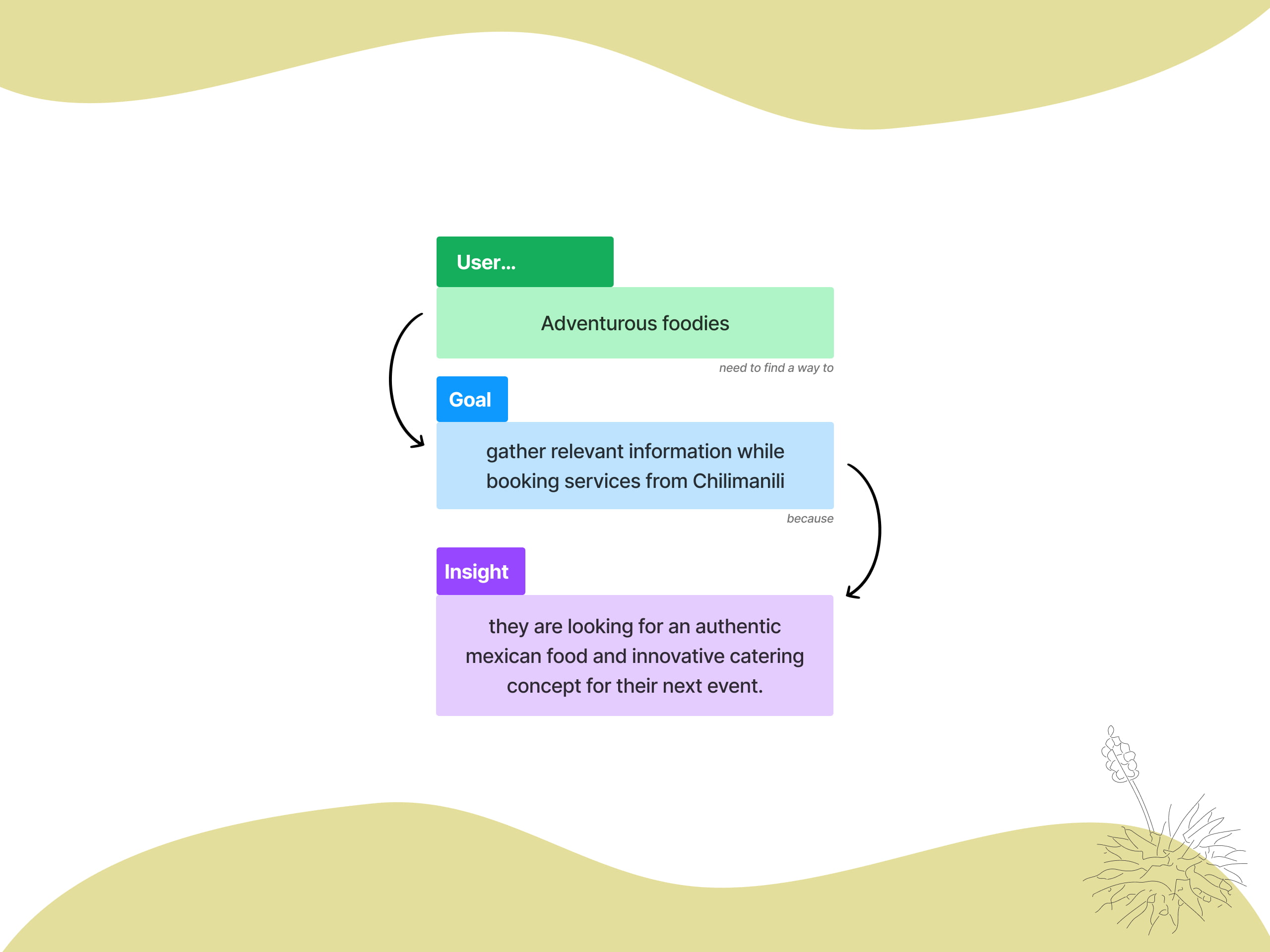
Defining Essentials for the Website's Success
With the definition of the problem statement and the HMW questions well fixed in our minds, the next step was to brainstorm a list of viable solutions and features that can bring our website closer to fulfilling the users’ needs and in particular of the business owners.
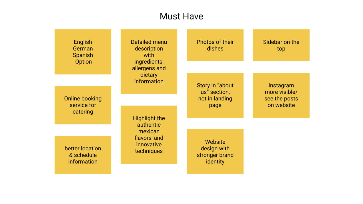
We decided to use the Moscow Method to prioritize such features in order to facilitate the definition of our minimum viable product. We defined the most important features taking into consideration the data from the user interviews and the insights from the talk with the stakeholders.
Here are our “must-have features”:
- Language Option: offer the users the possibilities to choose between the following languages: English, German, and Spanish
- Online booking for Catering Services: the chance to request catering services providing all the relevant information to the business owners.
- Web design with a stronger brand identity: Create a stronger bond between the website and Mexican food.
Minimum Viable Product
The goal of the Chilimanili website is to help users find out about the story behind the food truck, where to find it, and what food it serves. Users should find important allergy and diet information as well as get an impression of the authentic and innovative concept Svenja and Stefan offer.
On top of that, and most importantly, it should offer an easy way to book their catering services.
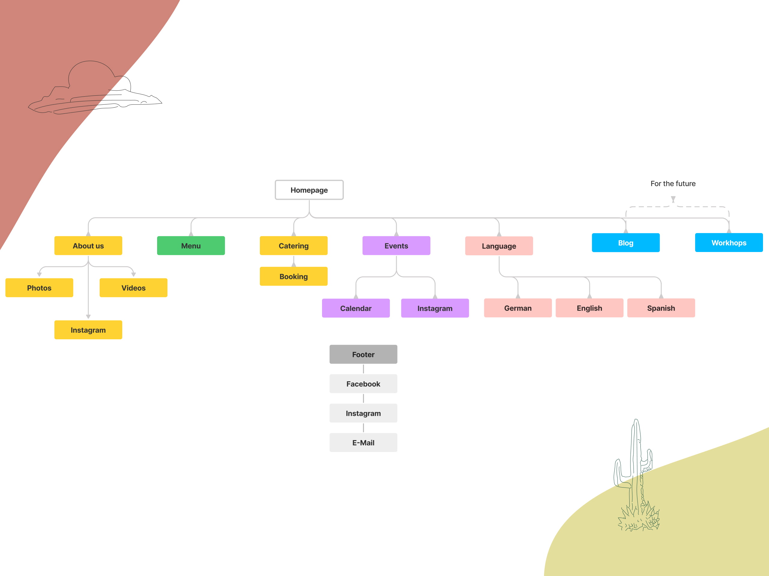
The new site map
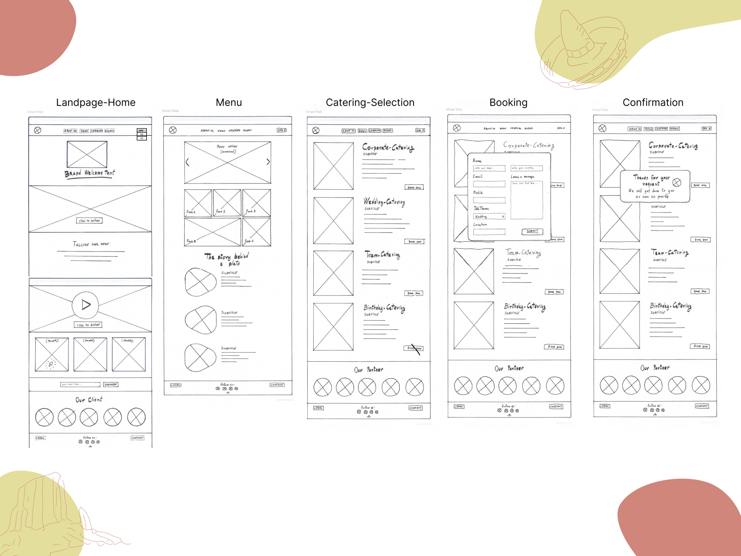
Low-Fi Prototypes
Concept Testing: Validating Acceptance in Design Choices
We had the chance to show our low-fidelity prototypes to 3 different users. We were curious to validate the user’s acceptance of our core design choices and features.
All the persons who tested the prototypes reacted positively to our concept ideas and pointed out some minor design details that we should fix before we move to the next phase.
Here are some of them.
“The main page should be more clear:
should have some info about the owners and
What is the vision?” (T.)
“I need to add how many people, and dietary restrictions”(R.)
“Maybe along with the food pictures I would like to see a description” (T.)
Mid-fidelity prototype
After proving that the Lo-Fi prototypes are well received by the users, we realized our Mid-Fi Prototypes with the aim to improve the usability and user experience of our website.
Here below you can see the 6 desktop screens that we created to jump into the testing phase.
“A link between menu and catering page would be nice”(M.)
“The order of pages on the header should be the same as the order of topics on the homepage”(M.)
“I feel a bit overwhelmed by the amount of the information” (N.)
During our usability testing, we noticed that the users asked for specific integrations in the desktop layout: some users were pointing out the need for a link between the Menu section and the catering one, and others were asking for a better organization of the header that should reflect the order in which the contents are displayed in the landing page.
However, the feedback that we received the most was the sensation of feeling overwhelmed by the amount of information displayed, especially in the menu section, the users were asking for clarity.
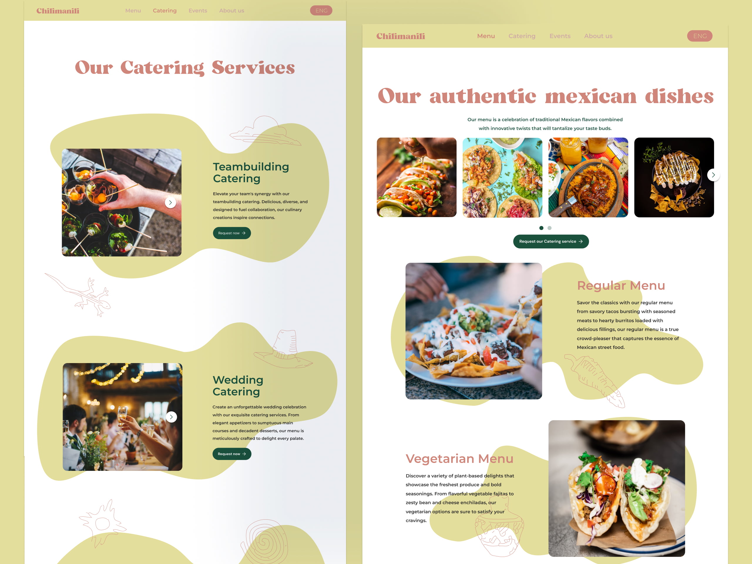
For this reason, we decided to redesign the menu section. We decided not to show the whole amount of meal possibilities but to display 3 clear menu options: Regular, Vegan, and Vegetarian. Combining the variety of food into a few menu options increased the clarity of the layout and converted these into easily recognizable options for catering services.
Moodboard: A Canvas for Brand Features
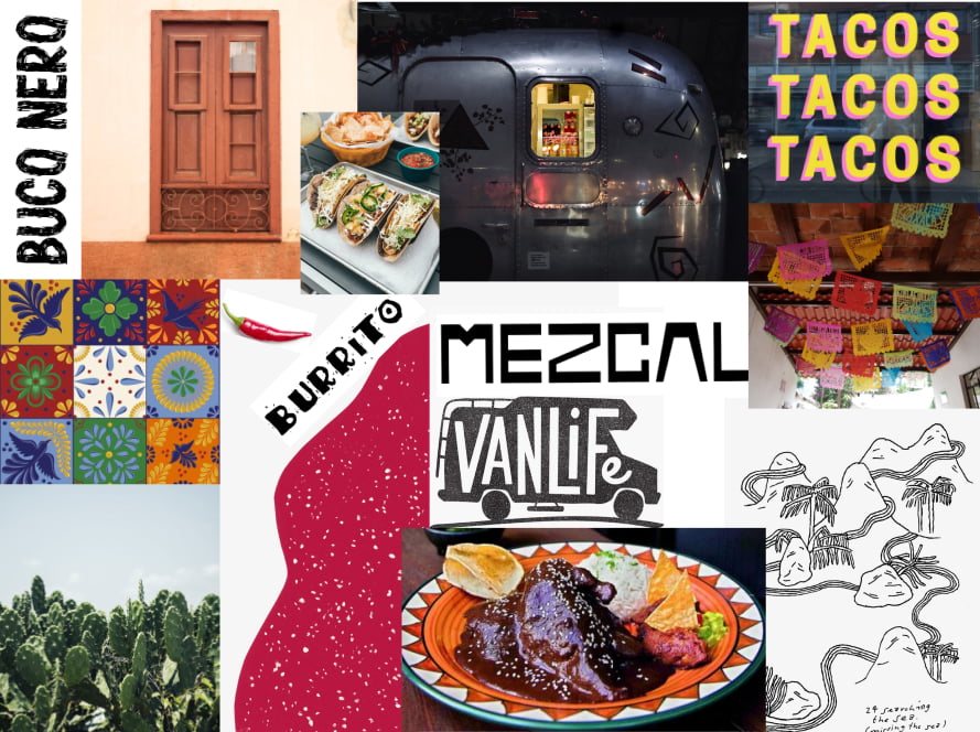
To make conscious choices in the area of the user interface we realized a Moodboard is a great way to visualize the looking attributes that we would like to have in our design.
We ended up with a mixed collage with warm tones, pictures of Mexican food, simple illustrations, and typography.
This mood board helped us to formulate the brand attributes that we wanted to have in our design.
- Authentic
- Engaging
- Down to earth
Style Tile: Capturing Mexico's Uniqueness in Design
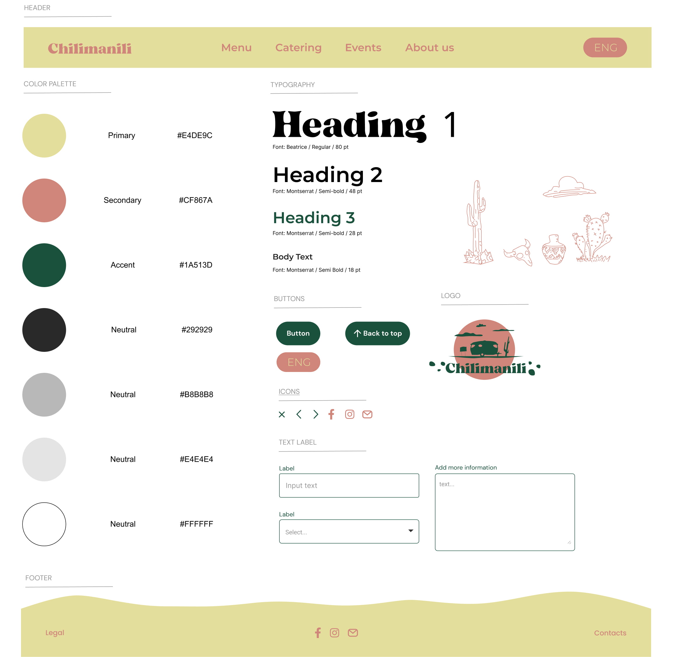
With this tool, we made a visual representation of our design system. We used the mood board as a starting to select our primary, secondary, and accent colors. We wanted to use colors that are warm, and convey an idea of earth but freshness at the same time.
For the Typography, we kept a bubbly font for the headings of the main section like Beatrice, and for the rest with maintained a sans-serif font like Montserrat in Semi-Bold.
We designed the footer with a non-geometrical shape the convey the peculiarities of the Mexican territory.
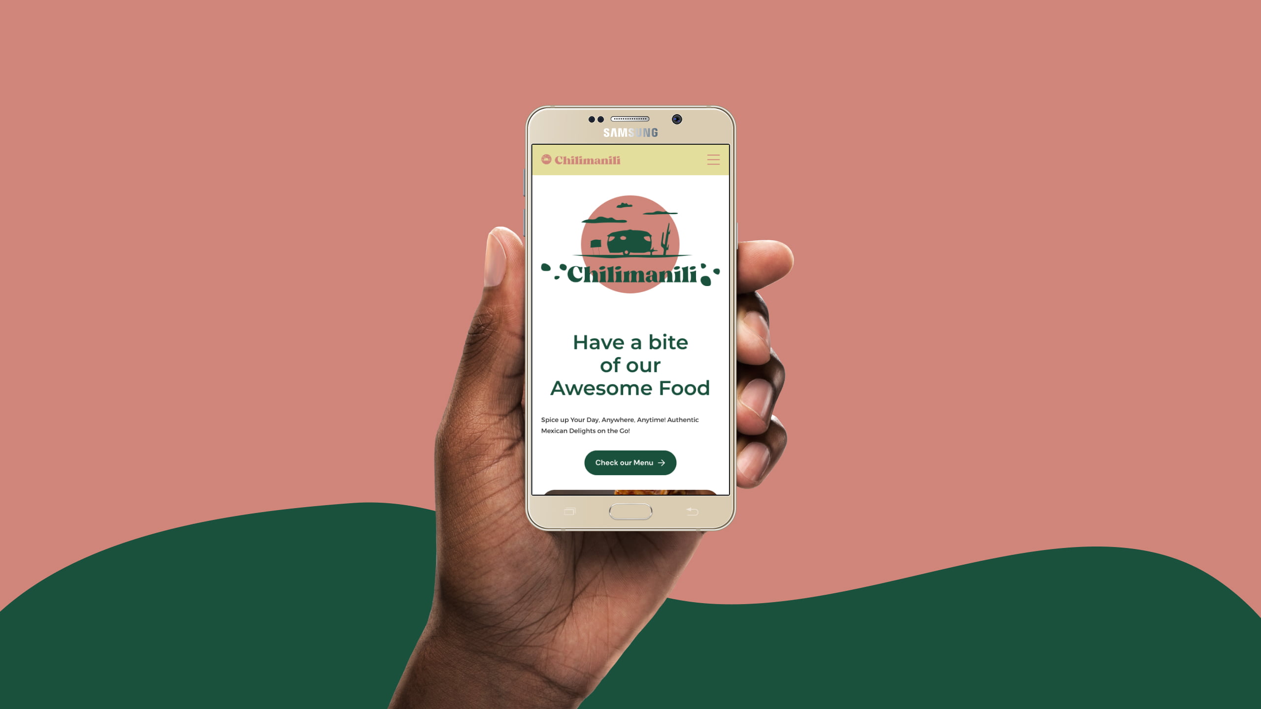
We remade the Logo of the business with the same style and colors highlighting the iconography of the Airstream Van that constitutes part of the visual attributes of the business.
Furthermore, some hand sketching was added in the navigation to enable the feeling of authentic handmade food.
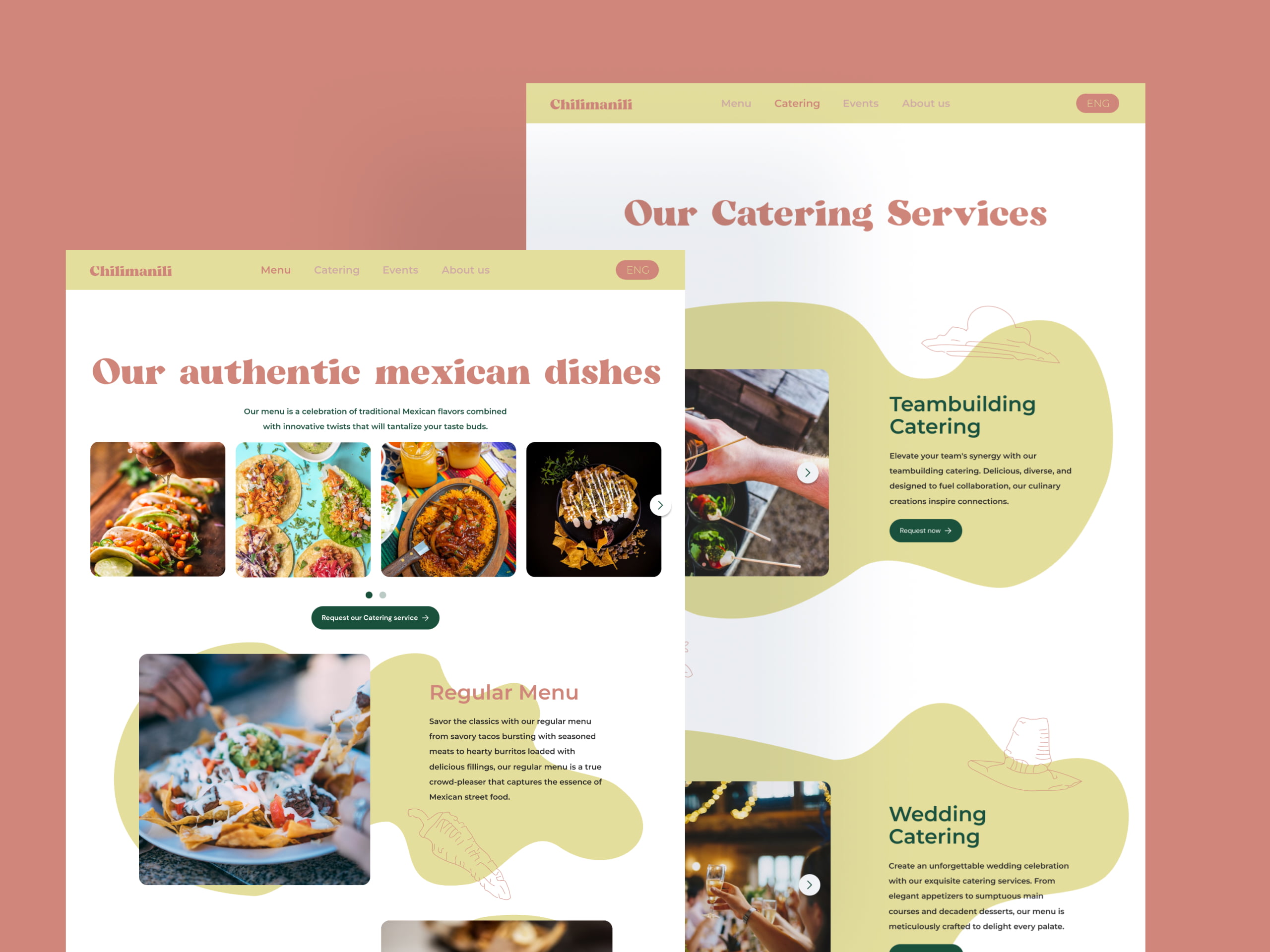
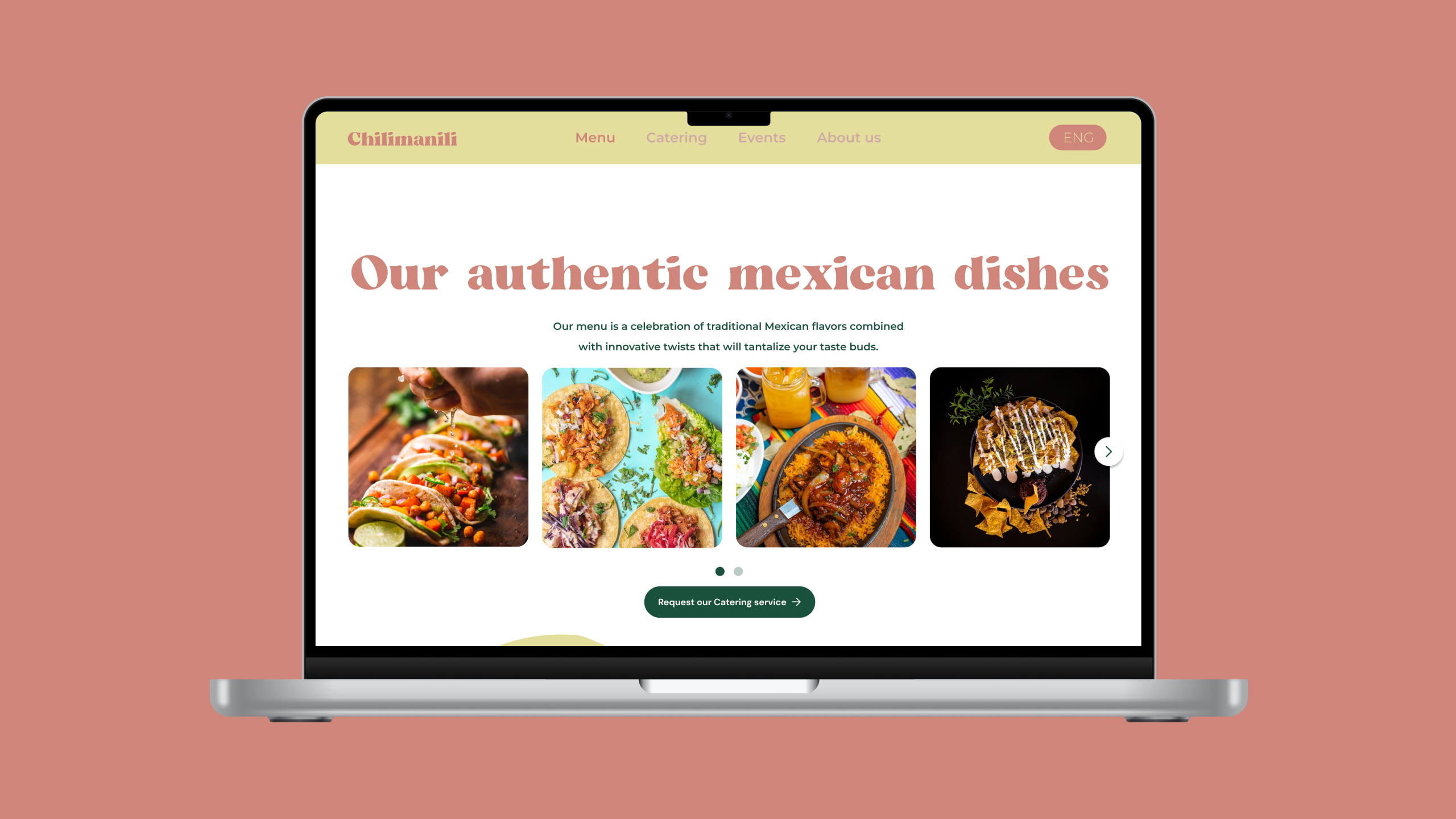
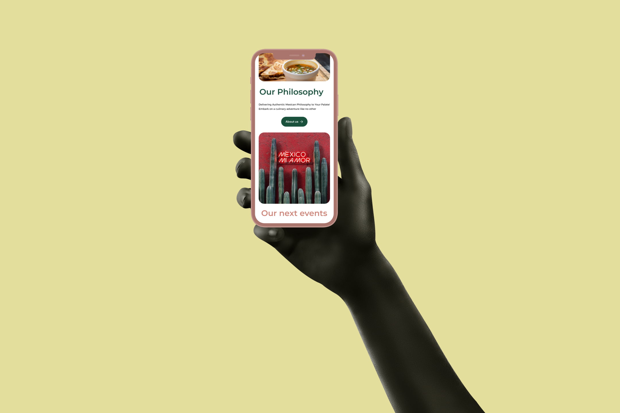
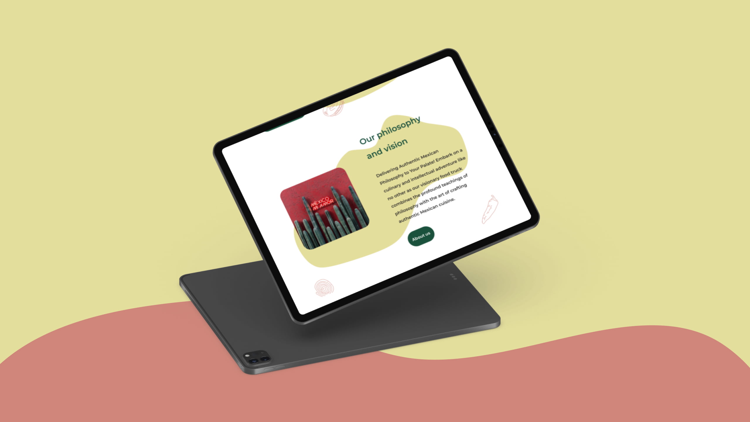
HIGH-FI PROTOTYPES
The Desirability Test's Revelations
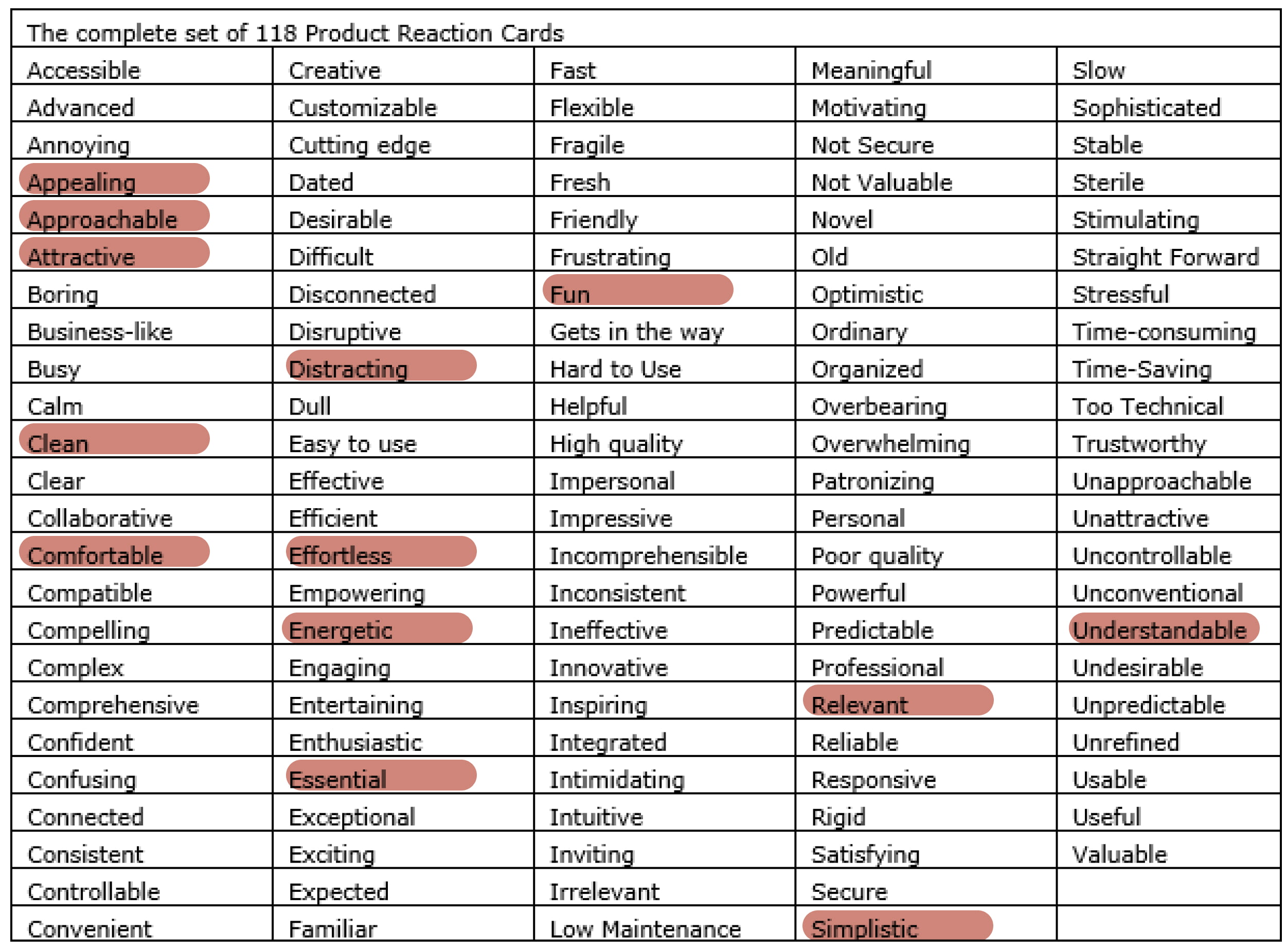
Upon completion of our high-fidelity prototypes, we initiated a desirability testing phase utilizing Microsoft Reaction cards as our evaluation tool. The primary objective of this test was to methodically assess users' emotional reactions to the design.
A clear consensus emerged from the majority of users who partook in the evaluation. They consistently employed descriptive terms, such as "approachable," "clean," and "essential," to articulate their perception of the website's stylistic attributes. Notably, during the desirability test, participants frequently noted that certain visual elements, including images, fonts, and shapes, were overly distracting.
Furthermore, astute participants identified a noteworthy opportunity for value augmentation – suggesting the incorporation of tutorials featuring authentic Mexican recipes. Collectively, users conveyed their unanimous appreciation for the design's vibrant and captivating character, harmoniously aligning with the energetic ambiance synonymous with Mexican street food culture, thus underscoring a noteworthy achievement in our project.
FINAL EVALUATION
→ What was the reaction of your users?
From the inception of our Minimum Viable Product (MVP) exposition, users have lauded the website's playful design elements, which concurrently uphold a pronounced Mexican cultural ambiance. A conspicuous transformation from the previous iteration to the current one has been universally noted. The introduction of a new menu catering to vegan and vegetarian dietary preferences garnered favorable feedback.
The business proprietor expressed satisfaction with the business rebranding, acknowledging the successful conveyance of quintessential Mexican culinary vibes. Nevertheless, a subset of users has indicated a desire for additional educational culinary content.
→ Next steps?
We would like to bring this project to the next level, incorporating much more of all the input that we received in our Usability and Desirability testing.
We would love to extend the navigation of the website and add:
- Blog Section: Where the company can share tips and suggestions about the art of making real Mexican food
- Workshop Section: We would like to create a bridge between the business and Mexico by organizing a series of regular retreats and workshops in the beautiful Mexican language and transmitting culture, food, and valuable knowledge to the people who are excited about the Mexican culture.
→ What knowledge did we acquire?
1) Achieve In-Depth Business Comprehension: It is imperative to attain a profound comprehension of both the user base and, more critically, the business itself. A superficial grasp of the end product falls short. Leveraging subject matter experts, we achieved a comprehensive understanding of the distinct advantages offered by catering services when juxtaposed with participation in festivals and concerts.
2) Harness the Power of Participatory Design: Within the team, individual preferences for color palettes abounded. Through a collaborative design session, we successfully delineated a novel palette that pushed the boundaries of our prior aesthetic inclinations.
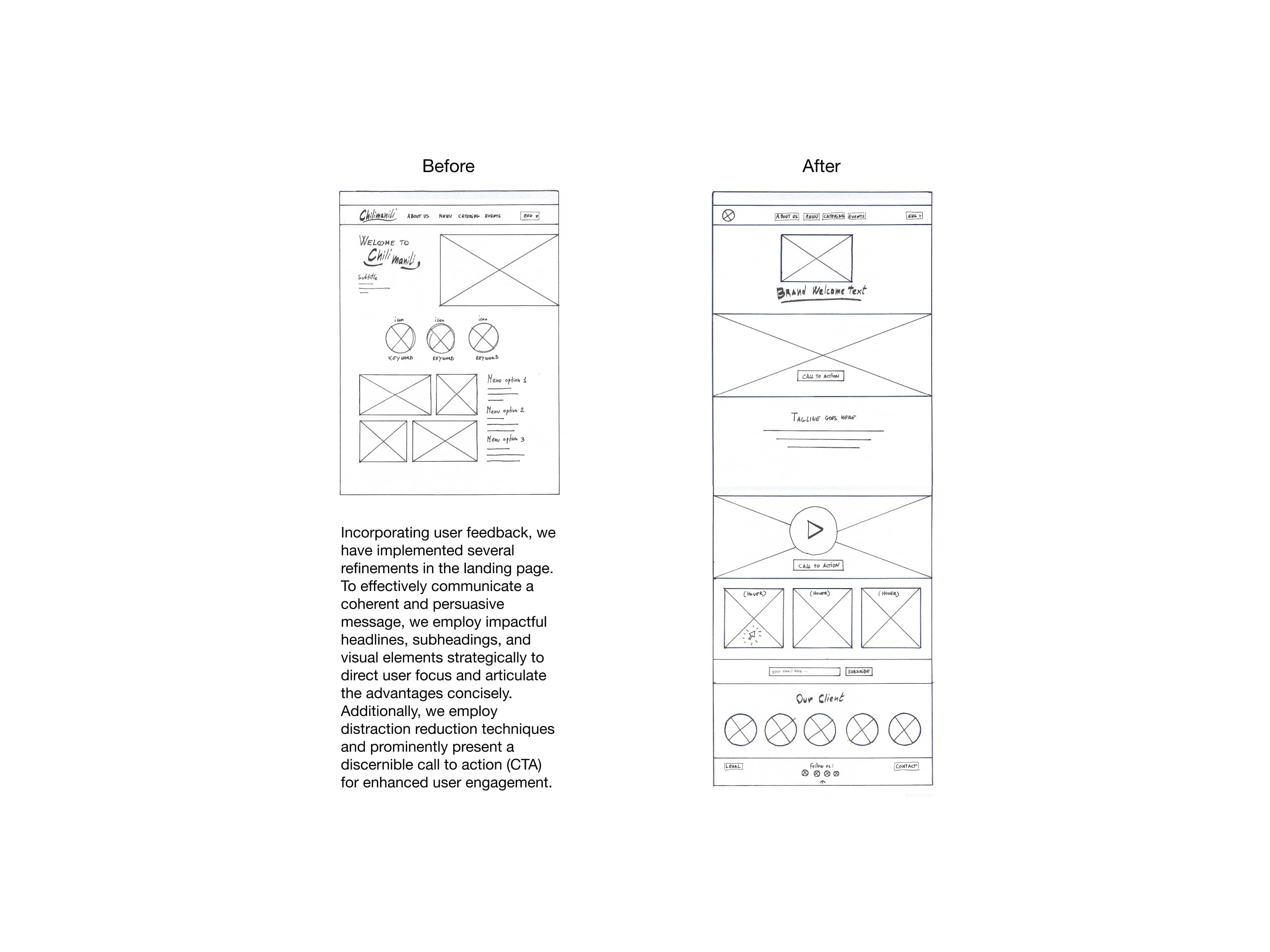
3) Unleashing the Potential of the Landing Page: In the initial stage, we introduced a landing page featuring an ambiguous value proposition. Subsequently, through meticulous analysis of user feedback, we not only identified and acknowledged our shortcomings but also refined the content to articulate a precise message and bolstered the effectiveness of the call to action.
→ Different design approach considered?
I should have allocated additional time during the Low-Fidelity (Lo-Fi) phases to iterate and fine-tune the optimal Information Architecture (IA). A more extensive set of screen sketches should have been generated and promptly subjected to user testing.
My initial assessment underestimated the intricacies inherent in a rebranding endeavor, including the pivotal role of meticulously selecting visuals to effectively convey the foundational principles of the business. In retrospect, I would approach this phase with a heightened level of awareness and planning.

Thank you for exploring my design journey.
If you're curious to learn more, reach out.
I'm just an email away!
Selected Works
