BEKIND
PRO-BONO UX/UI WORK
An ethical online marketplace recovers reusable items, supporting a circular economy and aiding vulnerable individuals
BeKind, an independent online marketplace, unites NGOs, companies, and individuals, facilitating the redistribution of reusable items to advance the circular economy and social causes. The project entails crafting a responsive website catering to both donors and donees. While the primary emphasis is on optimizing the user experience for NGOs and charities, the project also explores inventive solutions for donors (companies and individuals), fostering a holistic and impactful digital platform.
GETTING STARTED
→ Challenge
The specific challenge for BeKind is to develop an efficient and user-friendly digital platform that connects donors (companies and individuals) with NGOs and charities, enabling seamless donation and item selection processes. The goal is to streamline the redistribution of reusable items to maximize their use, support a circular economy, and provide for people in need while maintaining sustainability principles.
→ Role
The project developed organically, benefiting from the contributions of three team members. Our collaborative efforts were instrumental in overseeing the complete design process for BeKind's website, involving stakeholder engagement, user research, prototyping, and the creation of a high-quality design. Our shared commitment was to ensure that the project seamlessly aligned with the company's goals and met user expectations, resulting in a captivating digital experience. I gave a lot of input into the visual design, aligning it with the project's overall vision.
→ Methods
For the BeKind digital marketplace, a comprehensive approach was undertaken. Methods and tools encompassed extensive Secondary Research into the circular economy, Workshops for stakeholder insights, Surveys and Interviews for user feedback, Business Analysis, Affinity Diagrams, User Personas, User Journey Mapping, Problem Statements, MOSCOW & MVP prioritization, Site Mapping, User Flows, Concept Sketching, Mid-Fidelity Prototyping, Concept Testing, Usability Testing, Visual Competitive Analysis, Brand Attribute Development, Style Guide creation, High-Fidelity Prototyping, and Desirability Testing to ensure a robust and user-centered design.
→ Strategy
Our strategy for designing the BeKind digital marketplace was a holistic and user-centric approach. To understand the project's objectives and target audience, we organized stakeholder interviews. Recognizing BeKind as a bridge between donors and donees, we conducted surveys and interviews to delve into donation preferences, pain points, and motivations. We crafted primary and secondary user personas, developing a User Journey map and a Problem Statement that guided MVP feature conception and prioritization. We tested user flows through concept sketches and mid-fi prototypes, conducted visual competitive analysis, defined brand attributes, and created high-fidelity prototypes, culminating in valuable user feedback to refine our design.
FRAMING THE PROBLEM
Arranging a Workshop: Get to Know the Stakeholder
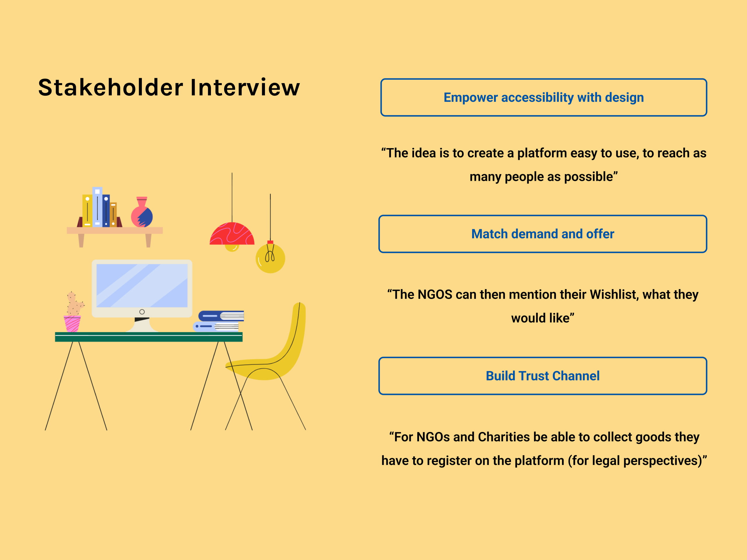
In our stakeholder interview with the CEO and Co-Founder of BeKind, we gained vital insights that deeply influenced our technical approach to the project. Mandeep stressed the importance of prioritizing accessibility through design, aiming to create a user-friendly platform to reach a broad audience. This directive guided our UX/UI design, resulting in an intuitive interface.
Matching supply and demand was another key focus. The CEO highlighted the need for NGOs to express their specific needs, forming a "Wishlist" of desired items. This feature became central to our design, bridging donors and recipients effectively.
Furthermore, trust-building was emphasized, requiring NGOs to register before receiving donations. These insights shaped BeKind, aligning with the CEO's vision of accessibility, demand matching, and trust-building.
The Impact of the Circular Economy
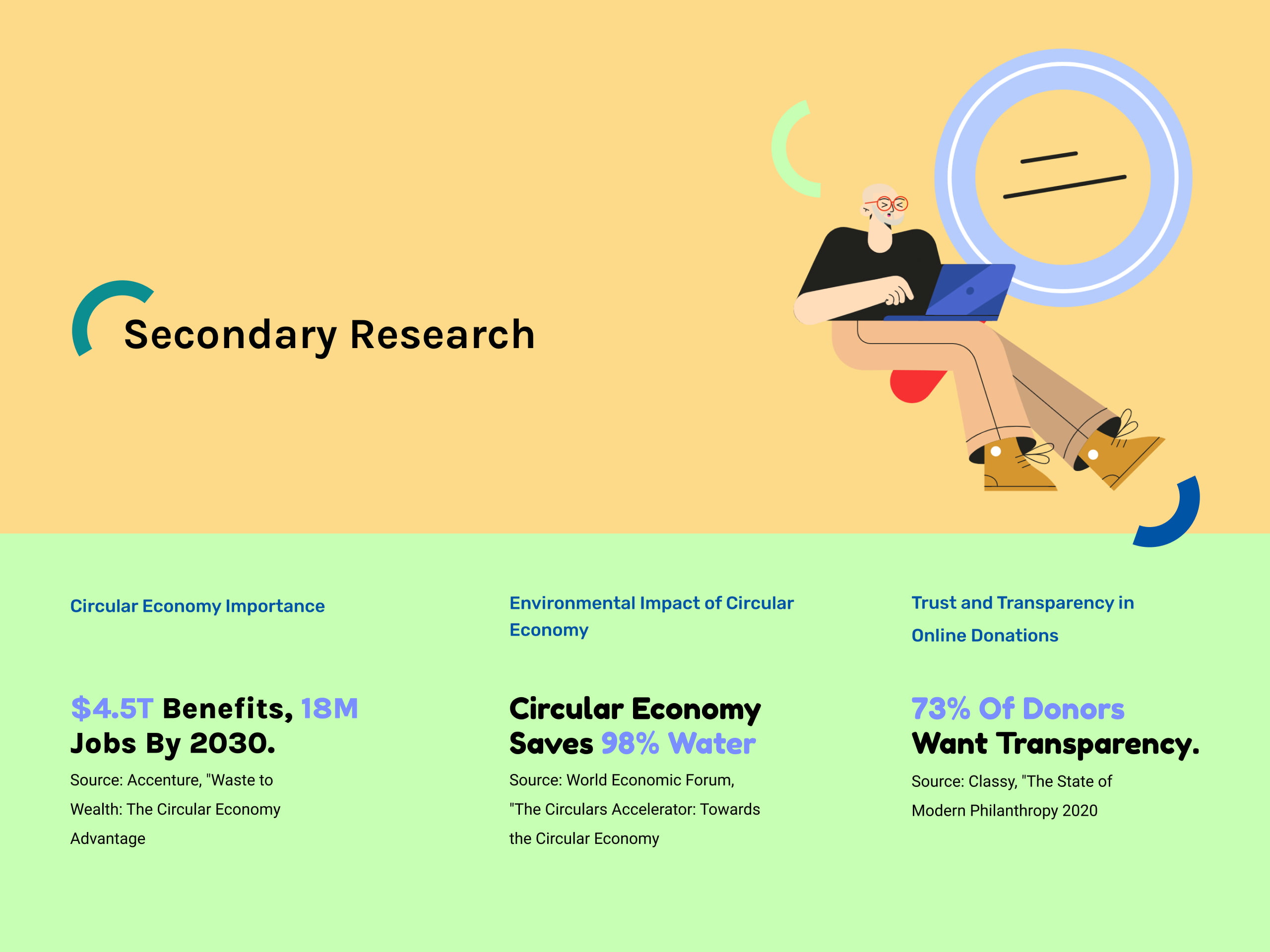
Secondary research has been instrumental in enhancing our understanding of the BeKind project by providing critical insights from authoritative sources. Accenture's "Waste to Wealth: The Circular Economy Advantage" report revealed the immense economic potential of a circular economy, projecting $4.5 trillion in benefits and the creation of 18 million jobs by 2030. Furthermore, data from the World Economic Forum's "The Circulars Accelerator" highlighted the staggering environmental impact of circular economy practices, indicating a remarkable 98% reduction in water usage.
In addition, insights from Classy's "The State of Modern Philanthropy 2020" underlined the paramount importance of trust and transparency in online donations, with a substantial 73% of donors expressing a strong desire for transparency. These findings not only informed our strategic approach but also underscored the significance of aligning BeKind's mission with the principles of the circular economy while prioritizing trust and transparency in our digital marketplace design
How To Stand Out From The Actual Market
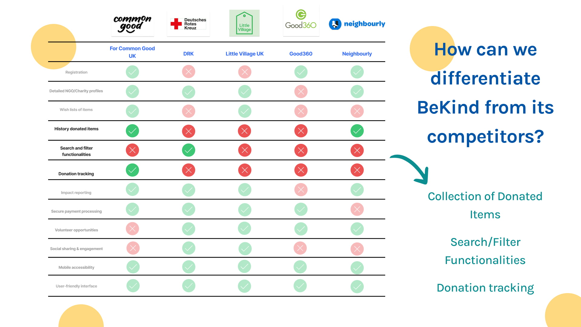
To differentiate BeKind from its European competitors, particularly in the UK market, we conducted a competitive analysis focusing on key aspects that set us apart. Firstly, our examination revealed that the collection of donated items presents a crucial differentiator. BeKind is dedicated to providing a seamless and efficient process for donors to contribute material items, ensuring that the donation process is both user-friendly and rewarding.
Secondly, we identified that robust search and filter functionalities are vital for user engagement. BeKind aims to stand out by offering advanced search and filtering options, allowing users to quickly locate specific items or charitable organizations based on their preferences and requirements.
Lastly, our competitive analysis highlighted the significance of donation tracking as a distinguishing feature. BeKind is committed to providing transparency throughout the donation journey, enabling donors to track the impact of their contributions, and fostering trust and accountability in the platform.
By excelling in these areas—effortless item collection, enhanced search capabilities, and transparent donation tracking—BeKind is poised to differentiate itself effectively in the European market, setting a new standard for online donation platforms in the UK and beyond.
Understanding The Perspective Of The Donors
We chose to employ a Google survey as our primary research tool for several compelling reasons. Google Forms offers a streamlined and user-friendly interface, enhancing participation rates.
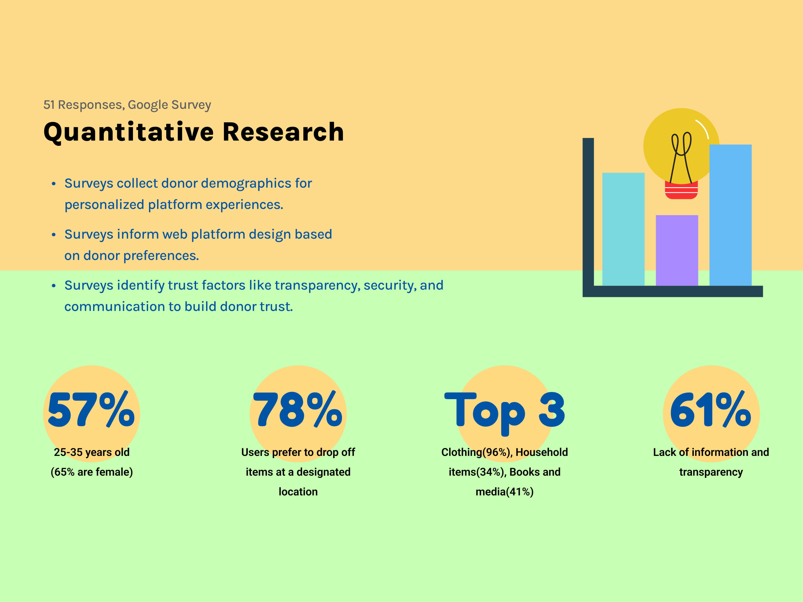
The survey data yielded significant insights. Notably, 57% of respondents were aged between 25 and 35, with a majority being female (65%). An overwhelming 78% preferred dropping off items at designated locations, streamlining the donation process. The most favored item categories for donation were clothing (96%), household items (34%), and books and media (41%). However, 61% expressed concerns regarding the lack of information and transparency, emphasizing an area for platform improvement. These survey results lay a robust foundation for tailoring our platform to align with the specific needs and preferences of our user base.
Interviews: A Look Into The Challenges Of Charity Organisations
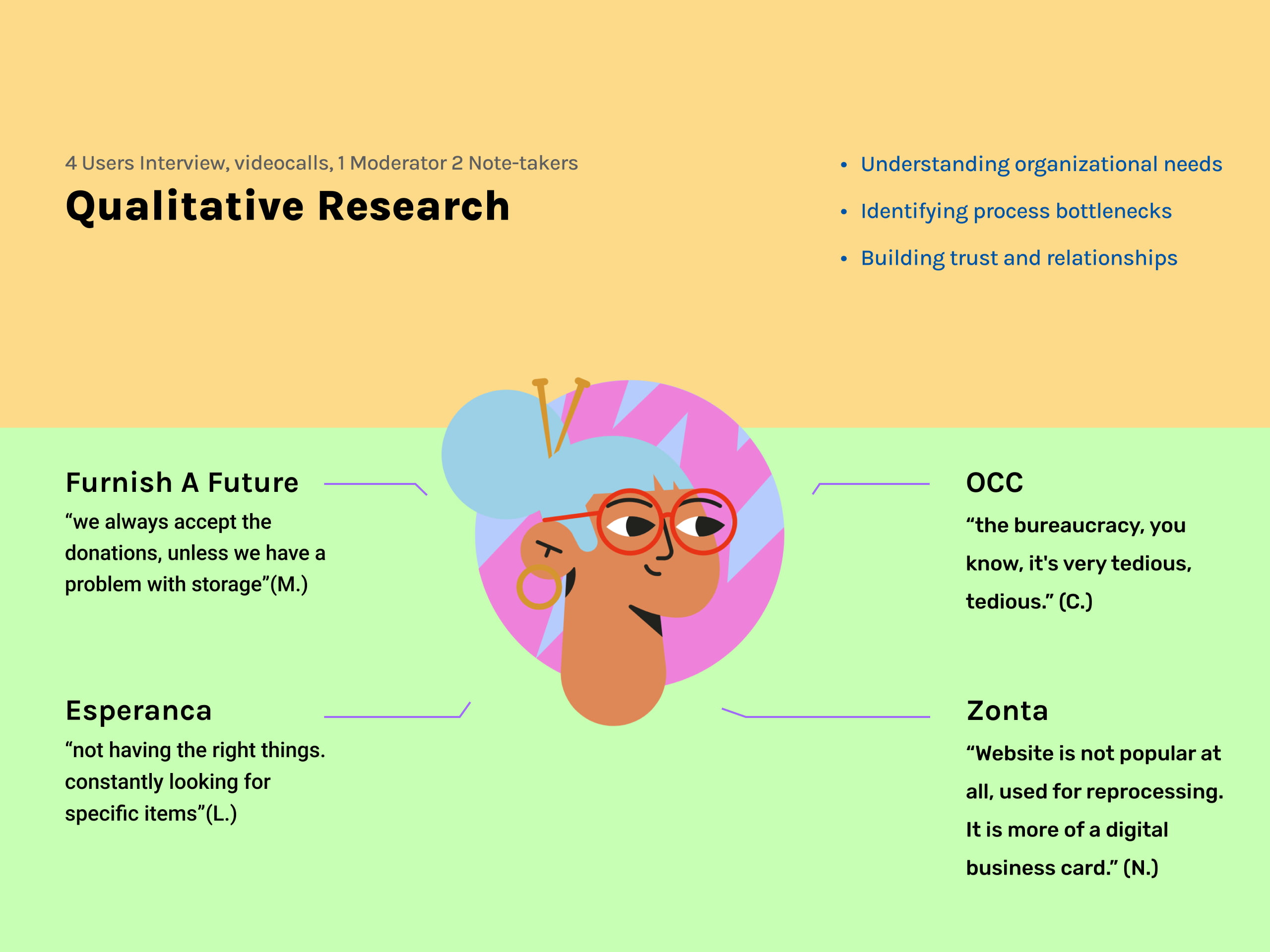
We opted for qualitative research to deeply understand charitable organizations' challenges and needs. Our objectives included uncovering motivations, pain points, and specific requirements, as well as identifying operational bottlenecks. Building trust and cultivating relationships were paramount.
Valuable insights emerged from these interviews. For instance, Furnish a Future expressed a willingness to accept donations, emphasizing resource management during storage constraints. Esperanca revealed a critical pain point: searching for specific items. OCC highlighted bureaucratic complexities, emphasizing the need for streamlined processes. Zonta clarified its website's role as a digital business card, not a donation portal.
Clustering Strategically Observations And Ideas From Our Qualitative Research
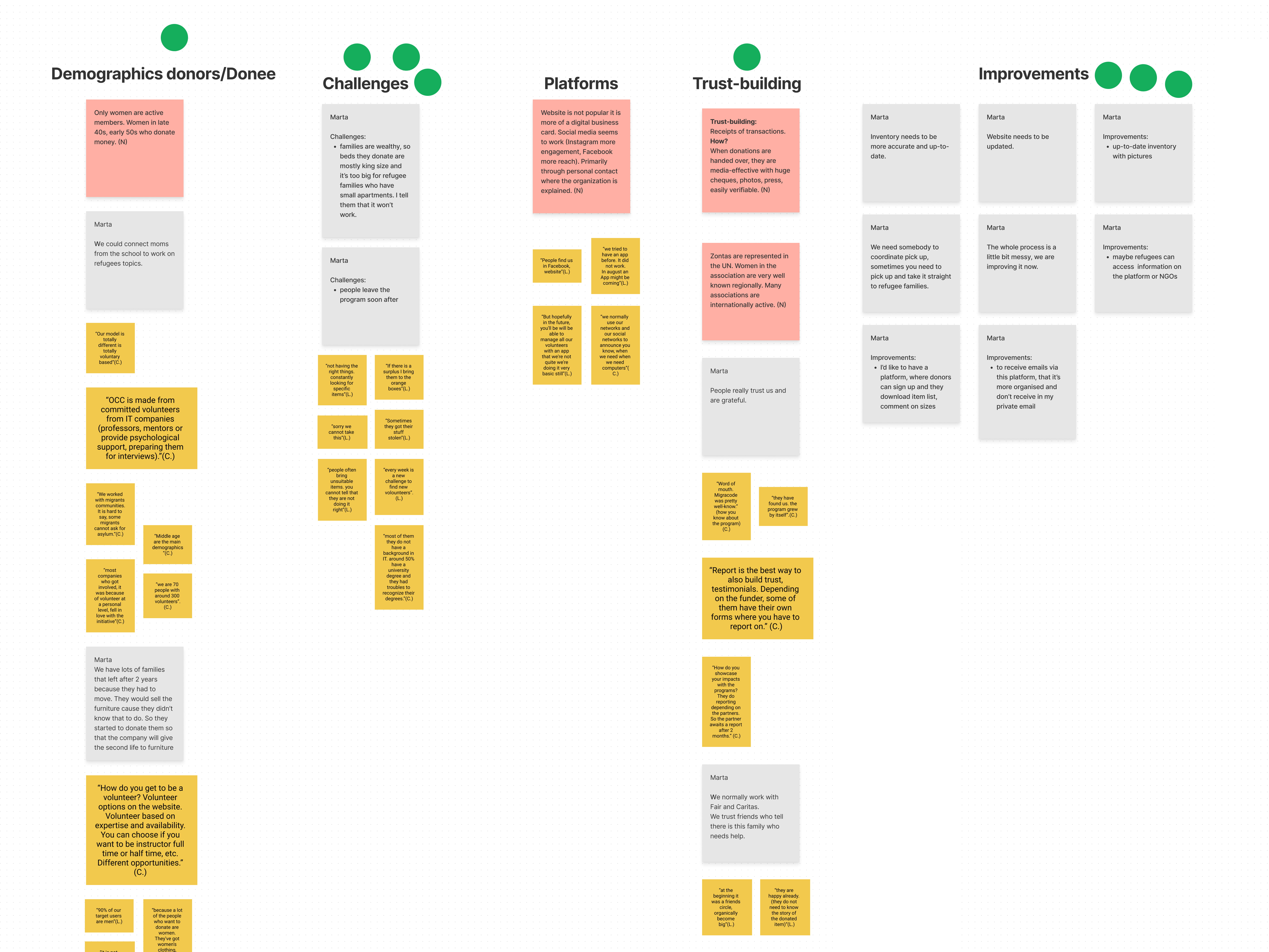
In our affinity diagram, insights from interviews with four distinct charitable organizations—Furnish a Future, Esperanca, OCC, and Zonta—were meticulously organized. The "Storage" category highlighted challenges in managing supply and demand, seasonality in donations, strict admission processes, and funding via membership fees. "Challenges" included issues with unsuitable donated items and website popularization. "Trust-building" emphasized transparent transactions, relying on networks and social media to announce needs. "Improvements" covered topics like accurate inventory, website updates, and a more user-friendly platform, including accessibility for refugees. This diagram guides our design process to address these specific organizational needs and preferences.
Targeting Charities and NGOs with Emma
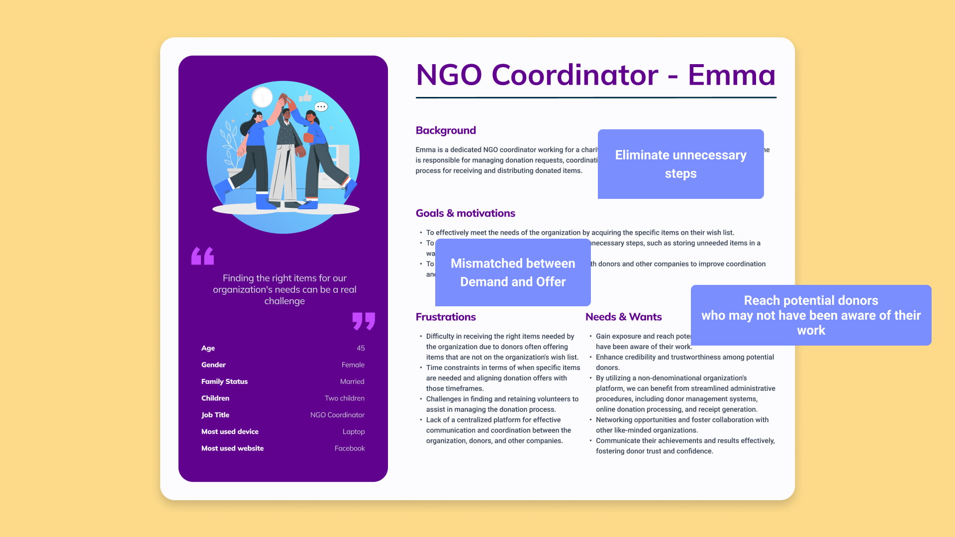
Meet Emma, the primary user persona representing the critical demographic of Donees, including NGOs and charities. Emma's role as an NGO coordinator is vital for her charitable organization, which heavily depends on donations. Her primary goals revolve around efficiently acquiring specific items on the organization's wishlist, streamlining the donation process, and enhancing communication and coordination with donors and other companies.
Emma's frustrations stem from the challenges of receiving the right items, aligning donations with specific timeframes, and managing volunteers effectively. Her needs include gaining exposure to potential donors, enhancing credibility, utilizing a user-friendly platform, networking opportunities, and effective communication to foster donor trust and support.
Reaching Out to Potential Donors with Sarah
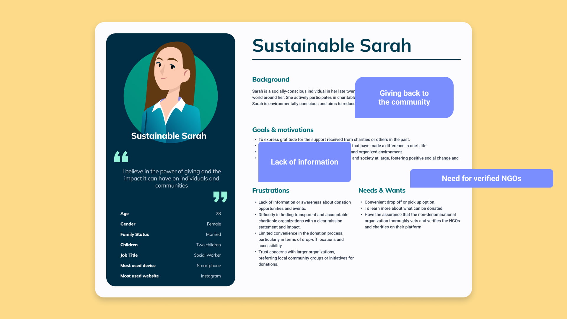
This is Sustainable Sarah, a secondary user persona representing the vital group of Donors within the BeKind digital marketplace. Sarah, in her late twenties, is driven by a strong sense of social responsibility and environmental consciousness. Her goals revolve around expressing gratitude, giving back to the community, and creating a clutter-free living space through donations.
Sarah's frustrations stem from a lack of information about donation opportunities, difficulty in finding trustworthy charitable organizations, and convenience issues in the donation process. She seeks convenient donation options, comprehensive donation information, and the assurance of thorough vetting and verification of NGOs and charities on the platform to align her charitable efforts with her values.
In Emma's Shoes: Exploring the Donation Process
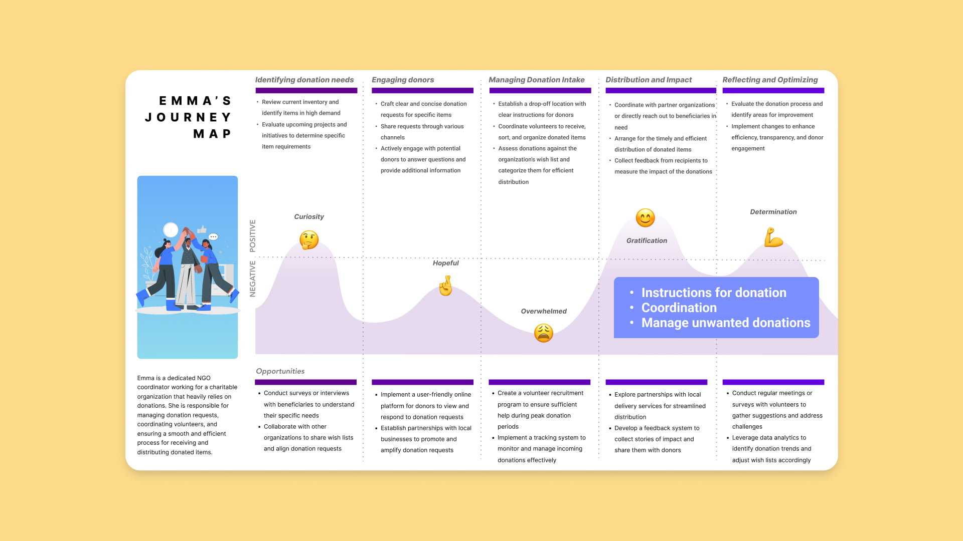
The Emma Customer Journey Map comprises five distinct stages that outline her path to accomplishing donation-related goals. These stages include identifying donation needs, engaging with donors, managing a significant influx of donations, efficient distribution, and a final stage of reflection and optimization.
Throughout this journey, Emma experiences moments of overwhelm, particularly when it comes to delivering clear donation instructions, coordinating volunteers, organizing donated items, and managing unwanted donations. This visualization serves as a valuable tool for understanding Emma's experiences and emotions at each stage, enabling us to identify pain points and opportunities for improvement in her journey.
A concise description of the problem that needs to be solved
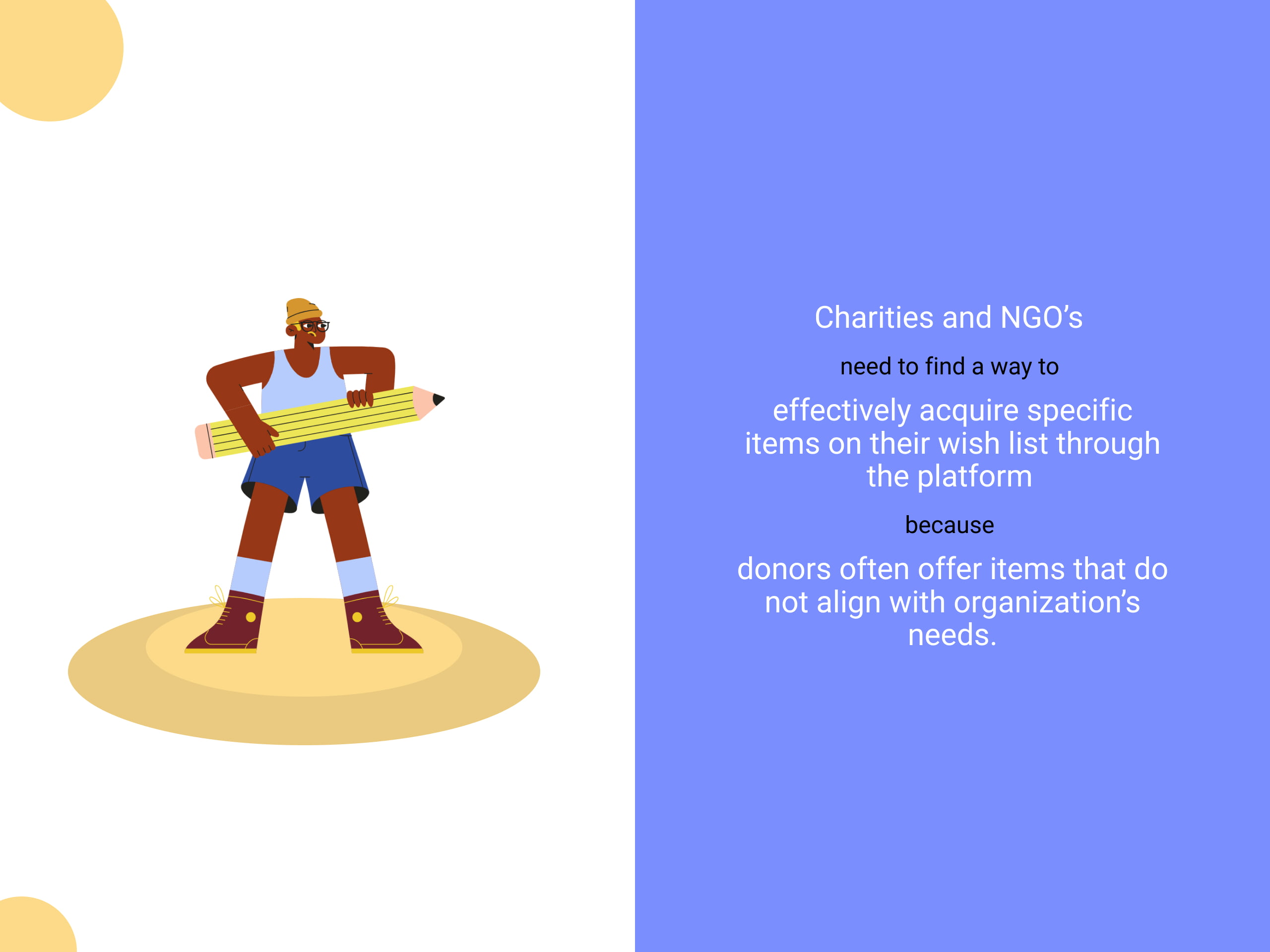
The problem statement for BeKind, revolves around the critical issue faced by charities and NGOs in efficiently acquiring specific items on their wish lists through the platform. This challenge arises from the frequent mismatch between donated items and the actual needs of these organizations.
Donors often offer items that do not align with the requirements of the recipient organizations, resulting in inefficiencies and frustration in the donation process. Our goal is to address this problem by designing a user-centric digital marketplace that facilitates seamless and accurate item acquisition, enhancing the overall donation experience for both donors and donees.
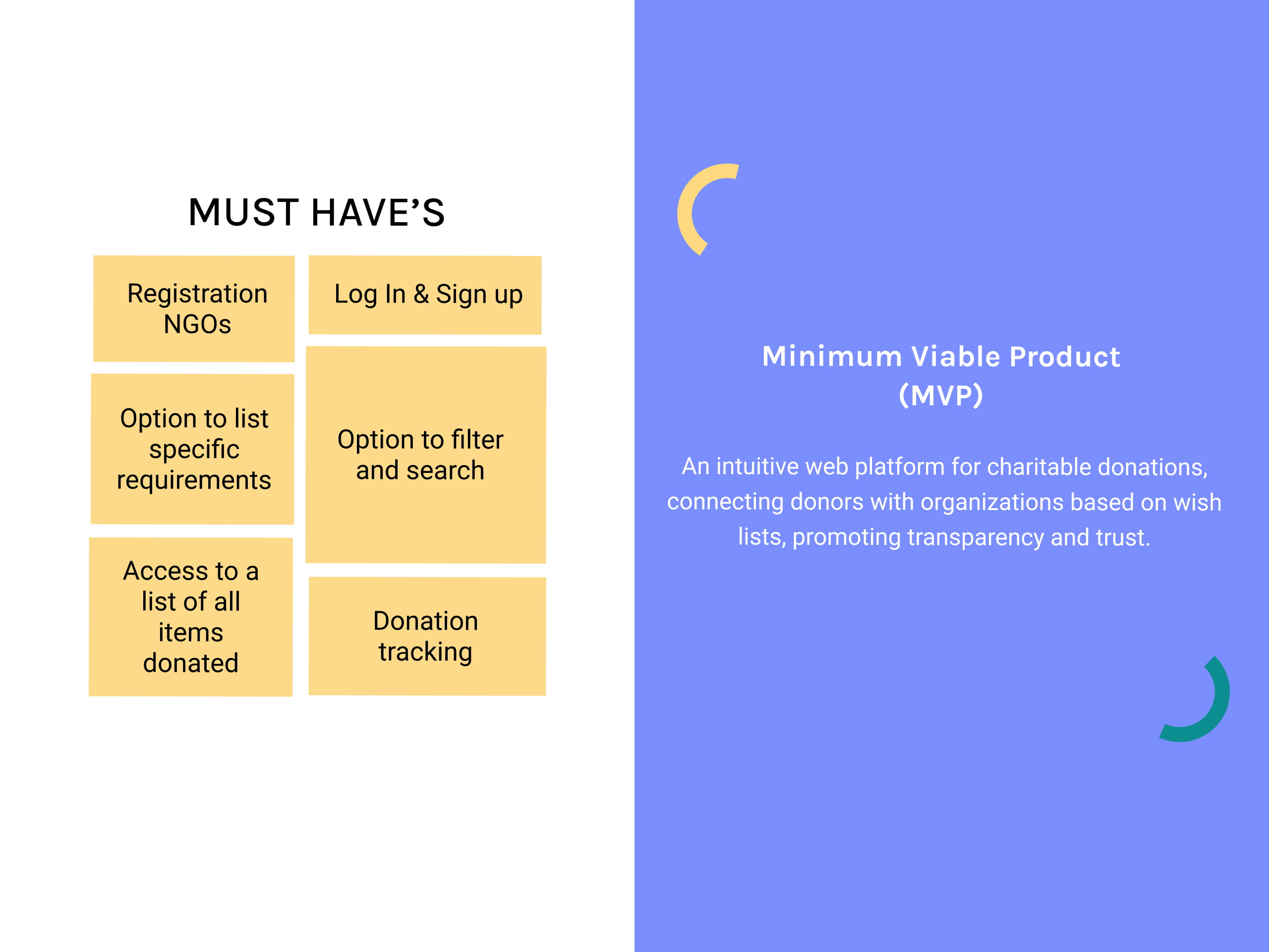
Prioritizing BeKind's Core: "Must-Have" Features
In the context of BeKind, the "Must Have" features are the backbone of the platform, including NGO registration, user login and signup, specific requirement listing, filtering and search options, and access to the complete list of donated items. These features are indispensable for the platform's functionality and user experience. The MoSCoW method guides our decision-making process, ensuring that we focus on delivering the most critical elements essential for BeKind's success.
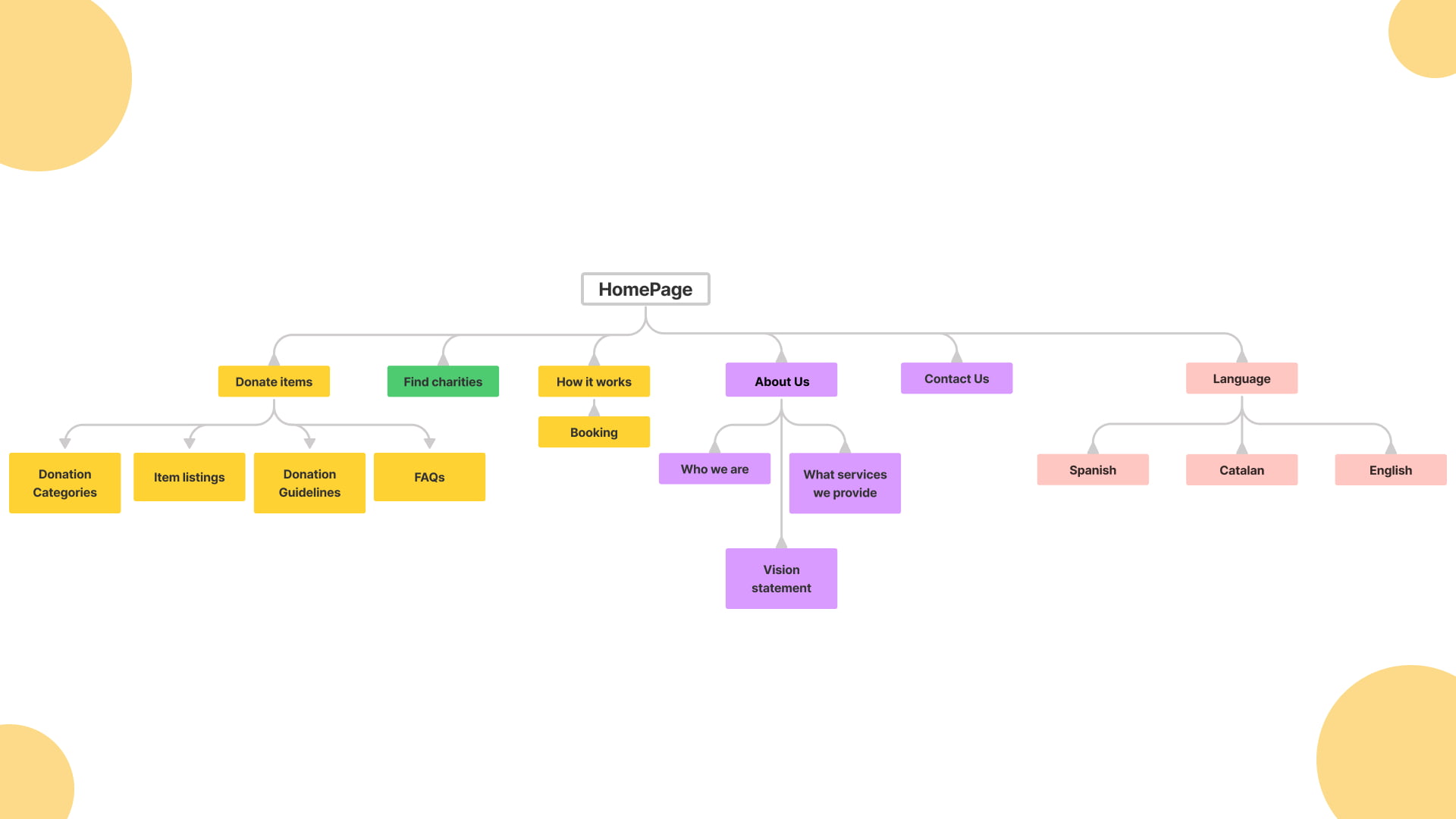
The new Site Map
The new site map for BeKind is a strategic tool designed to prevent users from getting lost in the complexity of the platform. It offers an alternative navigation method by visually presenting the site's hierarchy and groupings, ensuring that users can easily locate the information they need. This initial Site map serves as a preliminary navigational framework, intended to provide a directional reference during the development process. It is important to note that this representation does not reflect the final version.
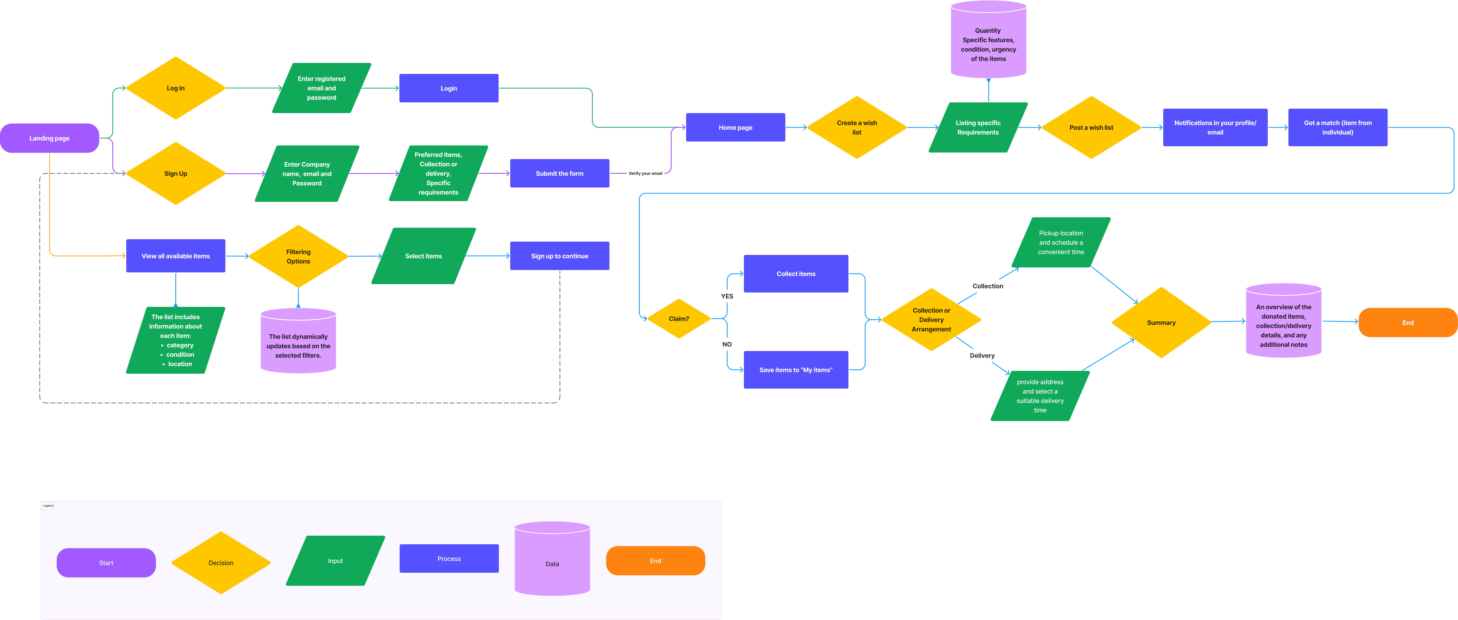
Charities and NGOs' Happy Path
We incorporate user flows to streamline the user experience, with a specific focus on the Happy Path/User flow for Charities and NGOs. These flows outline the ideal steps required to complete common tasks within the platform, ensuring a straightforward and efficient interaction while adhering to our MVP and deadline.
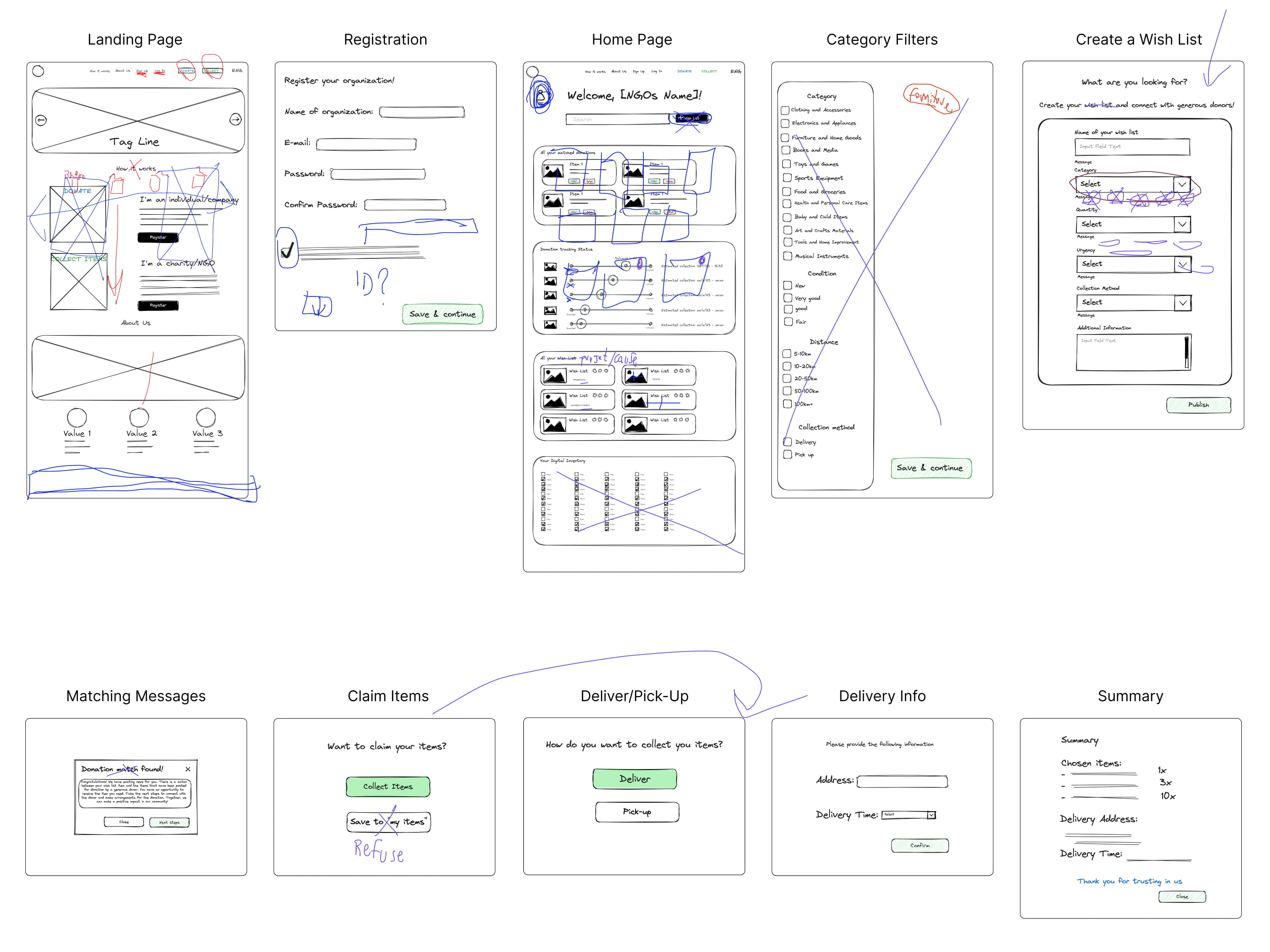
Low-Fi Prototypes and Concept Testing
We engaged with four users, collecting invaluable insights through their direct feedback. Some users expressed concerns about the terminology used, suggesting changes to avoid any misunderstandings. They highlighted the need for a brief introduction explaining how the platform works before users dive into actions like donating or registering. Feedback also influenced the layout, with suggestions to place images side by side for clear navigation. The navigation bar underwent scrutiny, with users recommending moving the "Log In" and "Sign Up" options to the side for familiarity.
Accessibility was another key point, with users advising on renaming elements for clarity. Additionally, users stressed the importance of clarity in various sections, such as explaining "How it works" and providing informative subtitles. These valuable insights guided our design refinements, ensuring that BeKind is user-friendly, accessible, and intuitive.
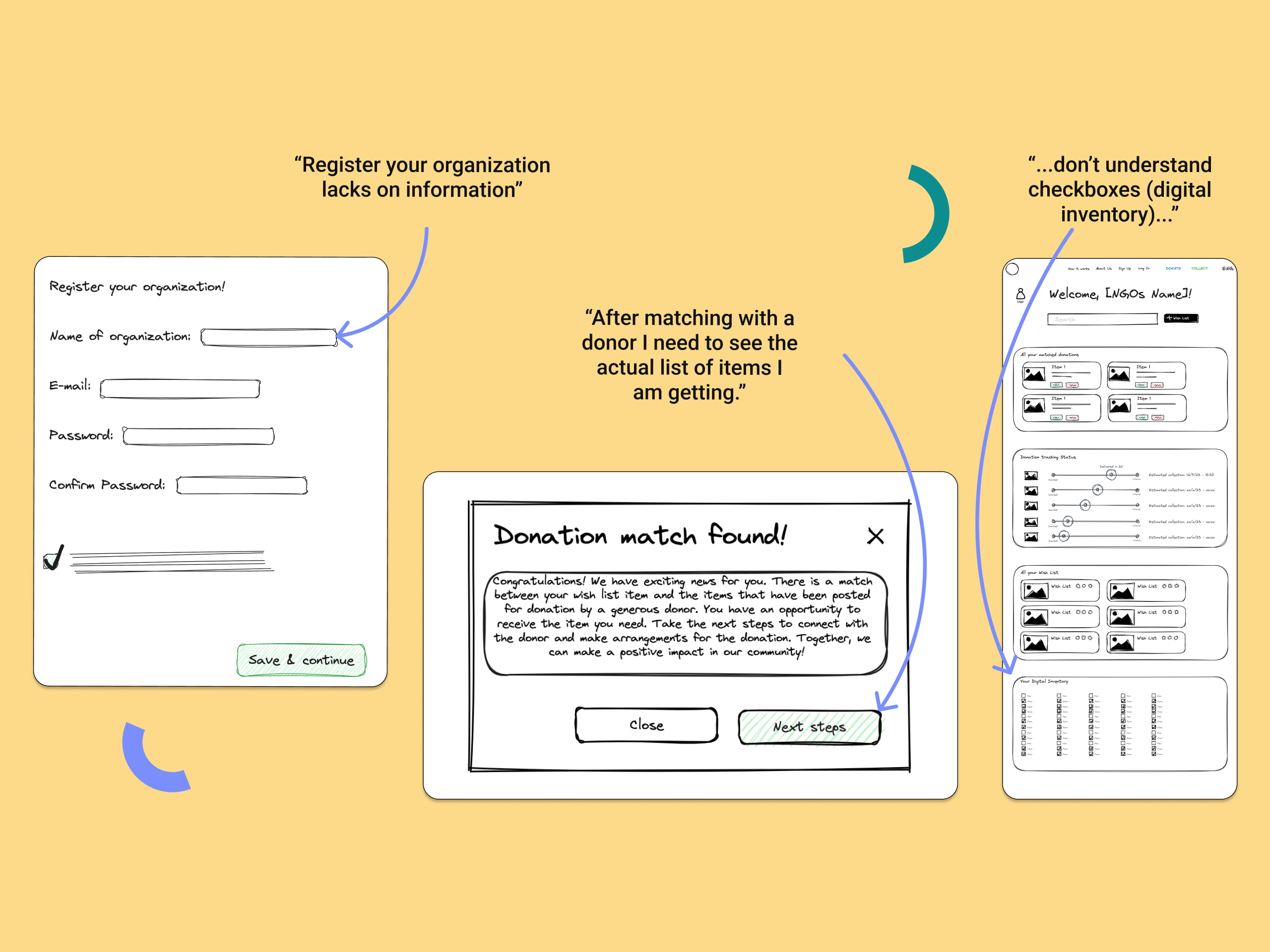
Crafting Mid-fidelity wireframes: Round one
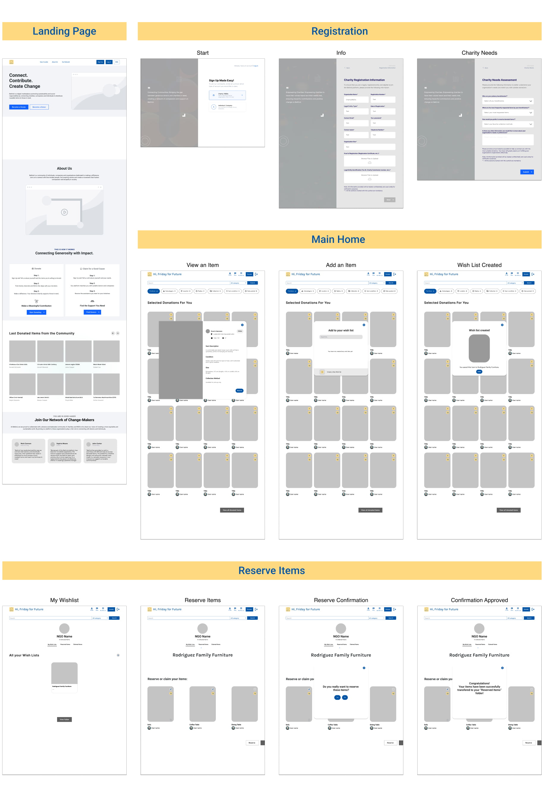
Building upon the insights gathered from concept testing, we transitioned to developing a Mid-Fidelity Prototype. This stage was especially critical, as it allowed us to address key areas based on user feedback. Our primary focus encompassed refining the landing page, enhancing the personal home for the charity channel, and optimizing the selection of desired donated items. In response to user feedback, we also dedicated efforts to improving the Charity registration process by incorporating additional requirements to streamline the onboarding process effectively.
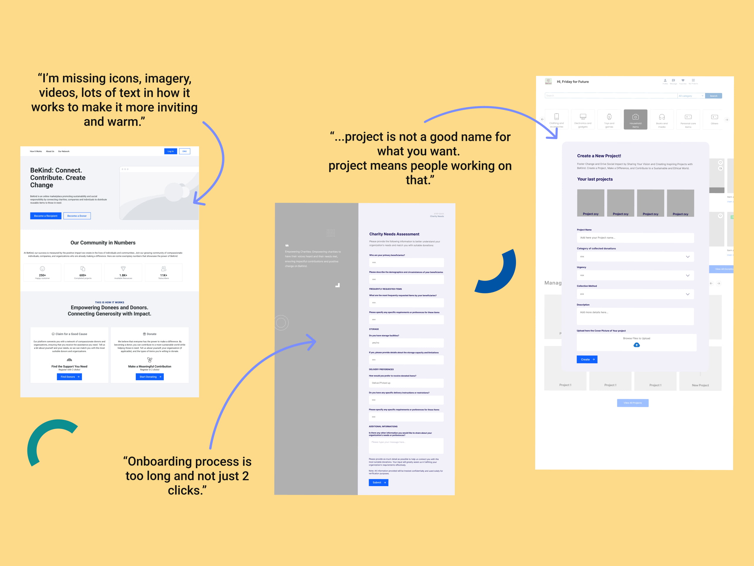
One significant outcome of this phase was the initiation of groundwork for creating a project folder feature. This feature is instrumental in fulfilling a user need identified during the research phase and aligns with user interview suggestions. Furthermore, our team began shaping a digital inventory storage system, aiming to provide users with a comprehensive solution to manage their donated items efficiently. Mid-Fidelity and Usability Testing are crucial steps that have enabled us to fine-tune BeKind, ensuring that it not only meets user expectations but also delivers an intuitive and seamless experience for all users.
Client's Perspective on Mid-Fidelity Prototypes
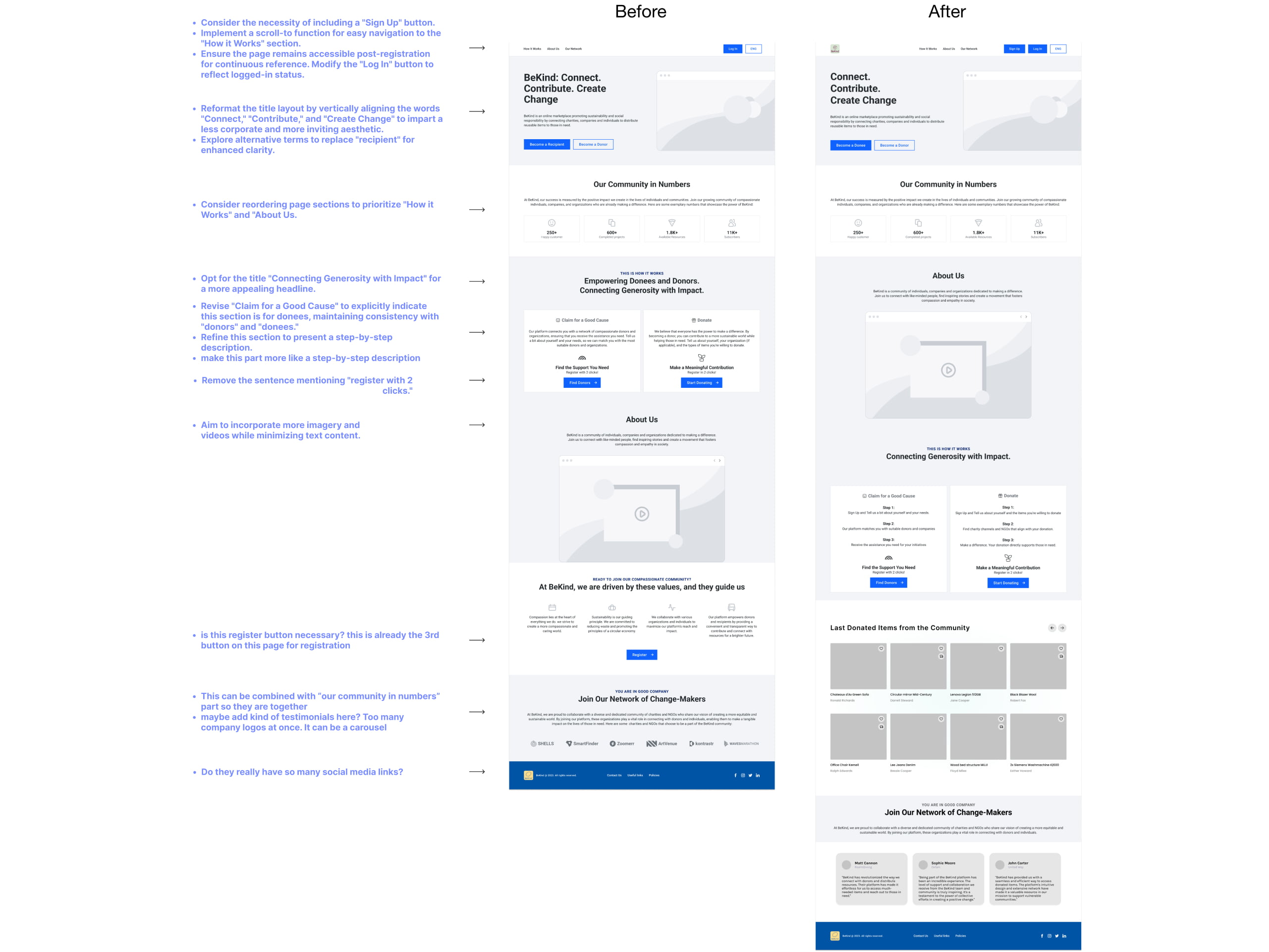
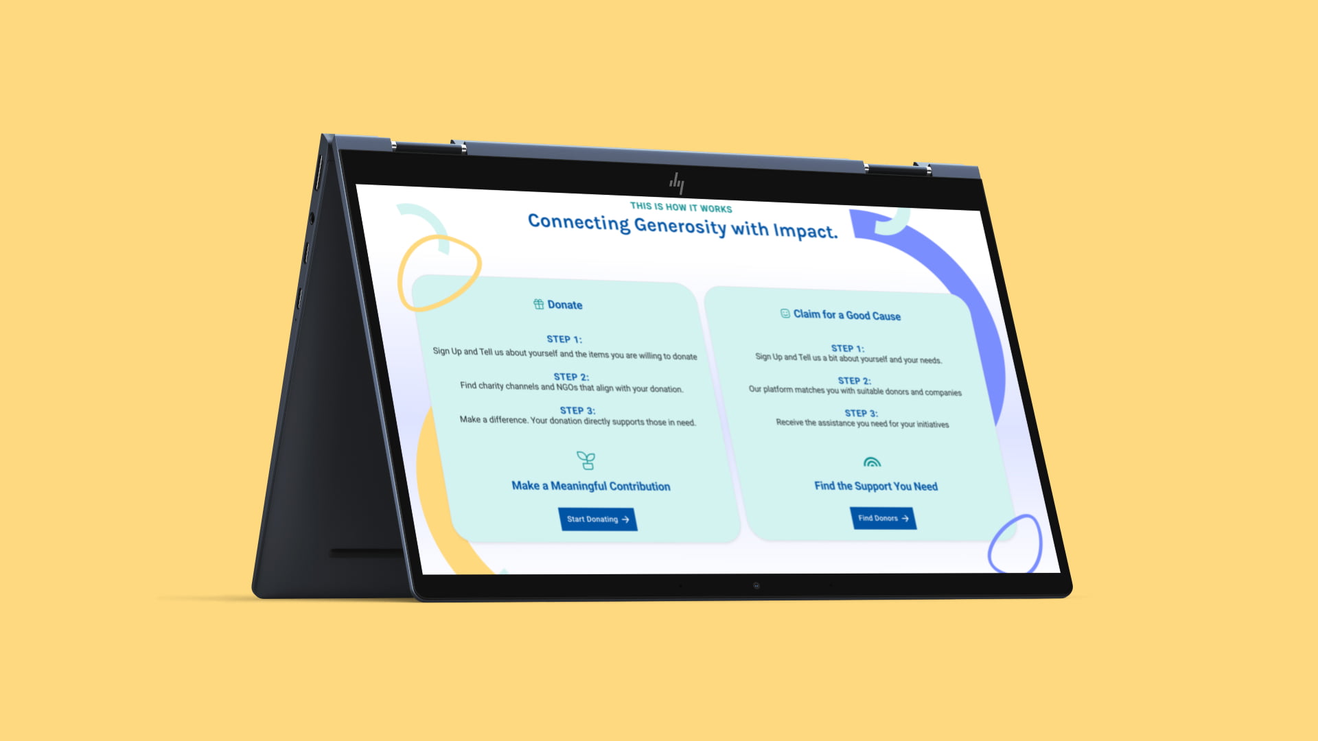
Incorporating the client's perspective on our mid-fidelity prototypes has been instrumental in refining our design concepts. Their feedback has guided critical adjustments in key areas of the platform. The landing page now features a persistent header for enhanced visibility and improved clarity in the "How It Works" section, with a simple switch of the "Donate" and "Claim for a Good Cause" boxes. The charity registration process has been enriched with additional information fields, including the contact name, telephone number, and organization size.
The primary user interface has been updated to include a chat box for user support, an icon-based sign-out feature, and an improved header that incorporates sections such as "How it works", "About us", and "Our network". The addition of item location mapping has also been noted for a smoother user experience. In the "My Profile" section, we've implemented the option for charities to add a Wish List or Urgent Request, improving their visibility on the platform. Finally, client input on notifications has led us to consider incorporating messaging features for seamless donor-donee communication. These client-driven refinements underscore our commitment to creating a user-centric platform that aligns perfectly with our stakeholders' needs and expectations.
Visual Inspiration for BeKind: Analyzing UK-Based Organizations
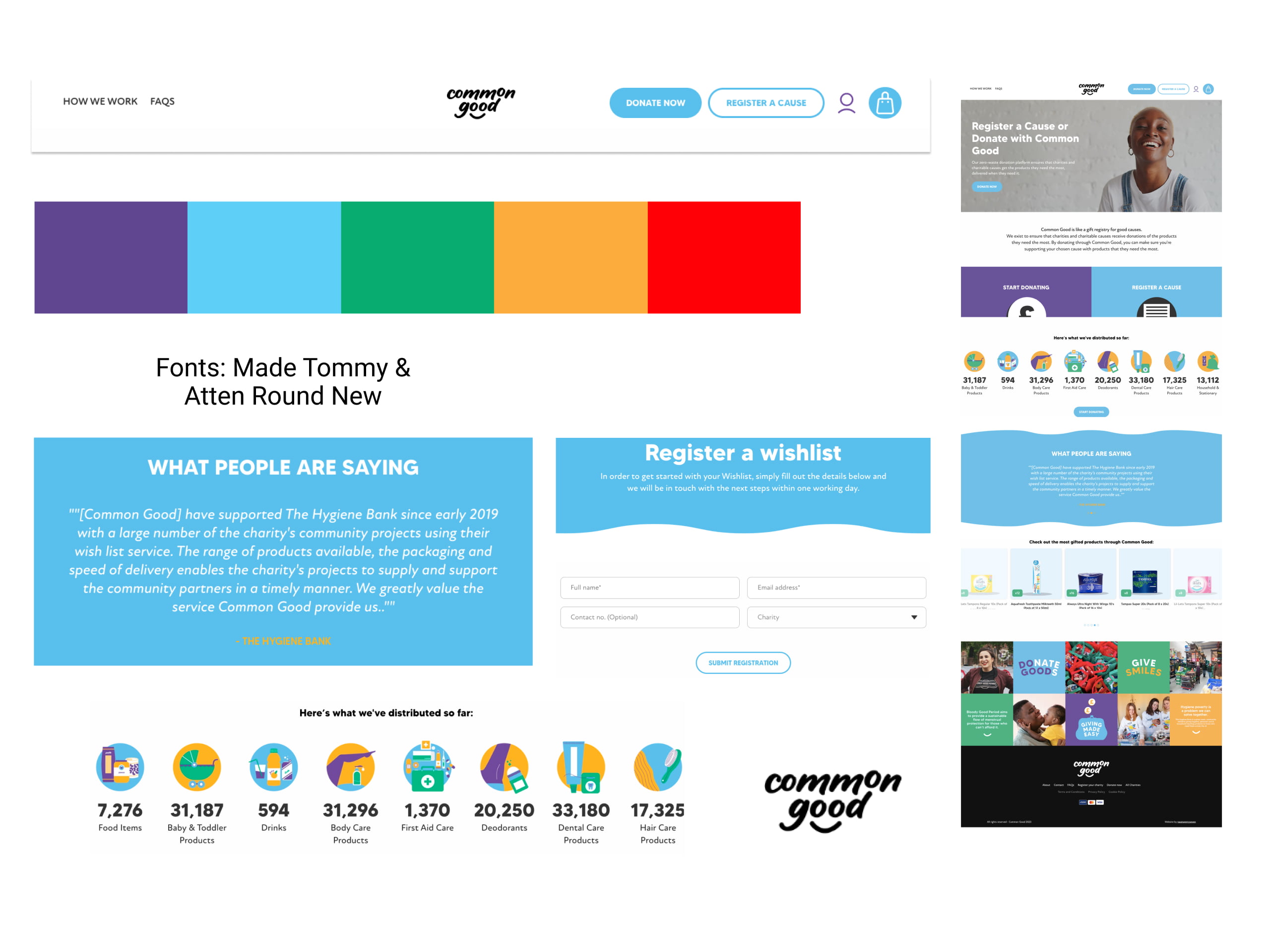
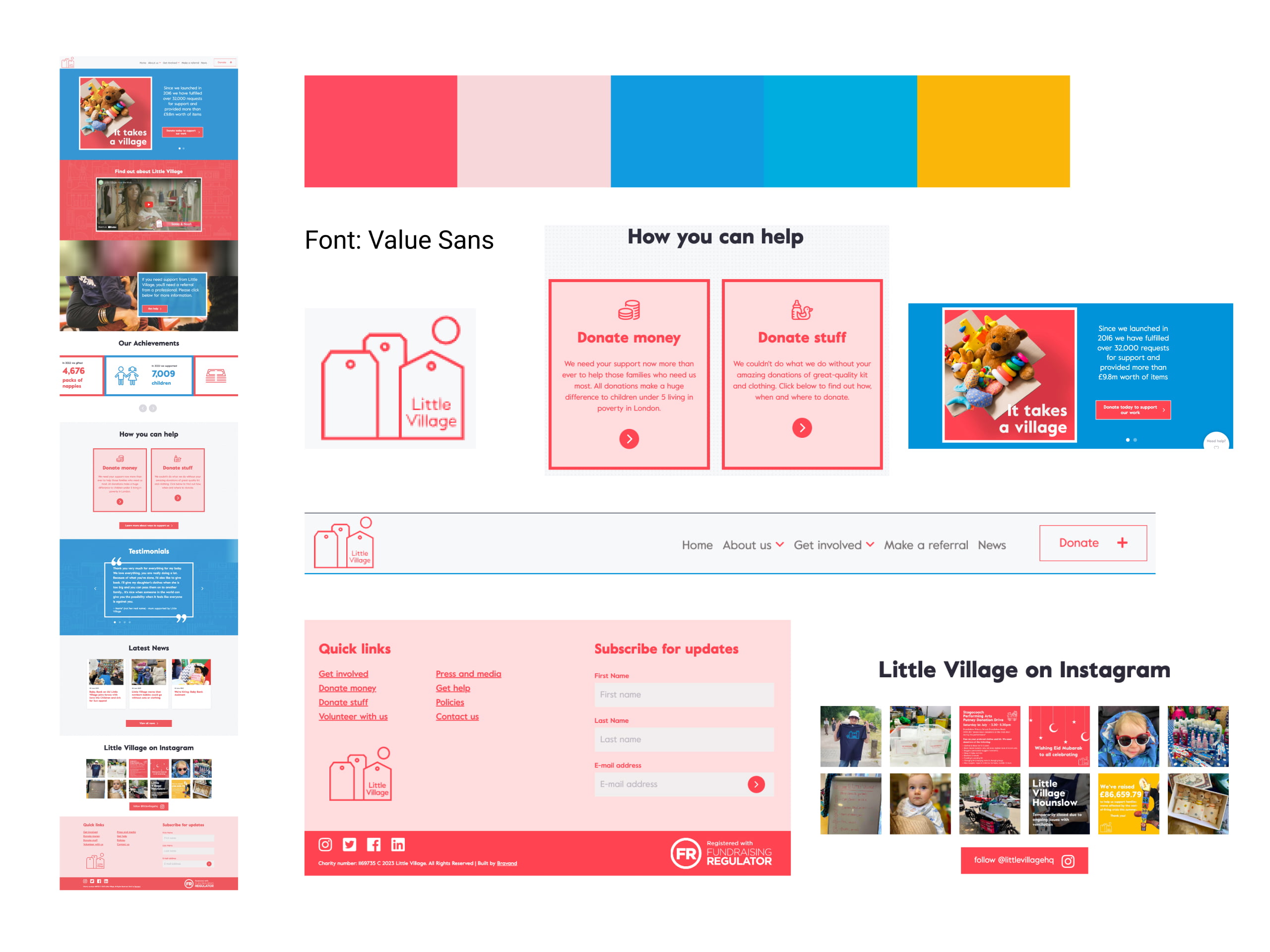
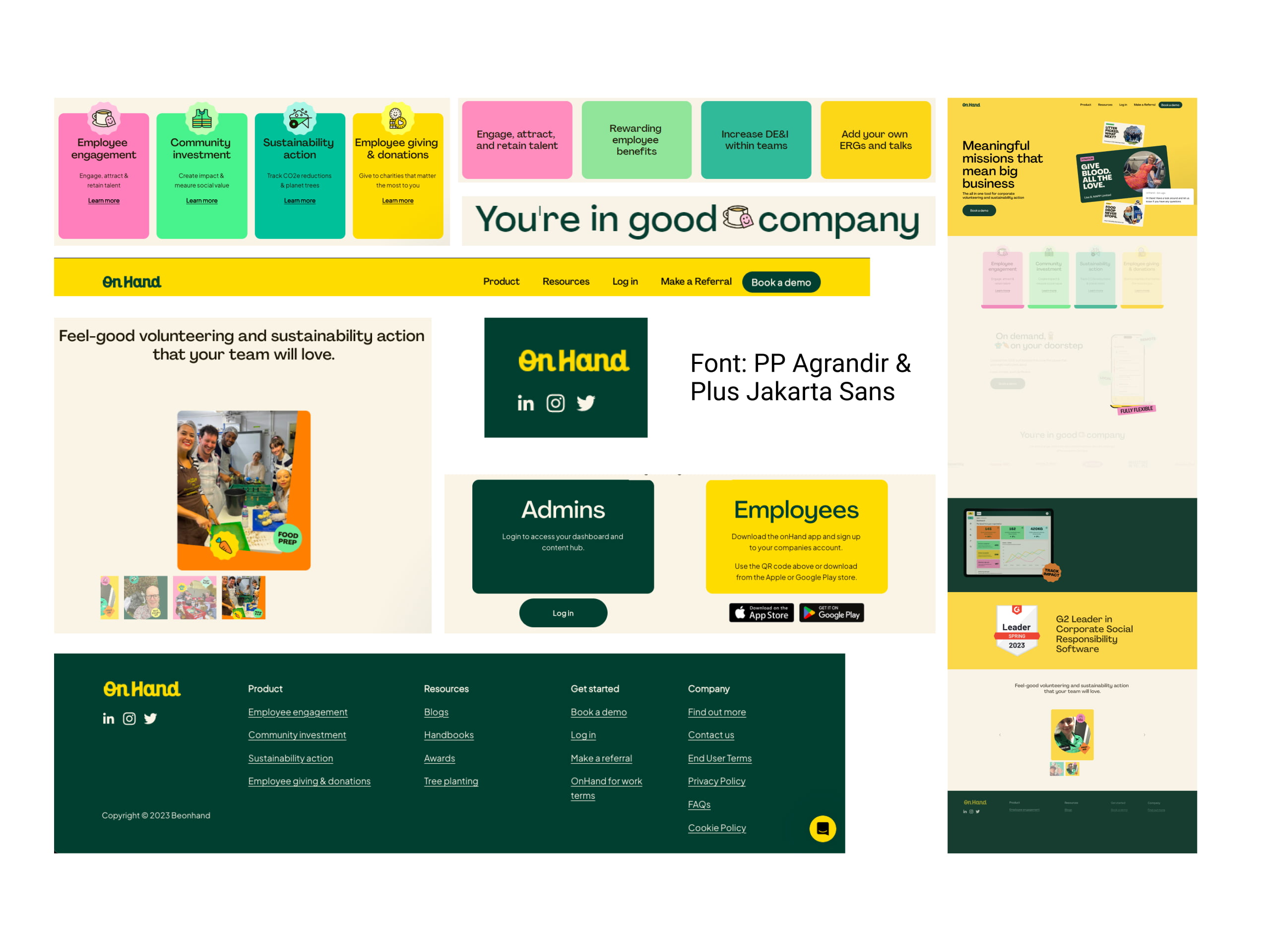
Our visual competitive analysis delved into the visual communication strategies of three prominent UK-based companies: For Common Good, Little Village, and On Hand. Our objective was to explore references and draw inspiration from their design aesthetics to inform our own visual approach to BeKind.
The emphasis in our analysis was on simplicity, cleanliness, engagement, and clarity. By studying these successful organizations, we sought to align our design style with the attributes that resonate most with our target audience, ensuring that BeKind's visual identity effectively conveys its mission and purpose while delivering an exceptional user experience.
Little Village
On Hand

Moodboard and Brand Attributes
Clean
Fresh
Easy to use
Circular
Sustainability
Style Tile Creation for BeKind: Communicating Sustainability and Ease of Use
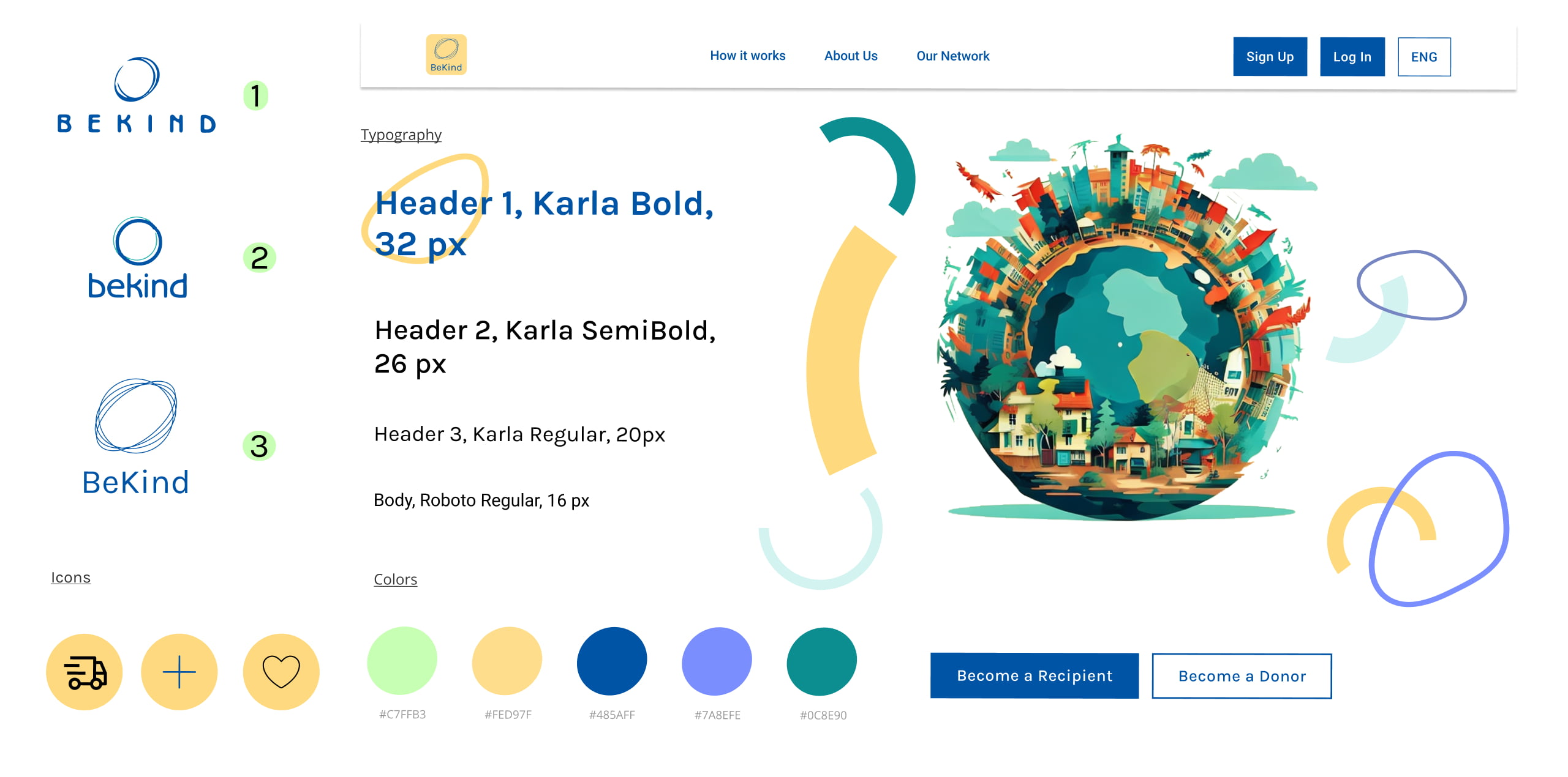
In crafting the style tile for BeKind, our primary focus was to encapsulate the brand's core attributes: Clean, Fresh, Easy to use, Circular, and Sustainability. To achieve this, we meticulously selected visuals that reflect the concept of circularity, aligning with BeKind's commitment to promoting a circular economy. The chosen typeface was a deliberate choice to convey a sense of freshness and clarity. This style tile serves as a visual guideline, ensuring that BeKind's design remains consistent and resonates with its mission of facilitating easy, sustainable, and user-friendly interactions on the platform.
HIGH-FI PROTOTYPES

Capture first impressions with 5-seconds test
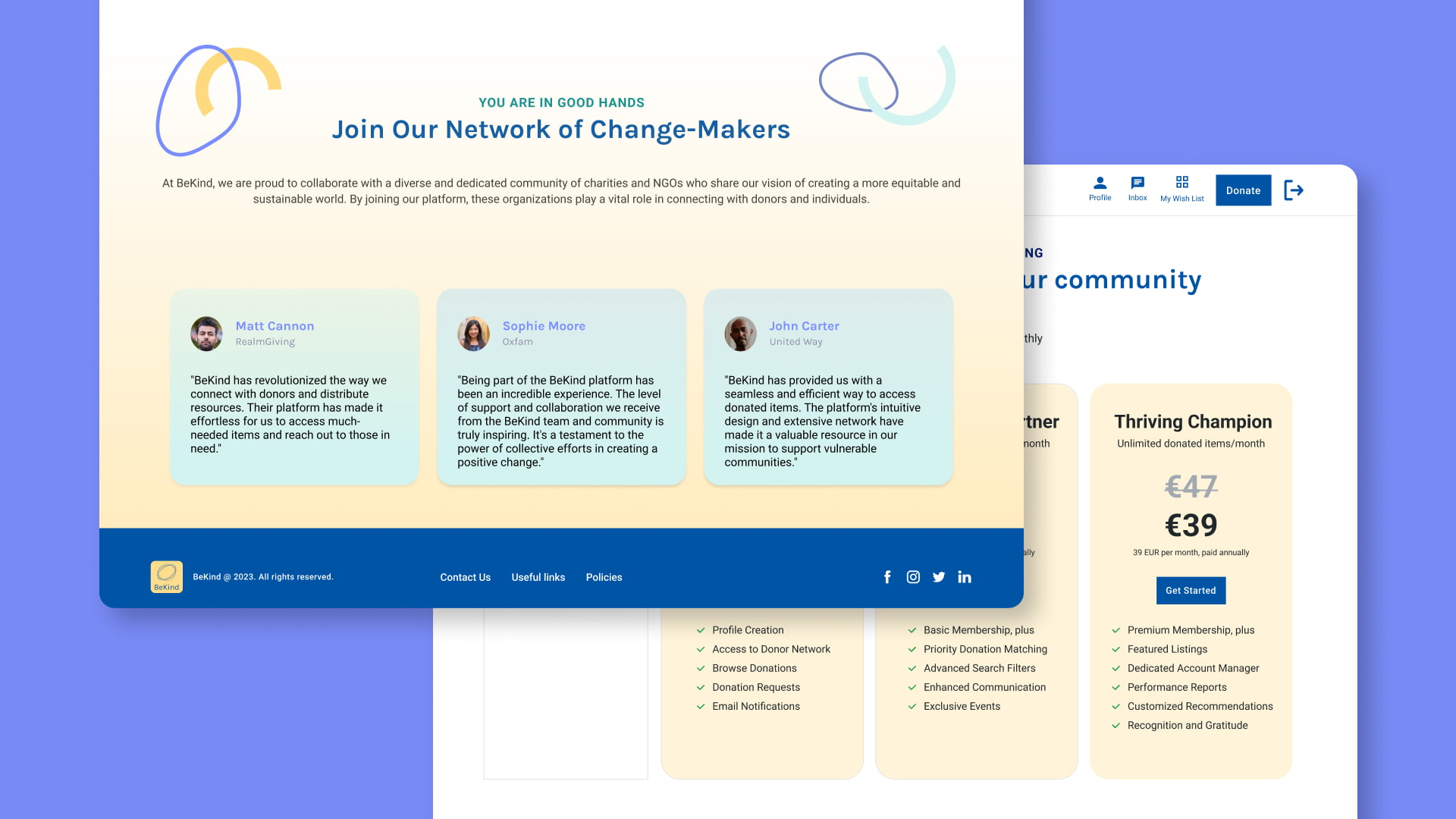
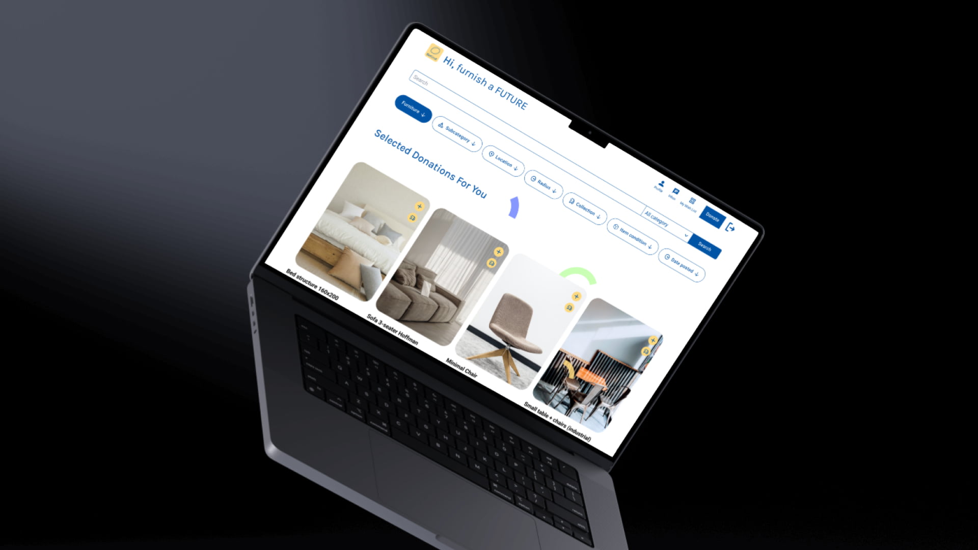
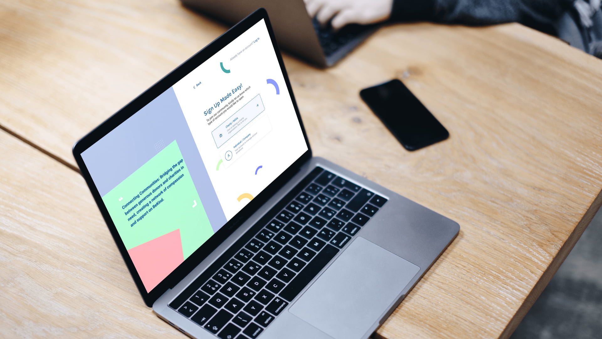
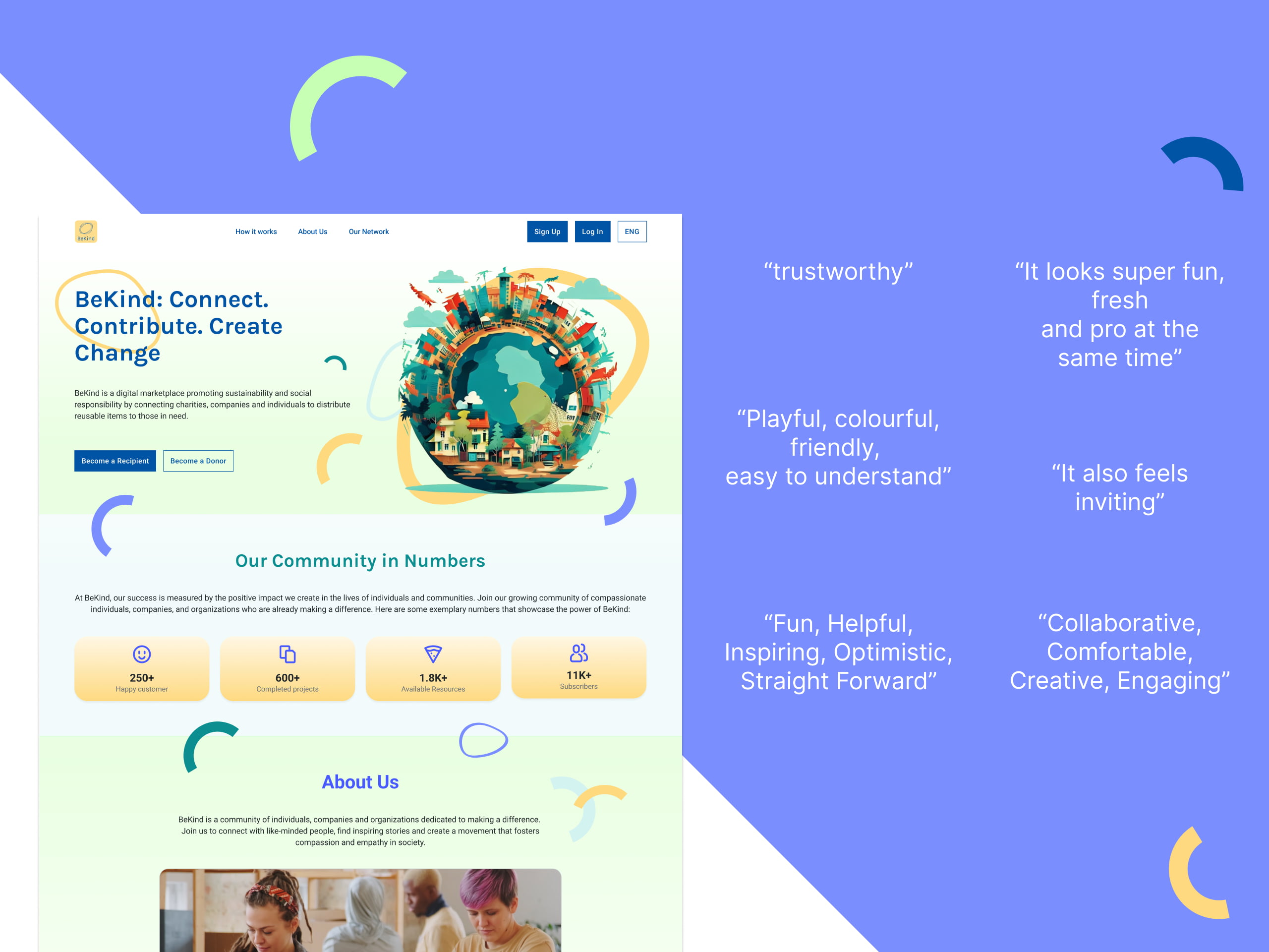
During our design process for BeKind, we conducted desirability testing to capture users' initial impressions within a brief 5-second timeframe. This approach aimed to gauge their immediate gut reactions to the platform's visual style. The feedback we received was overwhelmingly positive, with users describing BeKind as fun, fresh, professional, and easy to understand.
They found it playful, colorful, and friendly, creating an inviting and trustworthy atmosphere. These reactions align with our goal of making BeKind an engaging and user-friendly platform, fostering collaboration, comfort, and creativity. Overall, the desirability testing confirmed that our design choices effectively conveyed the desired brand attributes and resonated positively with users.
FINAL EVALUATION
→ What was the reaction of your users?
Upon presenting the final product, users conveyed positive feedback, lauding the overall experience for its fun and fresh style, along with a well-structured content hierarchy. However, there were individuals who still grappled with grasping the platform's core logic. The CEO and Co-founder expressed satisfaction with the professionalism exhibited within a remarkably short timeframe, and they particularly appreciated the visual design and Information Architecture (IA) of our final MVP.
→ Next steps?
The next steps in our project involve a comprehensive approach to further enhance the prototype. We plan to conduct additional user testing sessions to validate and refine the revised design while gathering valuable feedback. This iterative process will help us fine-tune the prototype's functionality and overall user experience. Simultaneously, we will evaluate the feasibility of scaling up the prototype for wider use. A critical aspect will be the cost-benefit analysis, which will enable us to assess the potential return on investment. Lastly, we aim to ensure alignment among key stakeholders, including users, clients, and team members, to ensure that the prototype aligns seamlessly with its objectives and expectations.
→ What knowledge did we acquire?
One critical lesson we've learned is the importance of early understanding, particularly when dealing with a project's backend complexity. This realization underscores the significance of investing time and effort in the initial project phases. Additionally, the creation of secondary user personas emerged as a vital tool for gaining deeper insights into the platform's primary characters, enhancing our ability to cater to their needs effectively. Lastly, our analysis of other e-commerce platforms has provided us with invaluable insights into managing user flows, particularly those focused on virtually preserving selected items, further enriching our approach to user experience design.
→ Different design approach considered?
In hindsight, there are aspects of our design process that I would approach differently. While crafting the ideal user flows for charity organizations, we initially focused on creating a streamlined path for collecting items within specific folders. However, as we began implementing additional features, such as the ability to temporarily reserve items, the interface became increasingly complex. This complexity, while well-intentioned, introduced challenges in terms of usability and clarity. We have come to recognize that simplicity often triumphs over an abundance of choices. In the future, I would prioritize a more minimalist approach, ensuring that each feature enhances the user experience without overwhelming the interface.

Thank you for exploring my design journey.
If you're curious to learn more, reach out.
I'm just an email away!
Selected Works
